10 Creative and Conceptual Logo Designs for Inspiration
A creative, memorable and unique logo design can make or break a business. Especially in the competitive world that we’re currently living in – your logo can indeed define success. Because of this, many businesses spend thousands (sometimes even millions) of dollars creating the perfect logo for their company. And believe it or not – this is often what is required to keep them ahead of the competition.
On a similar note, read this great infographic on the evolution of brand logos over time.
Below are ten conceptual logo designs that have redefined what it means to have a great brand. Go ahead and learn from them, get inspired by them and try to get your design juices flowing. Find out why these are 10 of the most well designed logos in modern graphic design.
1) Bee
Alexander Spiid, the designer of the ‘Bee’ logo above, utilized spall warped dots to create what appears to be a swarm of bees. The logo plays on the word ‘Bee’ and the letter ‘B’. The swarm of bees make-up the letter ‘B’ as you can see.
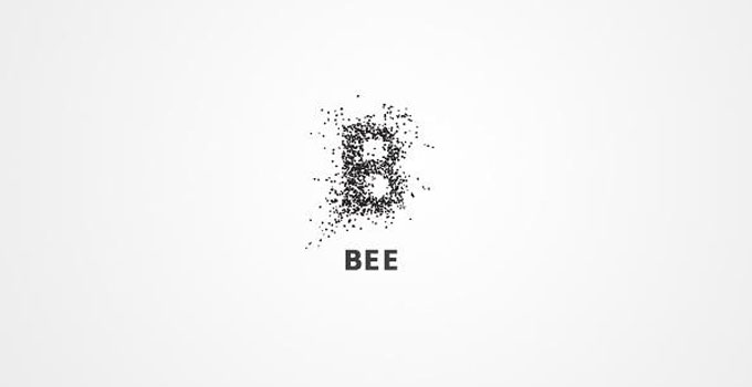
It’s a simple and clever concept that although relatively minimalistic, is sure to be memorable for years to come.
2) Missing
Joe Prince makes exceptional use of negative space in this logo design for “Missing” that plays on the idea that some of the letters are indeed missing from the design. He uses negative space in the design to represent the “I’s”, even though they’re not actually there.

It’s a clever design that also makes great use of font spacing to ensure that the effect is visible at first glance.
3) CloudCorner
CloudCorner is a cloud server company based around the idea that it’s like having your own private corner in the cloud. The designer of the logo played on this idea and designed the beautifully simple logo above. It features a cloud with a right-angled corner.
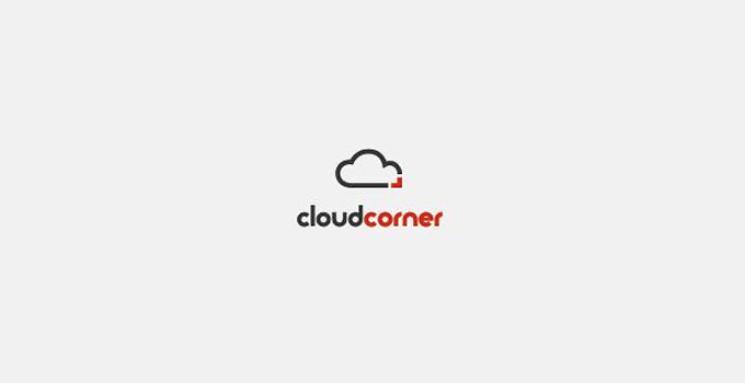
Two colors are used to represent each part (the cloud and the corner) along with the corresponding typography. Speaking of colors – find out the psychology of logo colors from today’s biggest brands.
4) HandyDog
HandyDog is one of my personal favorite logo designs on this list. I’m sure everyone has used their hands to create silhouettes of animals and other objects in the shadows and as you can see, this is what the concept of this logo revolves around.
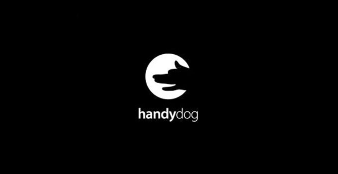
It portrays a hand creating a silhouette of a dog. It’s a simple logo that for whatever reason, also appears to have a small humorous element to it which further increases its impact.
5) KingFish
At first glance, the concept behind this logo might be obvious but if you look a little closer, you’ll notice that the outline of the crown appears to depict four fish. The jewels on the crown also double as eyes for each of the fish.
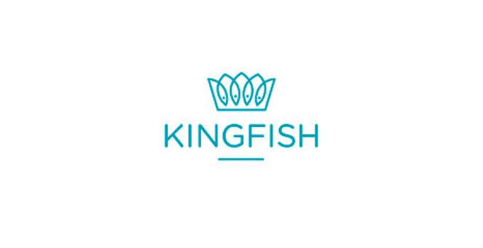
Once again, it’s an extremely simple logo with a great concept behind it. The final result is as elegant as it is clever.

6) DesignTent
With a name like DesignTent, you’d expect the company to have a well-designed logo and as you can see, this is exactly what it has. DesignTent’s logo manages to portray both the ‘design’ and ‘tent’ elements in a single imagine by portraying a tent that appears to be designed like a pencil.
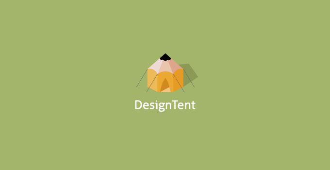
One of the nice elements of this logo is that it’s 100% symmetrical which further increases its beauty.
7) Freedom
One of the unique and creative things about this logo is how the designer has managed to do so much with so little. Effectively, this logo is nothing more than the word ‘freedom’ written in a basic serif font but by removing a section of the letter ‘m’, the logo is given an entire new meaning.
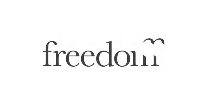
The removed section of the letter ‘m’ portrays a bird which in-turn represents freedom, the title of the company. It’s definitely one of the most creative logos I’ve seen in recent years.
8) LoveClip
LoveClip is one of the most beautiful logos I’ve seen on BrandCrowd.com, a website selling ready-made logos (more websites that create logos can be found here). Also, it features nothing more than a paperclip weaved into a love heart shape.
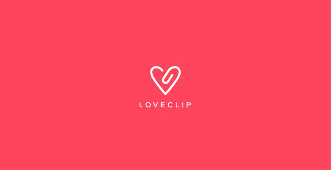
As the website states, it would be a fantastic logo and brand for a stationary or office-related website.
9) Corporate Bowling
Corporate logos can often be dull and boring but this logo for corporate bowling certainly manages to buck the trend. The concept is based around the corporate tie plus bowling pins; you can see that the pins are shaped like a traditional tie.
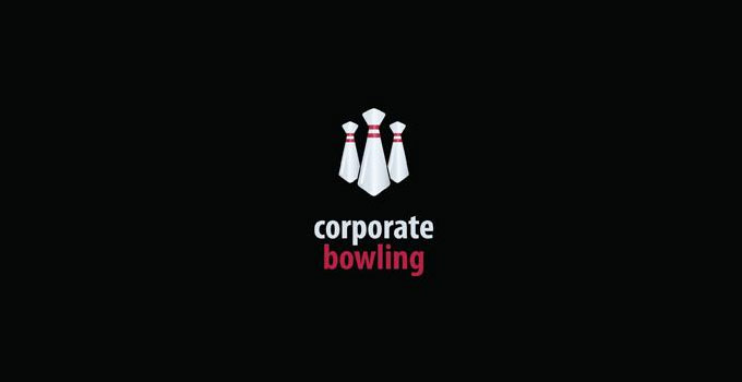
The neat thing about this logo is that the concept is instantly recognizable even at the first glance. It’s logo’s like this that are likely to be extremely memorable and help create a long-lasting brand.
10) Helium
Helium is a chemical element that is lighter than air, hence the reason why helium filled balloons often float away into oblivion. This is an idea that the designer of this logo for Helium played on by depicting the dot on the letter ‘i’ quite a distance from the letter itself. This gives the impression that the dot is helium-filled and has floated away.
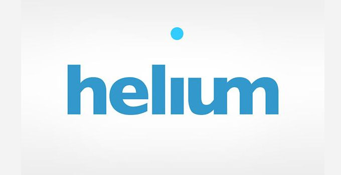
I love the simplicity of this logo and the fact that it relies on a small assumption being made by the viewer (the assumption that the dot is helium-filled), yet it pays off for sure.
Conclusion
As mentioned before, a great logo has the power to communicate a company’s desired message. And it has to send this message across successfully in mere seconds. This is why good logo designs are powerful and is paramount for long-term success. No matter what business you’re running, however big or small – new or old. Good logos are a must.
You also might want to check out this roundup of flat logo designs.