User-friendly mobile Apps – 12 Must have Design Elements to Follow (Part 1)
When it comes to designing a mobile app interface, there are some design elements that are an absolute must-have for an app. These elements make the app worth more than its actual value. They lend the app a much-needed simplicity and intuitiveness among other things. These qualities make the app easy-to-use and make the app experience pleasurable for the users.
Update: Part 2 is out! Please read here.
It is essential that the elements which lend the app simplicity and intuitiveness are seamlessly integrated into the app, making the whole (app) greater than the sum of its parts (features).
The following are the main design elements that increase the appeal of an app, as well as its significance. Therefore, the overall quality of the application is increased – leading to better success and efficiency.
1) Buttons (Click-ability, Size, and Receptiveness)
An app should have receptive buttons which are clickable, intuitive and also of the right size. Majority of the mobile app users use their thumbs to navigate through apps on smartphones. However, with 5 inch phones now a norm, more people use their index or middle finger to navigate through an app. So, it is important that buttons on an app are neither too large nor too small for people with fingers of all sizes.
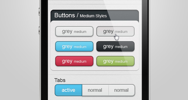
image source: www.pixeden.com
The buttons should also be clickable, have designs like jelly, flat or emboss or be enabled with arrows (as shown above) to let the users know whether the button has been clicked and where it will take them. Most importantly, the buttons should be receptive to touches on its border or edges, as some buttons only work if tapped in the center, which leads to an unfavorable experience for the user.
Keep in mind that you can download these UI elements that designers have already created for public use. This saves you the leg work of having to design one from scratch.
2) Translucency
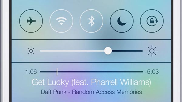
Translucency should be used extensively across the design of an app to keep the users aware of exactly where they are in the app, compared to say, the homepage.
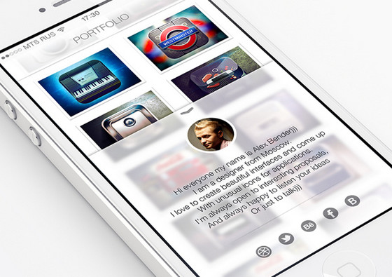
image source: Imagemodo.com
Using translucency (as in the above image) allows users to check additional features without leaving any particular page. Additionally, it makes returning to a page effortless, as it only overlays a layer on top of the original layer without affecting the state of the app.
3) Navigation bars
The navigation bars enable movement to the major sections of an app. But, many a times, the navigation bar is packed to the brim, and as a result appears cluttered on a smartphone with a smaller screen.
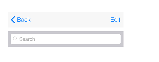
image source: applidium.com
Therefore, it is crucial to keep the navigation bar simple and neat, by putting only the major sections of the app as tabs. The additional tabs, if utterly necessary, can be put in a separate tab called ‘More’. This is an entire topic altogether, which can be covered at a later post.
See this tutorial on how to create a responsive navigation from scratch.
4) Controls
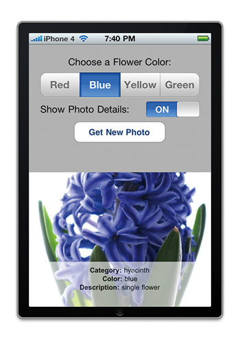
Controls are of various types and offer a wide array of functionality. They can be: Activity Indicator, Contact Add Button, Date Picker (for instance, to choose the date of birth):
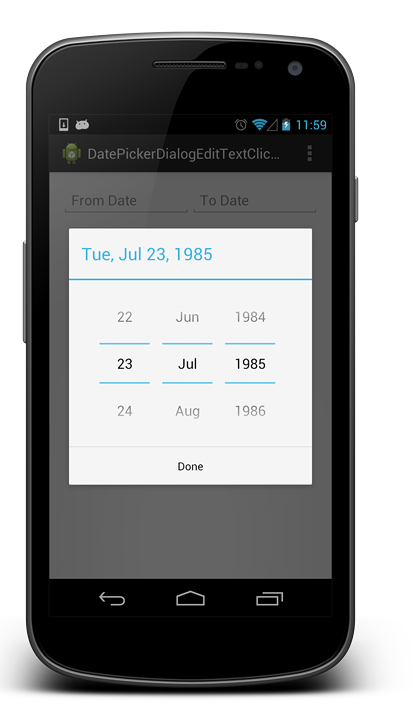
image source:
androidopentutorials.com
Additional controls can also be an Info Button (showing details about an item), a Label, a Network Activity Indicator (showing network connectivity), a Page Control, a Picker, a Progress View, a Refresh Control, a Slider (to increase or decrease brightness), a Segmented Control (to display a different view), a Stepper (to increase or decrease the volume) or a Switch (for toggling an option on or off).
They assist in helping the user understand the state or condition of an item and help in knowing the details of an entity within an app. As shown in the image, the ‘loading data’ animation tells the users that the app is loading the screen requested and will be shown to the users shortly.

5) Segmented controls (Tabs in a bar)
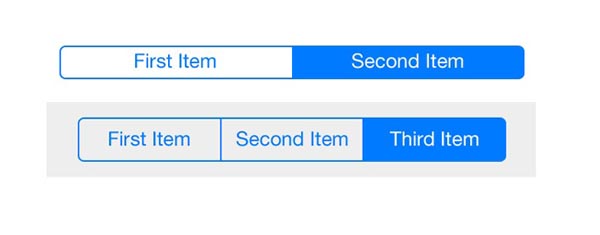
Segmented Controls are a kind of child of the parental set ‘Controls’. They require a special mention because they are extremely useful, especially when implemented on a mobile app. While the use of segmented controls can be limited on certain apps, appropriate utilization of these controls can greatly increase the usability of an app. Segmented controls provide a list of options called segments to the user.
When the user clicks on any of these segments, the display or properties of the app change accordingly and reflect that segment. So, Segmented Controls act like a kind of What You See Is What You Get (WYSIWYG) feature, as the screens change instantly to reflect the option chosen by the users.
What makes them so special is that users get to see altogether different screens without changing the state of the app or even refreshing it. It is instantaneous and extremely efficient because of the multitude of options in the segmentation bar.
6) (Intuitiveness of) Temporary views
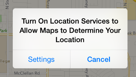
Temporary Views can either be Alerts, Action sheet, or Modal Views; they make it possible to show warning messages to users, allow users to take specific actions and enable the users to send emails to recipients respectively. These Temporary Views help the users in accomplishing tasks without changing the state of the screen.
So, if a maps app is running in the background (as in the above image) of a user’s smartphone, the user is able to turn on his geo-location service without moving away from the current screen.
7) (Precise context of the) Content Views
The Content Views are of 8 different types. These 8 views are: Activity View, Collection View, Map View, Page View, Popover, Scroll View, Split View, Table View, Text View. Activity View is shown when an action is to be performed by a user; Collection View can be used to display a collection of images; Map View is used to display maps; Page View (as seen in the image) is used to show display books or PDFs;
On the same note, read how you can design a native phone app with Chocolate Chip UI.
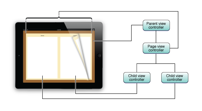
image source: apple.com
Popover can be used to display popups; Scroll View is shown when scrolling from the top to the bottom of a screen; Split View can depict two screens at a time; Table View can shows tables; and Text View can be used to display text. It is essential to utilise the appropriate Content View to display the specific item on a smartphone app.
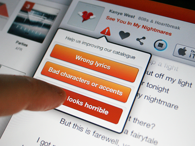
image source: designtickle.com
A mismatch can ruin the user experience, but tactful usage of these views can essentially provide another dimension to the app. Shown in the image above is a Page View, with a partially turned page indicating presence of more pages in the book.
Conclusion (for now)
We know that we’ve just presented you with a lot of information about mobile app design, so let’s close it up for now. Take these first set of tips as a good starting point for your next software. Stay tuned for more mobile articles, as well as the next 6 elements for your user friendly mobile application.
