Here are 4 Reasons Why Interactive Maps on Websites Are Helpful
Interactive maps are an incredibly useful way to share information on a particular region or location, because they’re both engaging and attractive. Furthermore, they’re interactive, allowing users to pan, zoom, scroll and even play around with a map layout.
It’s easy to see why a feature like this is so promising on the consumer side of things. Customers, for example, can find the closest store near them, or even a retailer that carries your products. But there’s a lot more to it than just viewing a location — these maps are useful for so many reasons.
A community crime map can show all the reported crimes in an area, easily pinpointed on a Google Maps-style interface. The idea is to allow people to look up crimes nearby, to keep an eye on the goings-on in their community.
1. Visual Navigation Is Easier
Think about when someone gives you an address or directions. Most likely, you look for a visual representation through a map or a GPS system. That’s because it’s just much easier to understand visual navigation, especially when you can see your destination or travel route.
One of the best reasons to use an interactive map or maps on your site is that they help your customers find important locations, events or nearby landmarks. This isn’t such a big deal if you run an online-only business, but you may or may not have some need for physical indicators. Maybe you need a map to show where your home office is located, for instance?
The point is, when a visual or integrated map accompanies an address, it simplifies things.

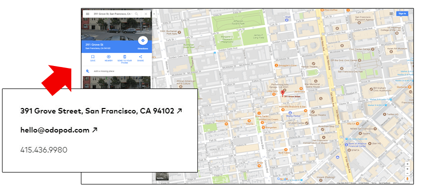
Odopod’s Map
While they do have an interactive map on their site, Odopod’s use of their physical address is a better representation of this point. Down at the bottom of their page, you’ll notice the address for their agency. When you click on it, it opens said address in Google Maps, making it much easier for potential clients to find the real-world location.
2. Interactive Maps May Improve SEO
SEO experts and marketers have argued forever about whether or not a plain address helps boost exposure for your site, particularly through Google’s search algorithms. It’s honestly difficult to say, and we may never know.
However, there’s plenty of evidence that having a real-world, verifiable address for a local destination, such as a store or office, can boost your site’s Google credibility. That, in turn, does impact your SEO ranking, which means you can improve your standings by taking advantage of it.
When it comes to improving SEO or site exposure, it doesn’t truly matter where you place the map. That said, it’s always a good idea to include it on a contact page or internal information post. In other words, somewhere your audience can get more detailed information about the map they are viewing.


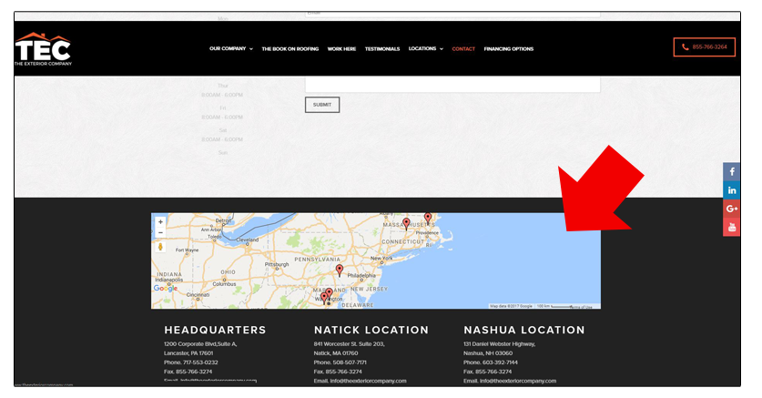
Exterior Company’s contact page
The Exterior Company, for instance, has a well-placed map on their contact page, showing nearby locations and service areas. You can bet this helps their search engine coverage, by allowing local customers to find them much more easily through local search.
BTW, here are good examples of Beautiful Contact Pages.
3. They’re Easy to Manage and Incorporate
You’d think adding an interactive map to your site would be difficult, but it’s not, thanks to many third-party services and tools that allow you to embed the necessary code. In short, it’s much easier than developing or producing a map internally.
Using a third-party service — such as Google Maps — means you don’t have to regularly maintain the content. The map updates externally, leaving you hands- and worry-free. That’s important because, over time, things around us change. Businesses close and new ones open. More locations and buildings pop up. Even the layout or design of areas can change completely over time. But the beauty of maps is that — unless you’re offering a real-world street view — they’re incredibly easy to maintain and update.
4. Present Information Groups With More Clarity
Another excellent reason to use interactive maps on your site, believe it or not, has nothing to do with sharing the location of a store or office. It can be used as a data point or visual representation of big streams of data.
Wireless providers, for instance, use interactive maps to represent their service coverage. These maps break the information down for customers so it’s more accessible, but also more engaging and interesting. Plus, it provides potential and interested customers with a good representation of what to expect regarding service, making them more likely to subscribe or invest in the company.
When trying to present information in this way, the best place to position an integrated map is beside the related content or page. In the example above, the wireless provider might include the coverage map near an FAQ or onboarding portal for new customers.

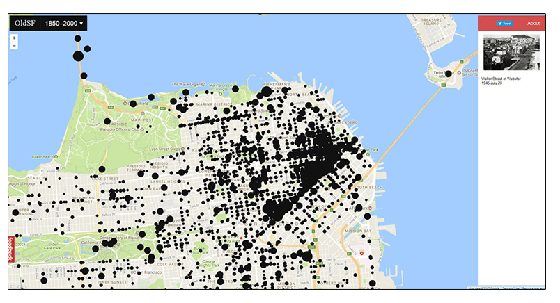
OldSF Map Page
On OldSF, which is a great case study for this point, you can see old-fashioned photos of San Francisco and their locations on a map interface, denoted by dots. Click on any of those locations, and you’ll see the related photo and the exact address.
It’s a great way to present the information, other than simply listing or throwing all the photos in a gallery. It’s also more engaging and interactive, because to explore and see the photos, you need to use the map interface.