7 Ways to Create a Fantastic Looking Homepage
Designing your own website can be a lot of fun. You get to choose the content, the domain name and the layout. However, creating a website takes a lot of hard work (especially if you try and do your own Search Engine Optimization) to the point where most people get frustrated and give up. This can have negative consequences on the look of your website and especially your homepage. Maybe the vision was good but the execution was not up to the task, so what is one to do?
Here are seven ways to help you get your homepage off the ground and looking great:
1. Quality Content
Spice up your homepage up by featuring quality articles, product reviews or pictures. This has the two fold effect of keeping your loyal users engaged as well as attracting new users to your site. This will also improve your SEO by making search engines like Google happy.
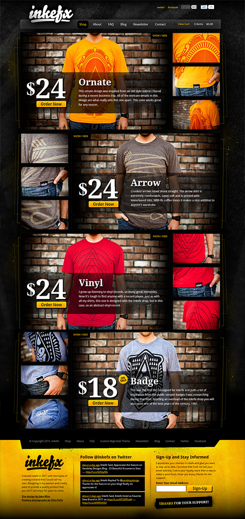
InkEfx's homepage displays an array of high quality content such as products, photography and graphic design elements
2. Be Creative
Always experiment with new ways of engaging people with your homepage. Try music or animation, or even a short video. Never be bland or generic, new websites need to make a big splash on the crowded online marketplace.
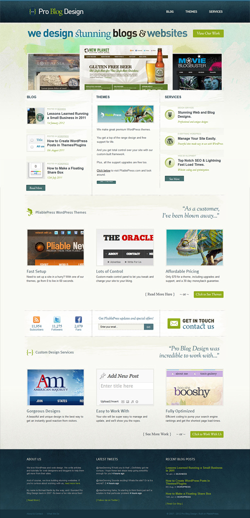
Pro Blog Design is a perfect example of a creative homepage
Keep in mind, creative doesn’t mean bizarre or extraordinary. Most of the time, it is keeping things simple.
3. Keep Your Links Focused
Your homepage will need several links in order for people to be able to navigate your site. However, make sure the links you include are relevant to your website. Keep the links focused and easy to understand. A link titled ‘About’ is easy to understand because it’s clean and simple. A link containing more than seven words is too loaded and unfocused.

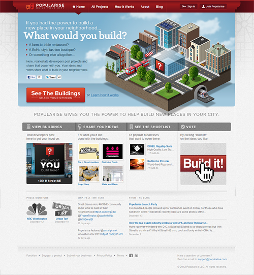
Popularise demonstrates good focused links in their homepage
4. Keep it Clean
The best way to create a great looking homepage is to avoid clutter. Big websites, like Amazon, have a massive client base. People will keep going to the site no matter how busy the homepage is. You don’t have that luxury. Keep the homepage clean and simple for now.
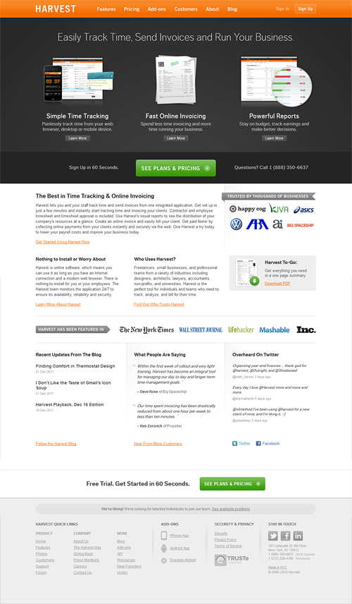
Harvest is prime example of clean and clutter-free web design
5. Limit the Scrollbars
It might be tempting to stuff your homepage full of information so people have everything at their fingertips. However, it can be pretty off putting for people when they are faced with a dozen scrollbars full of content. It can be so daunting that they quickly lose interest and leave your site, so save the content for the inner pages.
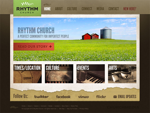
Rhythm Church kept the homepage short so no scrollbars appear on the right
6. Keep it Up to Date
Don’t let your homepage lag behind the times. Make sure your homepage receives regular updates to keep people interested. Of all pages that need to be refreshed periodically, your homepage takes precedent because it’s the first thing people will see.
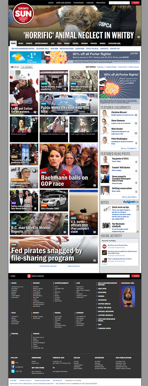
Toronto Suns homepage is filled with breaking new content
7. Make the Homepage Relevant
You want your website, and especially your homepage, to aesthetically match what you’re trying to sell. If you have a site that features classical music, make sure your homepage isn’t covered with barbed wire graphics. Make sure you register with a robust web hosting service, as they usually provide you with the tools to easily customize your site.
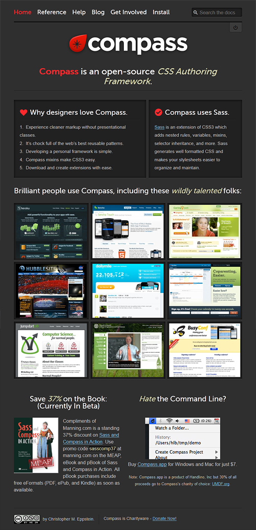
Compass sells software for web design - so their homepage has to look awesome
Your homepage is the first thing that people see when they click on your site, and with these seven tips you can make a great looking homepage that is sure to gain a lot of traffic. Now that you’ve just gained plenty of knowledge on homepages, don’t forget to have a unique 404 page as well!