User-friendly mobile Apps – 12 Must have Design Elements to Follow (Part 2)
A couple of months back we featured an article that focused on the “User friendliness” of Mobile application design. This has by far a very important subject and has been a big hit to our viewers. Below are additional elements that you should definitely consider. Elements that may make your software a level above “good enough” and become “great”.
8) Depth of Layers
Layers are similar to the translucency feature, but serve a deeper purpose. Layers help in determining the depth, which ultimately helps the users in knowing his current position in the app and the app hierarchy.
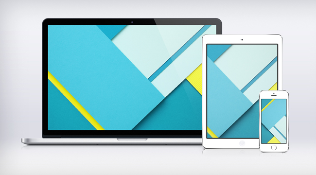
image source: ziggy19.deviantart.com
Google’s new “Material Design” is big on this element. It is understood that “Flat” design is in, but a certain degree of depth is still necessary for an even better interface. Read this article on Android’s newest features that involve the new material design.
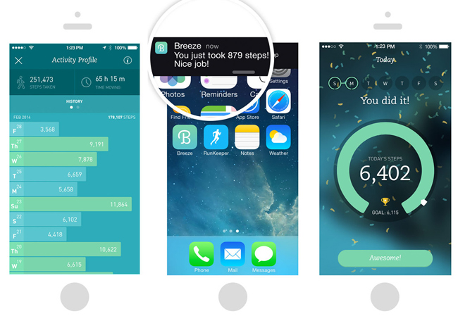
image source: applenapps.com
As visible in the image above, the centre mobile screen has two layers. The layer in the background is the home screen and the layer overlapping it is the notifications bar. This gives the user a clear idea of where he exactly he is in the app, and how he got there. The screen towards the extreme left of the image shows an app without layers and the one on the extreme right displays an app with two layers stacked on top of each other.
These variations in the depth settings help the users in understanding the hierarchy in the app, the same way breadcrumbs do in a website.
9) Screen Real-Estate Usage
Although the size of smartphone screens has seen a drastic rise over the past couple of years, the fact remains that smartphone screens are considerably smaller than their desktop or laptop counterparts. So, it is important to remember this pitfall has it’s biggest challenge by far: Real Estate.
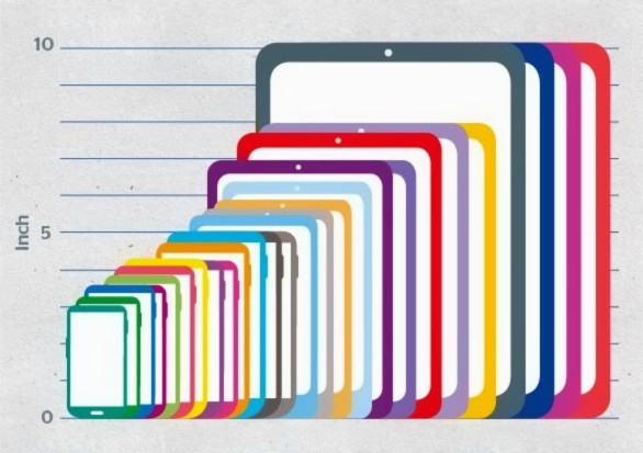
image source: blog.nerdery.com
Every centimeter counts. Not a single inch gets filled without careful consideration. Since mobile apps require smaller font-sizes, it is essential to keep the app design minimalistic. We should avoid cluttering the interface because Real estate is so valuable. Remember, only the real important features make it to the screen.
10) Visual Tags / Indicators
Visual Tags are objects used all across a mobile app. They help in notifying the users about something, draw attention towards something important or simply a notification of some sort. Maps are a good example of this treatment. Maps visual indicators to users about their starting point, their route and their final destination.
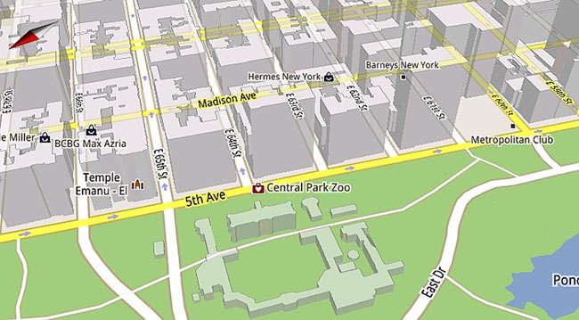
image source: slashgear.com
It is important to see that visual tags in maps can be primarily categorized into pins and markers. Pins tell you where a particular location is, whereas markers can depict anything from train stations, restaurant, park, monument or a place of recommendation.
Apart from maps, social media mobile apps use plenty of indicators as well. Notice that the Yelp mobile app uses their own version of map indicators – just to tie in the visual coherency of the entire application.
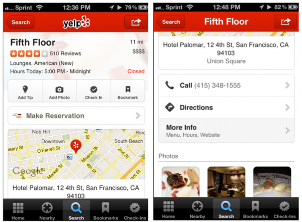

So visual tags are an important element to your application. Especially for high detailed software such as maps.
11) Use of Color
As if this wasn’t already a given, but colors play a vital role in mobile applications. Using color to convey application state, what the status of the request is, or even what is enabled or not – is a good experience to users. The use of color instead of text is becoming more and more popular because it simplifies your application a whole lot.
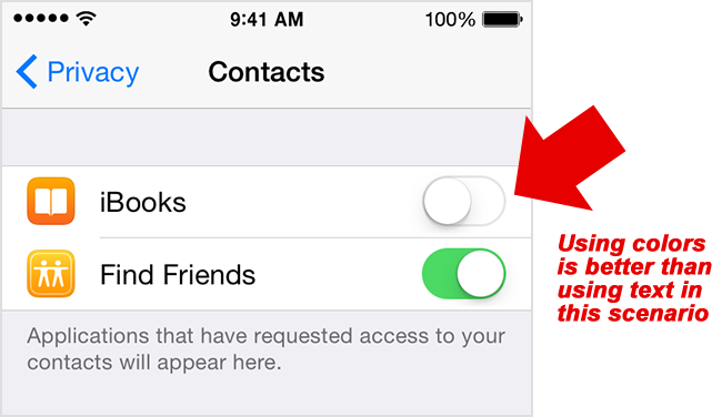
The above image cleverly depicts (through the green-and-white color mix) that the green color signals that the Find Friends option has been turned on (in the Contacts section of an app). Above the Find Friends option, the white-on-white colorway shows that iBooks has been turned off. Since both the features (i.e iBooks and Find Friends) only have two options each, only two colors have been used, keeping the background white for a “negative gap” effect.
Likewise, colors should be used to make the users understand complicated things at their first glance, without making them read long texts or go through multiple choices.
12) Positioning of Ads (If Any)
So if you really must, ad positioning in your mobile app is a big factor in its success. Yes – your application may be great, but if it’s riddled with ads, and placed in the wrong places – users will disengage and uninstall your software. Ad positioning is a whole discussion on its own. But we do know this – you have to be unobtrusive (almost very sneaky).
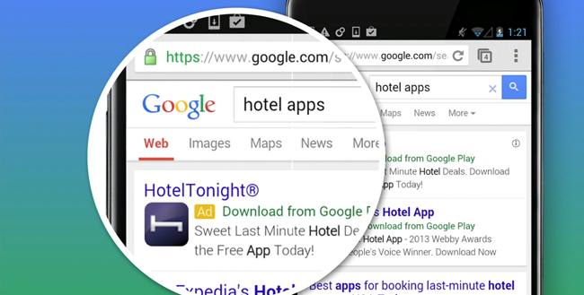
Who to better learn from but the pioneers of good ad placement themselves: Google. Advertisements are “baked” in the search results itself. We see similar treatment to other mobile apps such as Twitter, Facebook and again Yelp. But as we have mentioned, ad placement will have to be creative – because you almost don’t want your user to know it’s an ad.
For more about ad placement strategies, read this article which expands more on this tricky but interesting field.
Conclusion
We hope that you gain some knowledge in these elements that we have presented. When it comes to user interface and experience, the smaller things – because we ONLY have the smaller things to play with. So details matter and they matter HUGE! Implementing these design elements will get your application to stardom. Remember, the idea for a good app is for users to glide downstream, rather than going through a complex maze. Cheers!