A Collection of Liquor Website Designs that will Inspire you (or make you thirsty)
Like any product website, you would think that liquor might be one of those that wouldn’t have much to show. How can a web page convey a drink’s quality, taste and character? Believe it or not, some of the more popular liquor websites do indeed have some of the more advanced and creative features out there. From large slideshows, virtual tasting, high def movies, responsive layouts – you name it.
I had a chance to work with a client who owns their own vodka. So I was tasked to look around and see what others are doing. I’ve come up with a huge list – but I wanted to share some of the more exciting ones with you. Here is a collection of liquor websites that will inspire you on your next project:
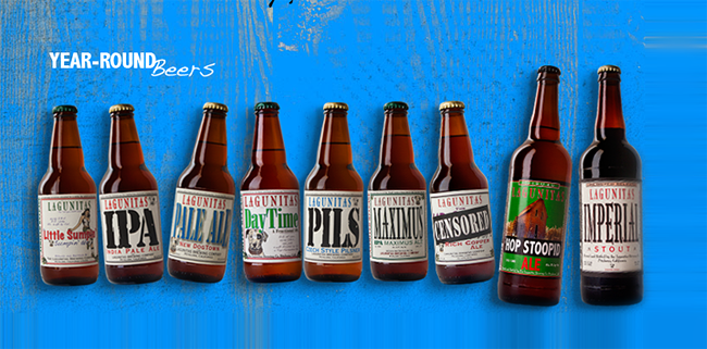
Lagunitas Brewing Company
Almost every aspect of the Lagunitas website screams fun. Plenty of activities, unconventional layouts, exciting colors – just about what you would like to expect from your beer. Note that large wood background, with beer bottles floating around. Grungy textures, vibrant splatters of paint. Oh, and that hand drawn woman down in the footer. Just lively and real cool.
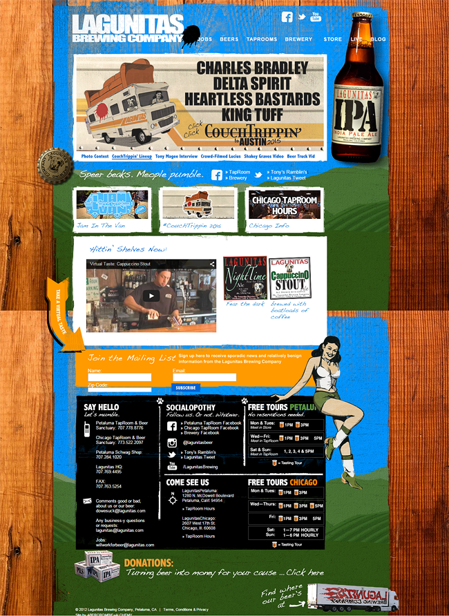
Feel the vibe with their photo contest called “CouchTrippin”, a recording party called “Jam in the Van”, “Taprooms” which show music tours of bands sponsored by the beer company. I like the there is a blog section – where they continue to show their creative side through blog posts. Of course, how they present their products is unconventional as well. Beer bottles just floating around – with no real pattern.
Once clicked, it takes you to a detail page with check this: a “Virtual Taste” section. How cool is that. Now if this Lagunitas brand doesn’t inspire you to do something creative, then I don’t know what will.
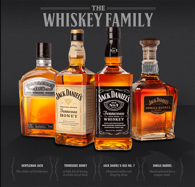
Jack Daniel’s Tennessee Whiskey
As if the name doesn’t ring a bell, Jack Daniel’s web pages sure has a good and loud punch to it – the same as it’s whiskeys. The home page features a nice static image of the Jack Daniel family of products. Combined with a melody of “old English” style of fonts, that golden whiskey shine as well as subtle hints of noise in the background – the home page simply works.
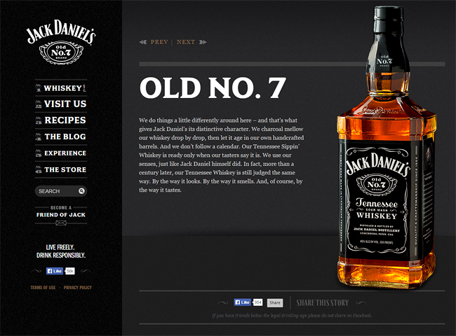
Once you select a drink, it takes you to a detail page. One that is filled with plenty of “teaser” copy about the product. The “learn more” section below has a carousel of full length videos – tells you stories about the bottle itself. History, how it’s made – things of that nature.
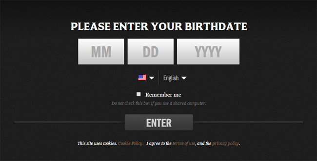
What I especially liked is the age verification form they have in the landing page. A simple, yet elegant form. Good choice of big fonts, well blended colors as well as center justified elements.
On the same note, check out this responsive age verification plugin you can use for your projects.
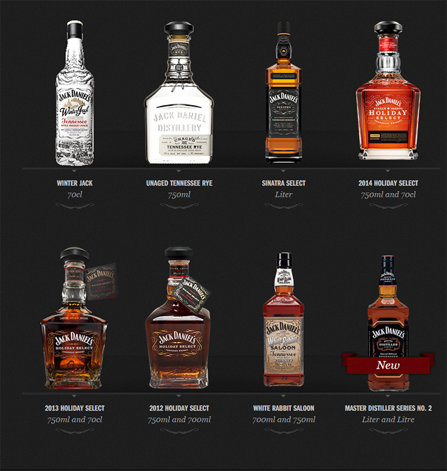
Lastly, a “Special Edition” section takes you to a long list of Limited edition bottles. The page is arranged in a way as if you’re looking inside a bar cabinet. Again, the nice typography, textures as well as high detailed photos of the whiskey bottles. Of course, once clicked – takes you to a detail page with the same good copy and marketing materials.
In summary, the Jack Daniels website has a darker, yet sleek and musky feel – that whiskey drinkers are accommodated with.
Brewsters Brewing Company
A North American micro brewery, Brewsters have spent a good amount of time in making their website real presentable. With the traditional homepage slideshow – featuring home grown graphics about their beer, food as well as promotions. Quick links shown in boxes right underneath the slideshow is a good touch as well as a news feed of their latest event.
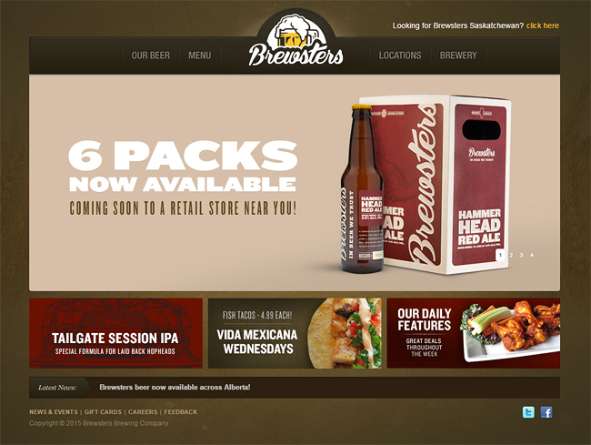
Their logo, branding as well as packaging is what astonished me the most. In most cases, a common earth tone as the main palette for their graphics tie in the designs altogether. Notice the individual sketches for each of their beers.
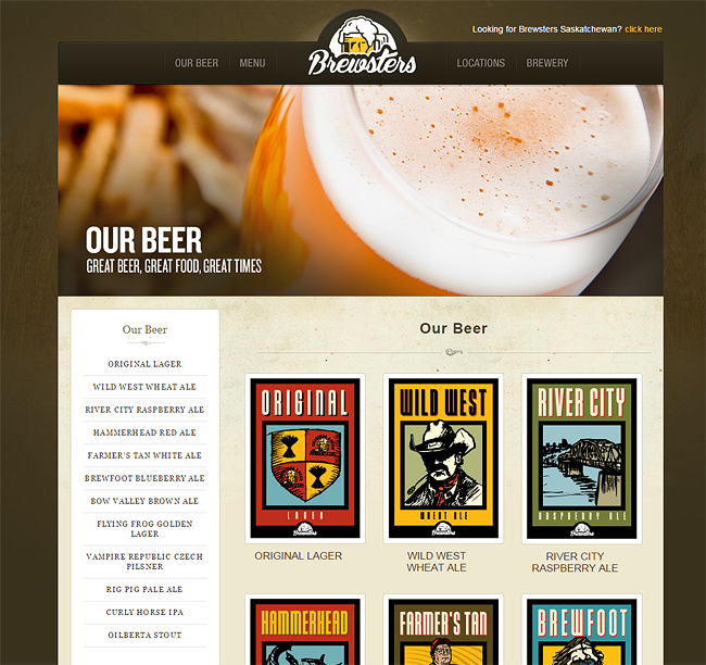
Once clicked takes you to a detailed page for the drink. A larger imagery of the graphic, nice typography as well as a large photo of the beer in a nice mug. Navigation is simple both in the header as well as the left sidebar. A grungy texture in the backgrounds adds a nice effect to the pages making it more collective.
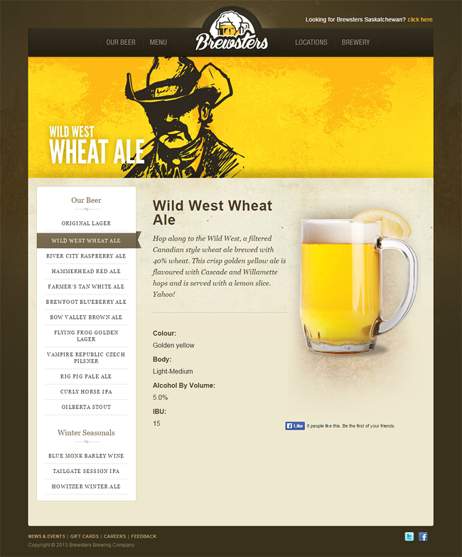
Keep in mind, Brewsters also run their own restaurant – so the menu is presented in the same fashion as their beers. Again, high detailed photography, good branding, excellent page layout. Color schema is awesome, plus good choice in fonts. Brewsters is a definitely a good inspiration for Beer and Food websites.
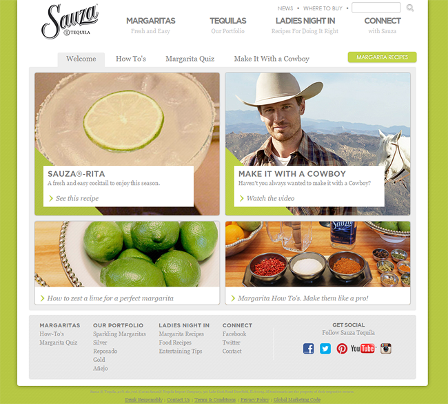
Sauza Tequila
Sauza Tequila’s website is among one of those that have kept a classic look. A standard grid, with a larger feature image on the left. Beautiful colors used for the backgrounds – and they change per major page. Good harmony is achieved when the elements such as photos, fonts and backgrounds share the same primary color. Take for example the page below. The lime green is seen in each of the photos, while lime is sprinkled all over the images. The buttons and icons all have hints of green as well.
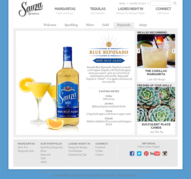
Another feature product – which is the “Blue Reposado” changes the feel to a “bluish” nature. Since the logo is gold and blue, so is the bottle and the rest of the page elements. Notice a smaller carousel which cycles by default. Contains are ideas for recipes, bartender how-to’s as well as food combination suggestions. Of course, high end photos are seen throughout.

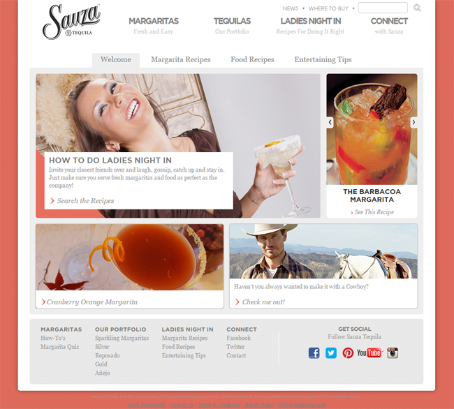
We switch the page to a more “flirty” effect. The “Ladies Night In” page show a more playful side of the drink. Again, we see that same color treatment for the web elements, imager as well as the background.
Overall, the Sauza website is creative and fun. Yet maintaining that familiar and classic web style we all have grown to like.
Rolling Rock
When I first saw the Rolling Rock website I got confused. I didn’t know where to click! Mind you that the website only consist of a single page. The sections are simply hidden away at the bottom of the screen. Also, when you click on an item – it animates smoothly to the section you need to be – which is a pretty cool effect!
On a similar note, you might want to see this tutorial on How to create a single page website.
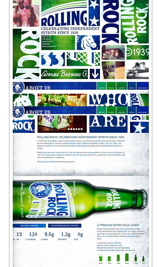
The tiles all lead to different areas of the page. The “Beer” section features a large horizontal bottle that spans the width of the page. A section called “33 Mystery” which is a little known fact about the ideal temperature to consume the drink. Again, grungy paper textures in the background, excellent color scheme, not so crazy about the plain fonts – but it does the job.
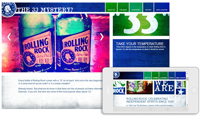
Carousels, interesting tidbits of knowledge, a beer locator section – the site is a bevy of information. Oh, the page is also responsive – meaning it looks good on mobile devices.
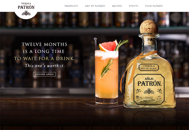
Patrón Tequila
What can we say about one of the leading makers of Tequila. Unlike Sauza, Patron’s website is more modern with more advanced technologies that we see in today’s websites. The homepage displays a full width static hero image of the bottle, events and special promotions. In the case below, a glorious shot of the drink and a cocktail right in front of a bar.
Speaking of hero images – learn how to make stunning ones from this tutorial.
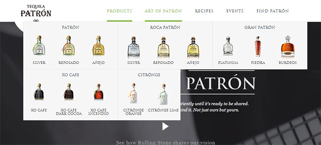
A mega drop down navigation is found on top. Once hovered, you will see a nice treatment of the products for each bottle is shown right in the menu. The fonts used seem to have the same identity as the ones used in the bottle and branding itself. The bottom of the page has popover menus that lead to more customized pages – such as the “Patron Club” and the “Hacienda”.
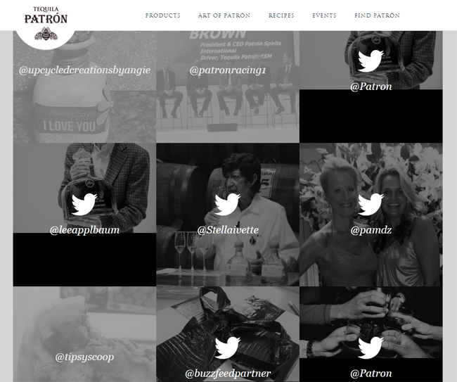
An effective use of social media is seen in the “Patron Worthy” page. Here, you will notice a page filled with the Twitter accounts of the people that matter in the industry. A lead to their handle, as well as some may have a video in them of some sort. Quite an interesting page if you actually have the time and view them.
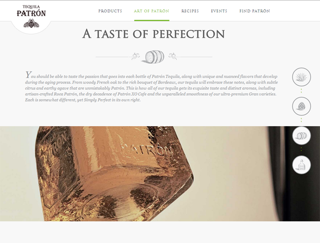
Finally, the “Art of Patron” is a huge landing page with a plethora of web design wonder that will astonish you. From embedded HTML5 video backgrounds, to beautiful illustrations, awesome photography as well as parallax and multiple backgrounds. Keep scrolling down and you’ll see in the right hand side a nice set of controls to keep you informed on where you are.
Of course, other pages such as the events, recipes are also treated in good taste. But you will have to check them out yourself to see. Overall, Patron has definitely done an outstanding job in representing their product online.
Belvedere Vodka
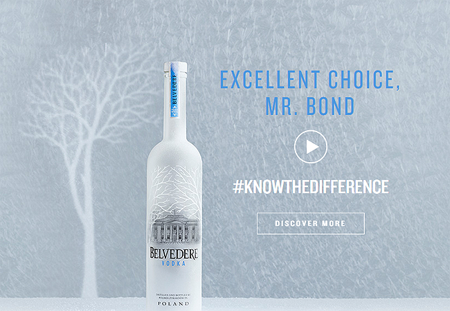
Cold and pristine. Just like the drink they produce, Belvedere’s website is filled with crafty elements and creative features that only a high end product can come up with. Right in the home page is a plug for the upcoming James Bond film – which features their brand of course. Nice play on the fonts, color scheme as well as textures and imagery. Right away you feel the drink’s serious culture as it uses nothing more than it’s bottle and a few words.
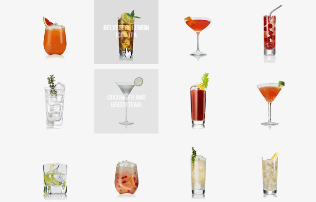
A full catalog of recipes displays a wide array of cocktails with nice hover effects. Once clicked, takes you a snippet of how to make. High details on the thumbnails as well as the single pages. Note that the pages are responsive, so the display on a mobile device will be optimal as well.
A brighter and more colorful full width navigation bar features deep links to the other sections of the site. What strikes me most is the “Character” page where the design is full width and alternating rows.
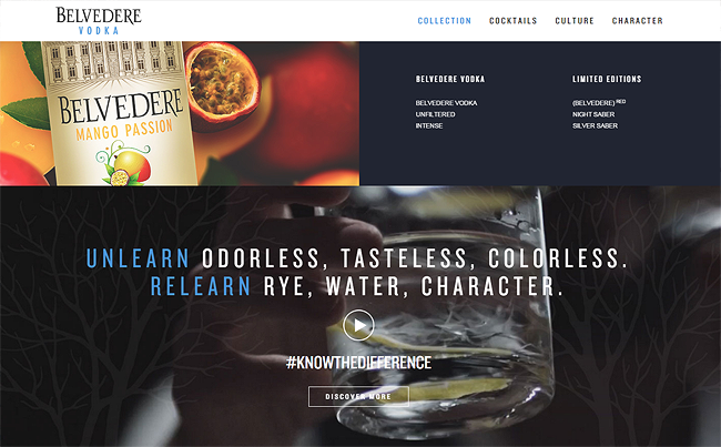
Not to focus on the design so much, but the content itself. Charity events, partnerships, publicity and history gives the site more a bit more “familiarity”. Hence “character”. The combination of content and overall design makes the Belvedere website a good choice for a well structured liquor website.
Conclusion
You see from this collection that liquor companies have done their job indeed. You can see how much work have gone into the research, development, content writing and marketing. What about you? Do you have any to add to this list? Leave your comments below.