Tasty Trends in Themeforest Templates
One of my favorite ways to stay up to date on the latest design trends is to browse Themeforest. Themeforest has hundreds of the finest web and graphic designers trying to sell their work. It is no surprise that it is here that you will see new styles and craze to ever hit the world of web design. Below is a list of styles (along with some examples) that I have been noticing in new templates from Themeforest:
Bokeh and Blurry Backgrounds
I first saw this style from this popular Tumblr theme. Bokeh is an effect where a colorful palette of round reflections are so washed and blurred from an out of focus lens of some sort. This mystique of photography somehow brings the subject (the content in our case) a much more focused and sharper look. The Bokeh effect gives the entire page an overall feeling of harmony and beauty.
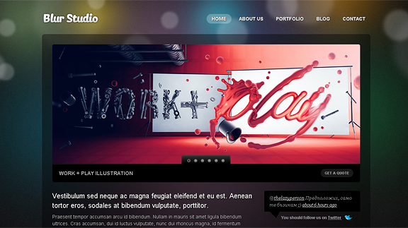
Blur
Bokeh in combination with transparencies as well as rounded corners give this template a thumbs up from me!
You can view the Item here, or Demo from Here
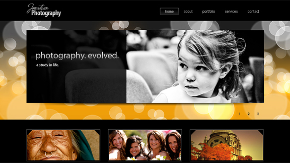
Modern Business 3
This template uses bokeh in the inner frames of the page. Very sleek, professional and elegant.
You can view the Item here, or Demo from Here
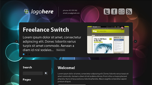
Dark ‘n Clean
Another Bokeh Beauty, don’t miss the amazing typography from this theme!
You can view the Item here, or Demo from Here
Overlapping Folds
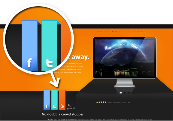
This style has been around for a while, but still doesn’t fail to amaze me. It is when the designer takes page elements and wraps them among sections of the page, as if it was three dimensional.
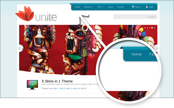
Unite
Definitely one of my favorites. Exceptionaly detailed – the folds even change in orientation when scrolling up and down
You can view the Item here, or Demo from Here
Stage
This one is very unorthodox. Folds, peels – 3d everywhere!
You can view the Item here, or Demo from Here
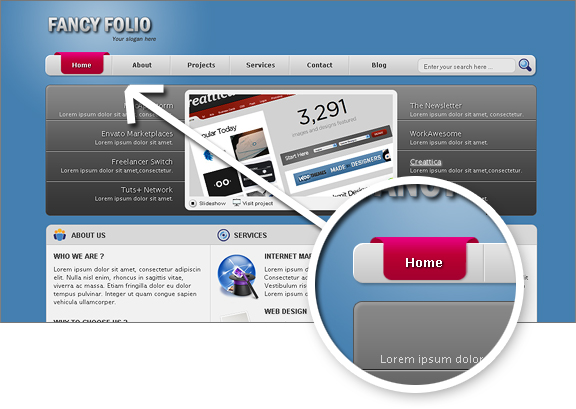
Fancy Folio
More in the safe and conservative style, checkout the folded navigation button
You can view the Item here, or Demo from Here
Wild Slideshow Transitions
May it be Flash or Javascript – I’ve noticed a trend in transitions. The “fade” and the “sweep” no longer suffice, check out the slideshows in the templates below for a better demonstration.
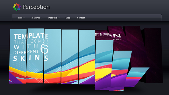
Perception
Sliced, reversed, waves – the slideshow on Perception will leave you breathless.
You can view the Item here, or Demo from Here
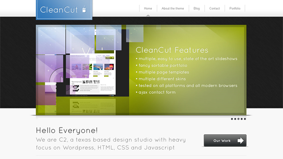
CleanCut
The transition effects on CleanCut will give your images that “Wow” factor.

You can view the Item here, or Demo from Here
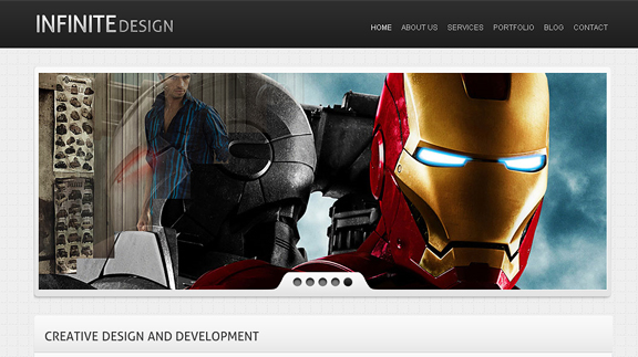
Infinite xHTML/CSS Theme
The slideshow on this template is a combination of many styles, played in random order. Tastefully done.
You can view the Item here, or Demo from Here
Accordions
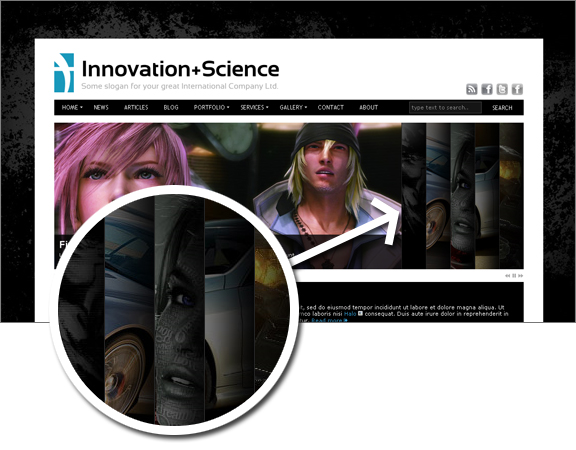
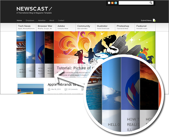
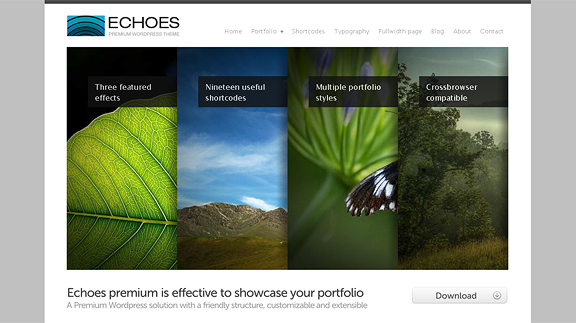
Instead of the regular slideshow, some templates integrate an Accordion effect (or both) right in the home page. Both are somewhat similar, though the Accordion is a new trend that gives your website that out of the ordinary style.
Innovation + Science
Definitely of of my favorites – Innovation + Science is very sleek, sharp and clean. The accordion is a good choice for this template.
You can view the Item here, or Demo from Here
Newscast
Again, one of my favorites – this template’s got it all: typography, spacing, color, javascript effects – and of course the accordion. Probably the best magazine styled theme I’ve ever seen.
You can view the Item here, or Demo from Here
Echoes
Awesome, awesome, awesome!!! This template simply echoes “awesome!”
You can view the Item here, or Demo from Here
Minimalist
Just as the title describes, minimalist styled websites try to achieve the best look out of the least styling. The aim of the minimalist is to present beauty out of pure simplicity.
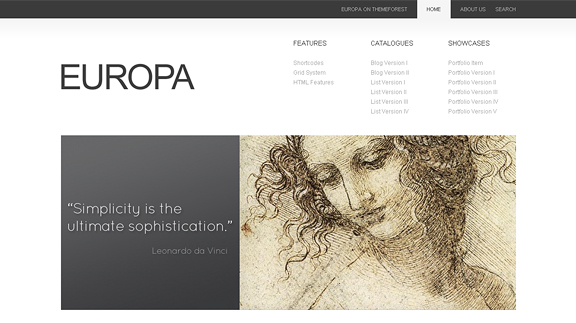
Europa
Big solid fonts, grayscale schema, massive spacing – this template speaks simple yet beauty.
You can view the Item here, or Demo from Here
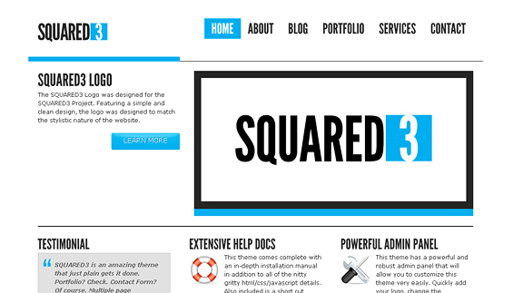
Squared3
Squared3 has good typography, as well as excellent color scheme.
You can view the Item here, or Demo from Here
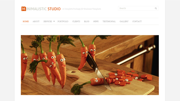
Minimalistic Studio
This template should also have been in the “Wild Slideshow Transitions” category, again – a nice solid template with simple accents and design applications yet effective results.
You can view the Item here, or Demo from Here
Conclusion
There you have it, a collection of tasty design trends in themeforest templates. What did you think of them? Would you buy any of these templates? Did you at least get inspired to build something as beautiful? Do you notice any other trends in Themeforest or elsewhere that is worth mentioning? Let me know your thoughts in the comments section:
