Print Designs that use Typography Creatively for Effect
As companies target us most effectively on the digital media platform using resources such as pay per click advertising, sponsored social media stories and email marketing, print media is quietly being removed from many company marketing strategies. In order to facilitate the move to digital media, companies are cutting their print media budget because they find the web allows them to reach more users through targeted campaigns, compared to the outdated platform.
Print advertising, such as brochures and flyers, is starting to disappear from our mailboxes, no longer inserted in our newspapers and laying in the streets and shopping centres. The main reason behind this movement is the issue that we take one look at a flyer given to us and if we’re not interested, we don’t go any further with it. In comparison, company campaigns are organised in such a way that they latch onto every possible consumer they can through marketing techniques such as 10% off coupons if you provide us with your email address, gathering more information about you and your shopping habits.
Despite the decrease in print advertising, most print designers still follow current print design trends, most of which are adapt to the current web design trends, including minimalist design, the use of calligraphy and animated caricatures within their flyers and utilizing techniques such as screen printing and litho printing when constructing a brochure. Print design agencies still consider good design to be important as it was five decades ago.
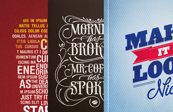
If you’ve stopped appreciating print design for web and graphic design or you just need some print design inspiration, I’ve found the top 5 print designs that use typography creatively for effect.
Morning has Broken
The “Morning has Broken, Mr. Coffee has spoken” poster design, designed by Simon Alander with coffee fanatics in mind, was completely hand drawn and uses a combined calligraphy and serif font. The subtle additions of coffee beans at the end of the roots give the poster a great finish.
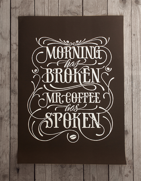
If you wish to see the process from start to finish, his Behance profile has photos from the drawing process right through to the painting section, along with the final product.
Make it look nice
19 year old Andrew Power, a graphic designer from Newfoundland, Canada designed this “Make it look nice” poster to show what he strives for at work.
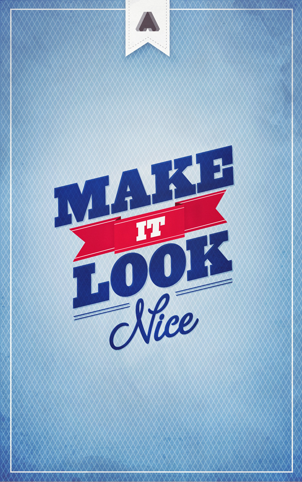
Using a light colour scheme consisting a palette of blues, whites and reds combined with sans serif and handwriting fonts, the poster design is minimalstic whilst sharing an important message to many designers around the globe.
We all live underground
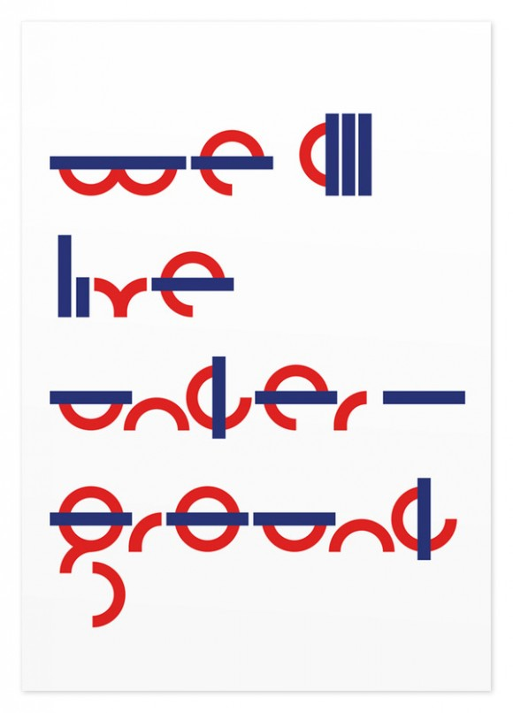
Whether you have visited the UK capital of London or not, you must be familiar of the famous London Underground roundel. The “We all live underground” poster which is designed by Sawdust, a small agency owned by Rob Gonzalez and Jonathan Quainton, makes fun of the roundel branding and colour scheme London Underground uses in their branding across their tube stations, trains and signage.
Altus ‘Pop up’ Brochure
The pop up design concept is most often used in children’s fictional books to help animate the story being told. However, Vancouver-based Andrew McPhee aided the process of transitioning the pop up design trend from children’s book to property buyers in this brochure designed for real estate developers, Altus Group.
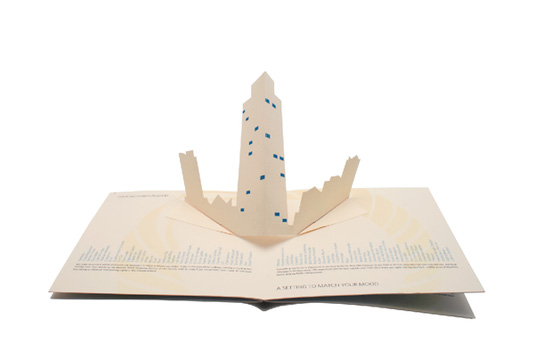
The brochure uses textured paper, popups and horizontal lists to make this print brochure appeal to their target audience and more specifically, their potential clients.
TVNZ “7” Folding Brochure
Traditional brochures are usually folded either one or twice, depending on the clients specifications. However Melbourne-based print designer, Thomas Pavitte, was met with a slightly unique design specification when he was contracted by Australian TV network, TVNZ 7. The TV network wanted a brochure which features all of their shows on the network, presented in a format that uses their unique branding.
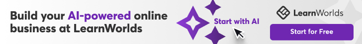
Pavitte designed and constructed the brochure in a triangular format, which when opened, is in the shape of the networks famous 7 logo and within it, all of their featured shows are presented in addition to information about them. This type of brochure design is unique as anyone receiving it is more than likely to remember the brand through such a minor design process.
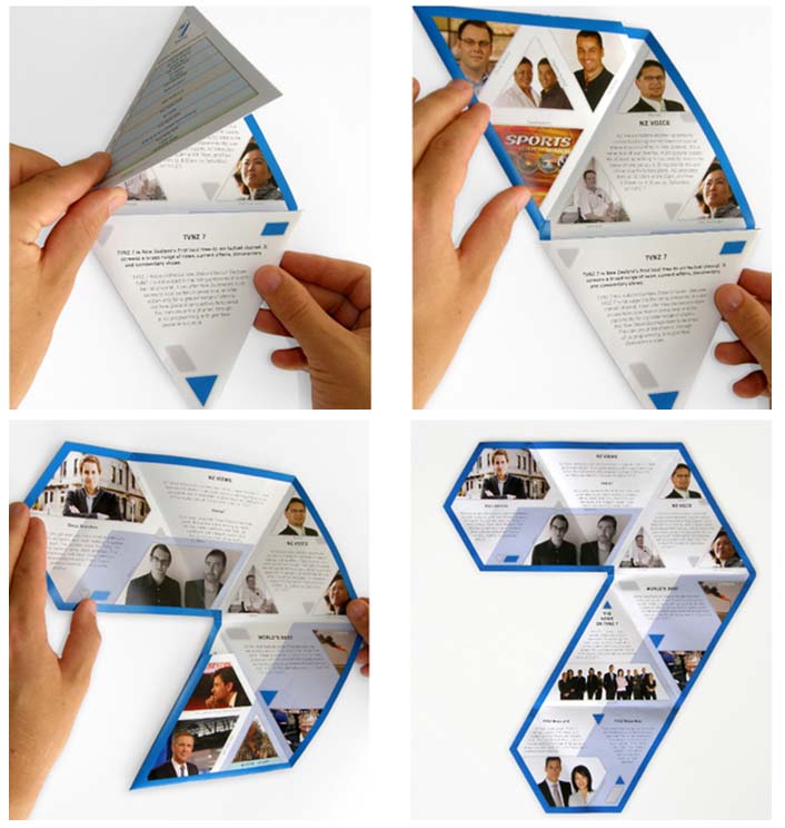
For Artists Who Can’t Draw
Jonathan Haggard, known on DeviantArt as skyringbreath, created this poster which uses two font faces from the sans serif family but the variants are narrow and wide.
The slightly large, narrow font face stands out and makes the viewer immediately read “Graphic Design, Can’t Draw” until the slightly hidden “is for artists who” appears within the orange background.
New York
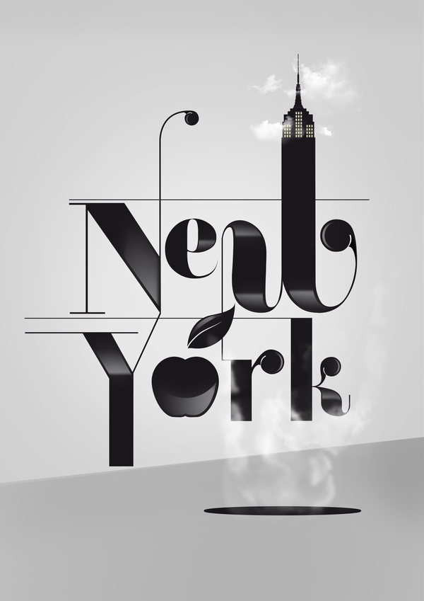
Graphic design and illustration studio, Pattern, located in Spain created this illustrated typography poster related around New York. The Empire State Building and the Big Apple both feature in the monochrome color scheme design, with the “steaming servers” lurking at the base of the design.
Typographic British Isles Map
Deviantart user gregatron has taken the traditional British Isles map and rebuilt it using the names of every city in the UK and Ireland and a single font face.
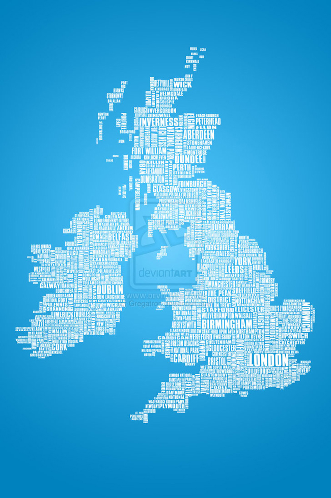
The larger UK cities; London, Birmingham, Cardiff and Dublin, are shown in a larger font size compared to Bournemouth or Weymouth. All of the typography uses a range of whites and light grays and is layered on top of a light to dark blue gradient.
Starbucks Typography
Similar to the last typography project, Deviantart user mvgraphics redesigned the Starbucks cold drinks cup out of typography.
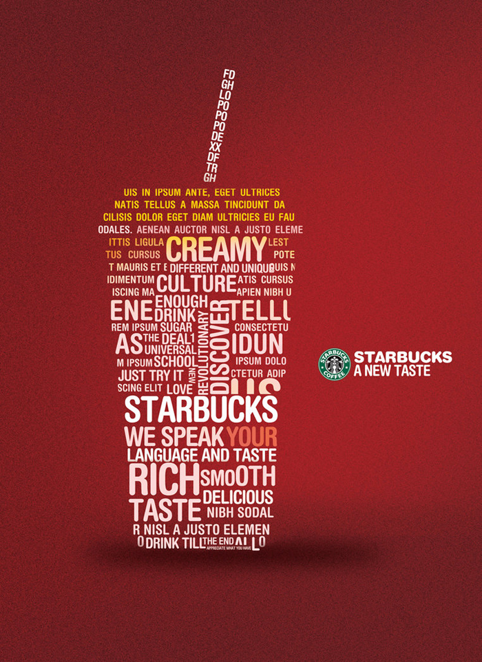
The words used to make up the cup includes the Latin sample text, “Lorem Ipsum”, along with some words to explain their drinks. The color scheme is a mixture of white looming to a yellow topping with a textured red background.
Conclusion
We hope that you fined these print designs to be a good resource for your next project. Typography used in the examples above is definitely original, creative and of course – inspiring for designers everywhere.
Stay tuned for more design inspirations coming your way soon!