Landing Page Design – 15 Modern Examples that are simple and amazing!
What makes a good landing page? Let’s learn from these examples:
Have you noticed, that it’s very rare that you find a good start-up that has a badly designed landing page? Or what about a good product with a dull website? Pretty much no right? Does this mean that the strength of a product rests on the web page that advertises it? Or just the opposite? Do landing pages really matter?
In this article, I wanted to bring together a collection of my favorite landing page designs. Keep in mind, there are plenty of goals for a landing page. This list pertains to the ones that are the best in aesthetics, simplicity and purpose. Take a look and let us know what you think.
On the same note, here are 5 tips on how to improve your landing page design.
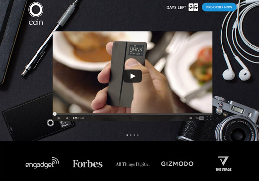
Coin
Large rotating images in the background, along with a short movie explaining what the product is all about. As you scroll down, you will see more details regarding the product. The coin website is very modern and well designed.
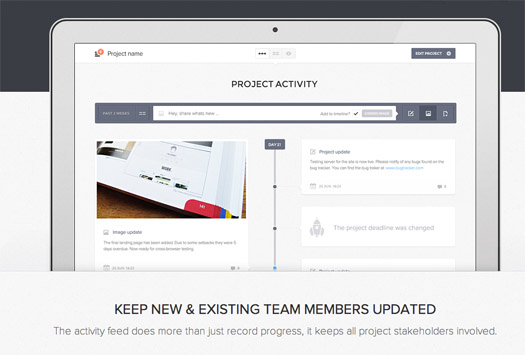
Updately
Updatey may not even be a complete product as of yet. But their landing page is already making a splash. Strong emphasis on the beta invites, large thumbnails and good teasers on what the software is going to be.
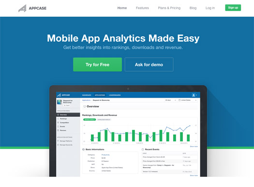
Appcase
Call to action buttons, a screenshot of the software, a little analytics and good imagery. Very nice.
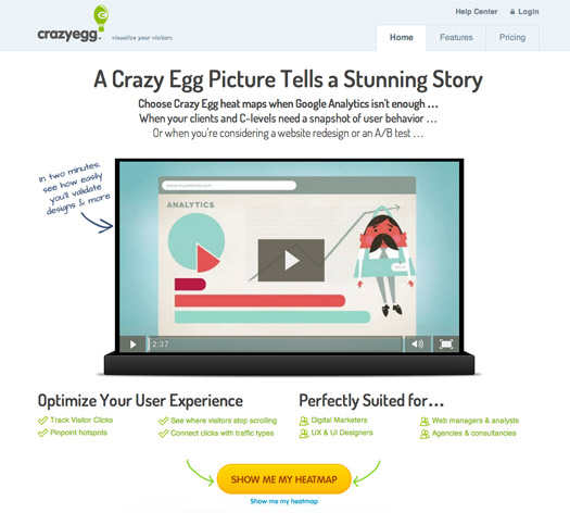
Crazy Egg
The Crazy egg movie in the landing page is very effective. Good story-telling and explaining on what the service does. After watching, you definitely have more knowledge on what they’re selling.
Gazar
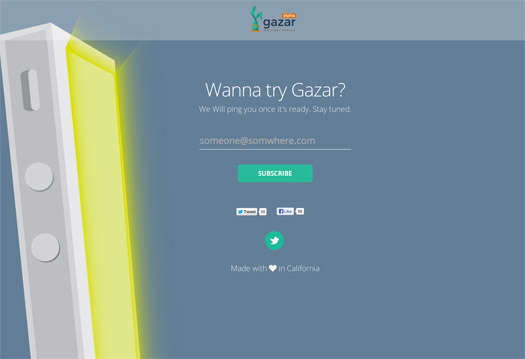
Go ahead, click the learn more. The page scrolls a bit lower along with a presentation-like material. As you keep going, a slow introduction on the software begins. Good images and overall design on this page.
Horizon
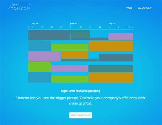
Vibrant colors, a huge slider and large imagery. The horizon website is very pleasing to the eye.
Facebook Messenger
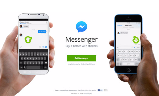
Awesome representation of two people messaging each other. This alone explains the service altogether – there is no need of anything else. Oh, except a call to action – which is strategically placed right in the middle of the page. Well done.
Spire
Simple and clean. The Spire landing page utilizes the parallax effect to convey it’s services and messaging.

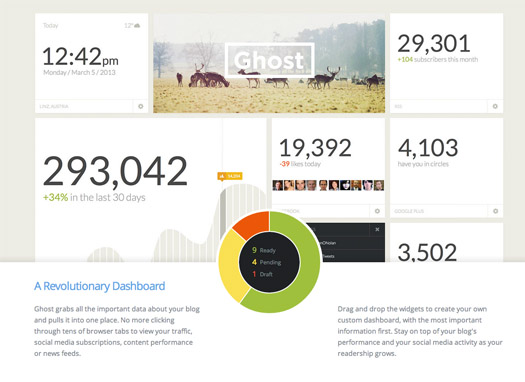
Ghost
For a product that claims to be simple – it’s landing page must do just that: Be simple. And yes, it has succeeded. The Ghost landing page is both stunning, clean and noteworthy.
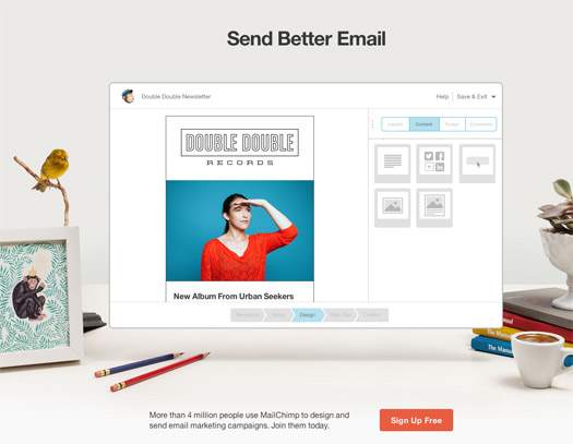
Mailchimp
Good animation combined with real life photography – very effective. Mailchimp’s landing page may have plenty of messaging, but somehow it has organized it very well. Makes you want to do some email marketing right away.
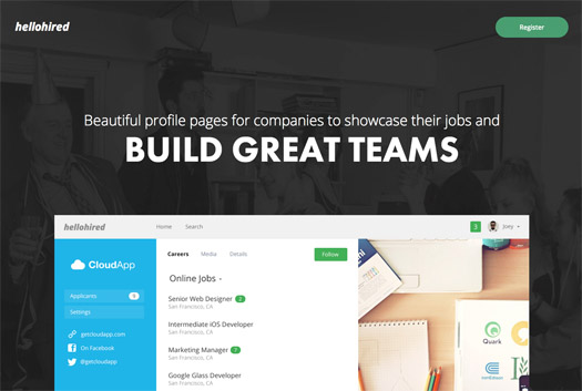
HelloHired
Large type, backgrounds and images. Hellohired’s page is full of modern web design elements that makes want to keep scrolling up and down. The full width effect works really good as well.
Simpose
Again, good use of the entire viewport. Large images, typography and color schema. The copy and messaging works well.
Client Instructor
Brilliant layout and colors. Nothing real ground breaking on the design, but an exceptional landing page nevertheless. I immediately learned about the product in one viewing. Well done.
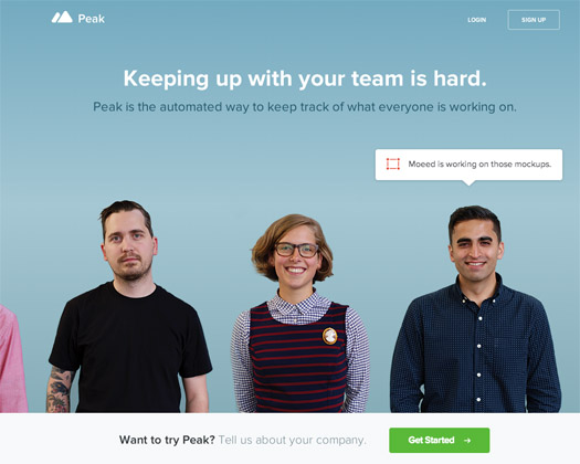
Peak
Peak’s landing page is both informational and entertaining. The product itself looks well designed – but their landing page itself is just a real treat to the eye. It’s amazing how creative people can get.
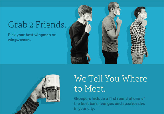
Grouper
This one is like viewing an infographic as a web page. Informational, entertaining and very effective. A fun way of getting word out. Use of original language like “lameness” is a big hit. This landing page is a favorite.
Conclusion
So what do you think? As I’ve mentioned, the above landing pages did a great job on communicating what the product is about. May it be answering questions for potential customers, or perhaps even make a sale. Most of them did well on getting people excited about what they’re presenting. I sure felt a sense of assurance as I looked through them.
Which of these landing pages do you like best? Do you know of any others that deserve a mention in our roundup? We’d love to hear what you think in the comments!
