Here are Good Examples of Stylish Logotypes
I’ve been a fan of thoughtfully designed logos for years – ever since I was first made aware of the arrow hidden in the negative space between the E and the X of the FedEx logo. When you know what to look for, you can spot the difference from a mile away between a logo that’s been thrown together and a logo that’s been carefully crafted.
I love hand-drawn designs to logo styles. Maybe it’s because my own hand-writing is terrible, but I really admire designers who are able to create a logo that makes use of beautiful cursive, or that has typography that’s out of this world. This is similar to this set of print designs that use typography for effect. I wanted to bring together a collection of some truly impeccable designs – each one with it’s own unique style and art direction.
I hope you find this collection inspiring and interesting, and that it gets you excited about practicing your own logo styles. And of course, if you’re particularly proud of your own logo design and you’d like to share it, I’d love to hear about it.
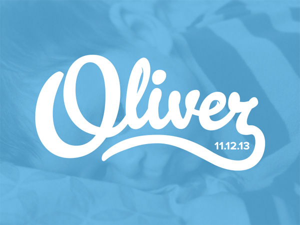
I love the hand-drawn signature style of the logo for Oliver – it’s free-flowing lines add a ton of personality, and it manages to look elegant without being too serious.
The logo design for Lift makes use of a bold, chunky typeface that works brilliantly against a colorful backdrop.
Next Ship uses a quirky, unusual logotype to grab your attention, without being brash or in your face.
FlyByUnicorn doesn’t just have a creative name – it also has a beautifully designed, creative and stylish logo that makes use of cursive flourishes to add some excitement to the design.
The logo for Brain Train lives up to it’s name by adapting the T in the logotype to form – at first glance – the image of a brain, and at second glance the smoke from an old fashioned steam train. On a similar note, check out how you can land the Graphic Design job of your dreams.
Canadian startup JitSpot – where the “Jit” stands for “Just In Time” – incorporates a little clock into the logotype, and makes use of a beautiful drop-shadow to help give the design some lift.
The logo for Carpe makes use of a beautifully ornate custom typeface that has an old fashioned aesthetic.

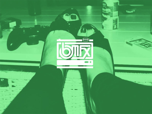
The logo for BMFX uses the brand’s letters to form a Polaroid camera, and looks great when placed against a solid color or an image background.
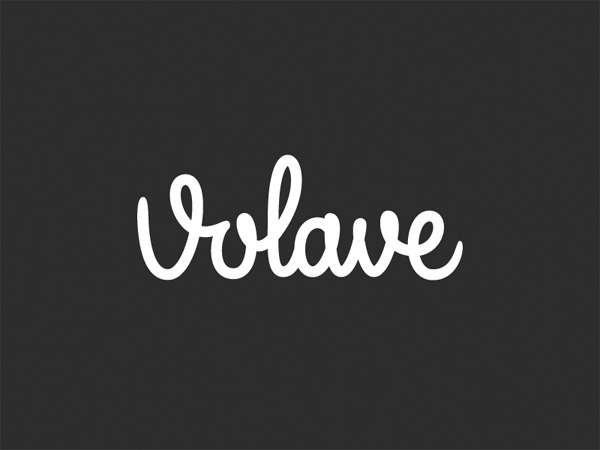
The custom lettering that forms the logotype for Volave adds a bit of quirky personality while managing to look friendly and elegant. For all of you Font freaks, read this showcase of beautiful and free fonts.
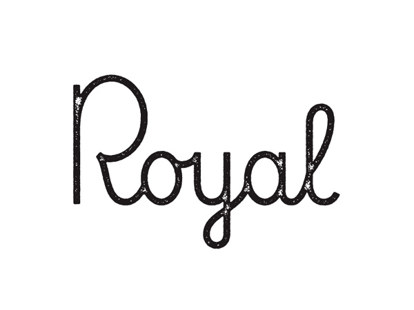
The logo design for Royal is simple, but it has an unexpected charm and personality. The texturing adds a slightly grungy edge to an otherwise minimal and clean design.
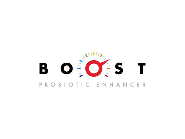
Boost adds a rev counter to the middle of their logo, using the second O as the basis, and manages to use symmetry to balance an otherwise complex idea.
There’s something extraordinarily beautiful about the logo for Well, despite it’s simplicity. It’s custom typography means that it’s full of personality, even though it’s such a small design.
The logo for Orbit uses a logotype that’s fairly futuristic, and opens with a space-themed planet with a ring.
I love the logotype used for String. It’s big, chunky text works beautifully against a dark background, and the elongated tail of the G forms a clever speech bubble for the rest of the design.
The logo for .mn:ml. is one of the strangest in this whole collection. It’s lowercase blend of letters and dots creates an aesthetic that’s quite out of the ordinary.
Which of these logotypes do you like best? Have you designed a logo that you’d like to show off? I’d love to hear what you think.
