10 of the most insanely Creative 404 Error Pages you'll ever see
Most of us must have come across a 404 page while browsing the sites over the internet. Now why did you land on 404 error page you ask? Well there may be various reasons such as a wrong URL, a broken link or even a technical reason from the web server itself. Or even worse – the page doesn’t exist any longer. But whatever the reason may be, you may feel frustrated and would want to leave the site altogether.
So, why not make your 404 pages really creative? Why not make them fun and convincing so that customers will want to stay on your site and find other pages in your site?
This article will showcase just 10 of these error pages. But through this 10 examples, we hope it will spark your creativity and build a cutting edge error page that will drive your visitors back on the right track. Ready to get started? Here we go:
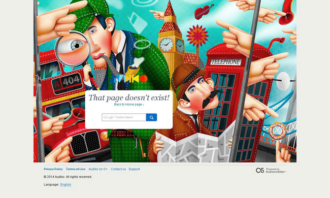
Audiko
An prime example of 404 page that I especially like the most. The illustration is created with couple of things, which indicate to search again with the help of search box. The symbol for links is used, which are placed perfect place just above the search box.
Chrisglass.com
Chrisglass’s 404 page includes an image of team, where Chris and his comrade is going on a trip for hunting the right page, which you are looking for. A clever design of illustration is used that surly influences viewers to click somewhere on the page. But, one negative thing that I observe on this page is: there is only one link at “404”. Once you click on it, you will land to the home page.
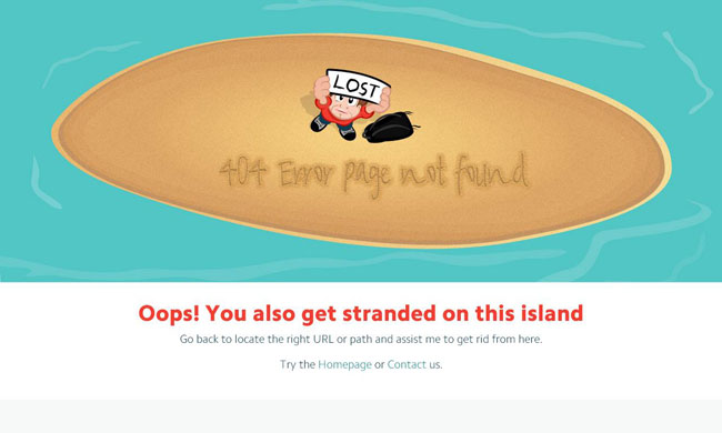
CSSChoper
Sometimes, simplicity does work really well and it can be seen at CSSChopper. The illustration explains clearly, you have lost connection with us and the proper management of links desperate to locate the right path or click on home page. A professional and really cool 404 error page design that I really love.
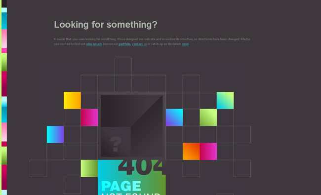
Duoh.com
Probably, a colorful and abstract error page at Duoh with few links. Even without any navigation and animation, this page looks amazing with their implemented idea.
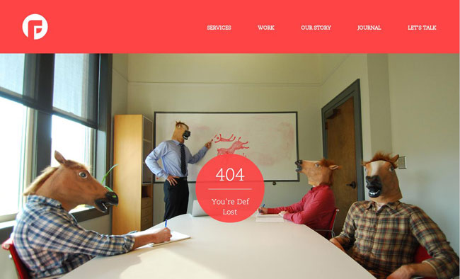
FocusLab
A funny image of a conference full of Horse masked workers. Quite a kick – no pun intended.
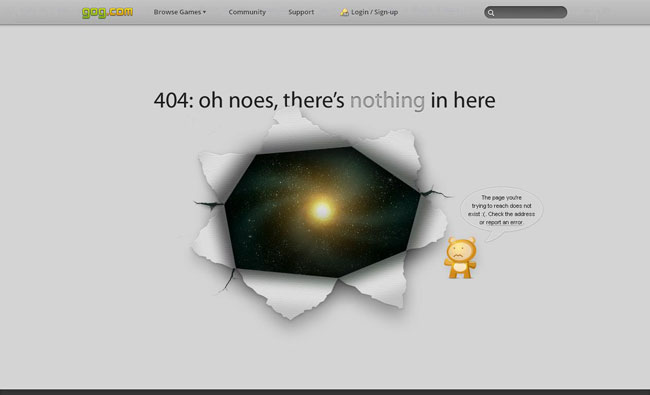
Gog.com
A really cool error page that really convey the message that you are at the wrong page! The picture, which is used on this page is clear and simple, yet interesting, In my opinion, this is a good practice to fairly stay connected customers. The proper management of link makes it easy for further searching.
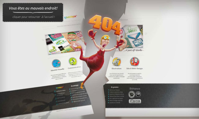
Illucolor
Real clever and unique graphics. The 404 page of “Illucolor” is capable to redirect visitors. It looks as if your internet connection is broken, then you need to fix it as soon as possible. As I assume that the graphic says click somewhere to save. Once you click on logo, page will redirect you at the home page. Visually appealing page design, good implementation as well.
I Love Icons
This 404 page does not much, but it doesn’t have to. Its simply saying: you lost connection. I especially like that awesome graphic and dark background.
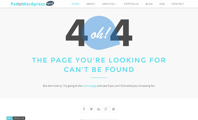
PSD to WordPress Expert
Beautifully designed 404 error page that not only informs visitors about the unavailability of page, but also instructs them to go to the home page. This interesting yet helpful messaging drives users to stay in the site.
The Movie Nerd
A pair of broken 3d glasses. Best fitted and categorizes the error page with smart and creativity paired with consistent branding. The highly visible navigation menu bar is available just below the logo and it seems to be sure the viewer needed to go back to locate their right path.
Conclusion
It’s a real treat to see what web designers have come up with when it comes to 404 error pages. Combined with some wit, fun images and smart messaging, 404 error pages have now become a valuable commodity for any website – big or small. It will be inevitable that your visitors will get stranded, click on a broken link, or experience a server error of some kind while browsing your site. The least we can do is think ahead – be creative and try our best to make them feel better.
Hold their hand, guide them – and walk them back in the right path. Keep them in engaged in your site – build a better 404 error page for you website today.
