Are Flat Designs becoming “Too Flat”
Lately, I’ve seen a big surge of web designs that have fallen a bit short. Layouts that have somehow failed to impress me.
Yes I see it’s modern. Yes it’s minimal – but it’s a little “too flat”. I fully understand the concept and am actually glad that people have actually caught up to the idea. I also get that simplicity is beauty – and I couldn’t agree more.
But sometimes, especially in web design – too little is not enough (Yes, pun intended).
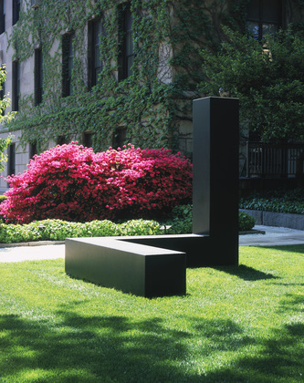
“Free Ride” by Tony Smith and is displayed in the museum of Modern Art in New York. – It’s minimal and it’s simple. Note the space that the object is filling up. The sculpture forces the viewer to appreciate it’s dimensions. In other words – it’s not flat.
So What do I mean by “Too Flat”?
Just as it sounds, “Too Flat” being boring. No design. Not enough style.
We have gone a long way since pen and typewriter. We use our phone, mobile devices and desktop computers on a daily basis to do complex and simple tasks. These devices are multi-dimensional by nature.
They are not flat. So why should our websites and applications be?
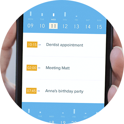
Above is a screenshot of Peek Calendar’s user interface. At first glance it’s not easy to tell which part you can click, which is a link, a button or even a swipe. I’m sure it’s a good application – it just doesn’t look that intuitive.
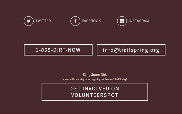
This is Tailspring.org‘s contact page. Just a tad too plain? Button 1 is no different from button 2. Or did you even know that there were buttons? Or note that none of the elements are different from each other.
Yes I get that it’s consistent. It just looks like a wireframe to me.
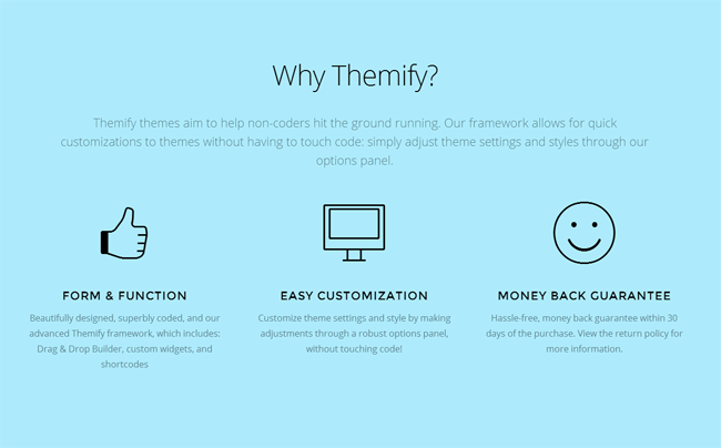
A section of Themify‘s redesigned homepage – real flat and simple. The icons have that monotone feel. Font and colors are definitely minimal. Now even though I’m a big fan of this designer, but this new style is quite dull in contrast to his previous works.
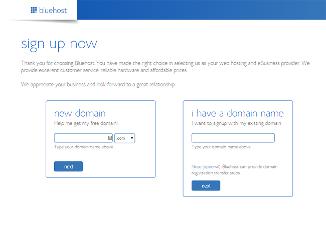
We have Bluehost’s Sign up page which is nothing more than white containers with blue borders. Single color throughout. I get the minimalism effect they’re trying to achieve, but it lacks “punch” – especially for a high impact page such as the sign up form don’t you think?
Just because Skeuomorphism is dead – doesn’t mean it has to be “Too Flat”
Yes, we don’t have to design our calendar app – to look like a real life calendar – with torn paper edges and such (yes even you Mac fans). We don’t have to design our media player – to look like a real life jukebox. Yes we get it.
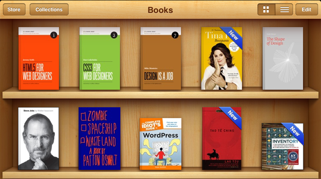

Flatter designs makes us appreciate the space that is used for our UI. In the case of the book shelf above, A flat design will ditch the background graphic and leave the cover’s of the books as thumbnails for selection. Okay that’s reasonable.
But “Too flat” is still not the answer. Take both calendars below as an example. The flat “Metro” calendar on the left is just not impressive.
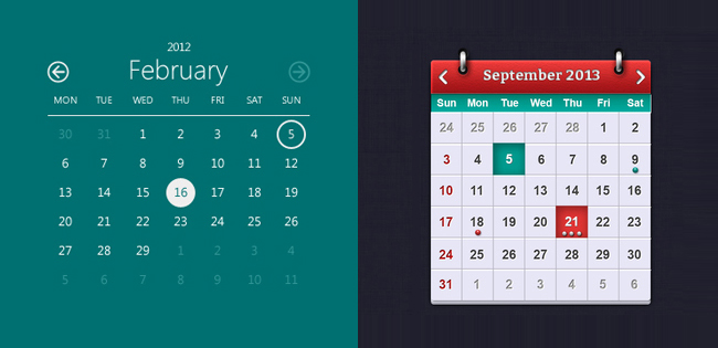
On the other hand, the skeumorphed calendar on the right is just real nice to look at. I appreciate the details and the time the designer took to make all the gradients and shadows – to make it a more pleasant interface overall. I choose this design over the flat one any day.
Just because it’s responsive – it doesn’t have to be “Too Flat”
So was it just coincidence that responsive and flat design both became popular around the same time? I think not. Responsive is the way to go for sure. But with responsive functionality being in its infancy stages – designers had no choice but to keep their designs pure code. Meaning – they had to simplify. Since this “responsive thing” is so new.
No images for borders, no grapic backgrounds or even repeating .gif for gradients. This will not work well when you’re dealing with multiple browser sizes. The layouts had to be all CSS driven – thus, leaving the designs a bit incomplete. Literally – with no “real” design.
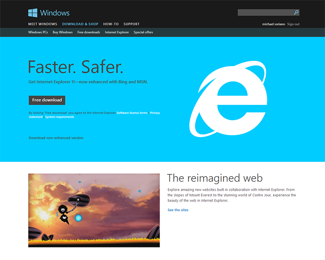
To me it looks a bit unfinished. It’s just a bunch of DIVs with background color. Especially when the colors are so uniform (like Microsoft’s Internet Explorer home page) – it’s a too “matchy”.
As responsive design is now becoming more advanced, web designers have found ways to stray away from the older “flat desings”. Look at the homepage of Forefathers Group. It’s hard to believe that this is a responsive layout. Notice the textures, background images and graphic elements for the buttons and such.
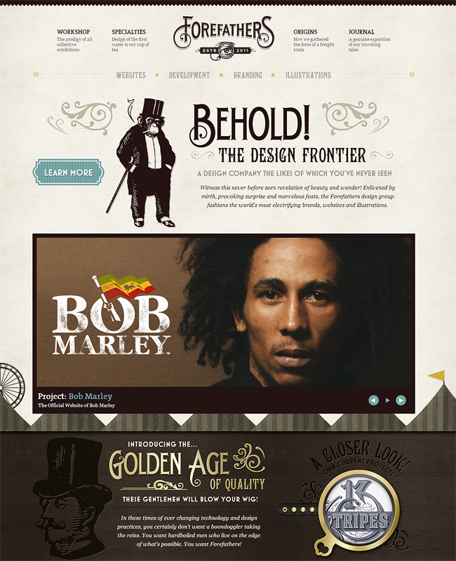
Forefather Group’s designers have found ways to combine the usability of a responsive layout, yet not lose the style that they wanted their site to portray. Yes to repeating images, yes to textures and diagonal shapes. In other words – f*ck Flat Design!
So Am I alone in this?
Apparently not. I have encountered several posts of authors that are not impressed with the “too flat” design trend.
I myself have fallen into this “Too Flat” trap. Take a look at my older designs such as the “Realty” WordPress theme and Fearlessflyer.com. I know that when I was coding – I was “keeping it safe” by making the elements flat. Now I look back and realize – I could definitely do better.
So what’s the real answer?
Don’t get me wrong, flat design is definitely a step into the right direction. But flat taken to the extreme – falls short of inspiration and style. So let’s get those gradients back in our containers. Find those textures add put them back in place. Let’s add some reflection and shadow effects into our designs.
A little more “style” in web design won’t hurt.