Branding 101: Using Microsites to Build Your Brand
How can you make sure your brand message is getting across in the most effective way possible?
A brand is not simply a logo or a name. It’s not even the product or service a company offers. What really makes a brand is the reputation, story, and unique selling point it creates to attract a loyal customer following. But in order to attract a loyal customer following, you have to first communicate your brand message to your audience by continually interacting with them — so your brand message is reinforced over time.
One good way of enforcing your brand is through the use of Microsites.
A microsite (a topic-focused, single-page website) is the perfect way to develop a creative, engaging and compelling line of communication that provides an enjoyable user experience. Moreover, it can supplement a brand’s full website by providing a more in-depth resource for information on a particular product, event, or social issue that users can actively engage with.
Here are some tips, techniques and examples for inspiration as you begin to build your interactive microsite.
Develop A Strategy
As you begin planning your microsite, think about the goal you’re looking to achieve. Since microsites consist of one page as opposed to multiple, it’s important that they stay focused on one topic. They should offer an exclusive place for visitors to interact and learn about one specific subject, free from getting distracted from multiple navigational options and calls-to-action.
Create a visual hierarchy
Make your purpose instantly obvious by developing your page’s layout in a way that emphasizes different elements. By placing information about the page’s purpose – like copy and a call-to-action – above the fold and providing clear instructions for the next step, your users understand what your site is about and why they’re engaging with it.
Make navigation easy
The navigational system of your microsite will likely be different than that of your full website, because its simplified content and layout allows for easy navigation. But communicating how to navigate the site is just as important as on your full website. Some different ways you can build your navigation creatively are:

- No navigation: if you have very little content and just want to send a quick and simple message, your microsite could literally consist of one page that doesn’t scroll or click elsewhere. This is good for users who want to quickly know all they need to about the purpose of your microsite.
- Click navigation: if you choose click navigation over scrolling through your page, just make sure that your links are very clear in what they lead to, and avoid linking to external sites.
- Scroll navigation: the most common type of microsite navigation is a continuous scroll. This system opens up your options for creating compelling design and coding effects for your users to enjoy as they scroll and get informed.
Show your design skills
The biggest part of what makes microsites unique is their interactive focus. Where you may have held back on your full website, you can let your creative skills shine on your microsite, as users are there to be impressed and interested in what you’re communicating. A thoroughly designed site shows that you’ve taken the time to think of new ways to engage users.
Sites That Work
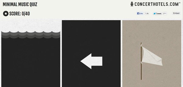
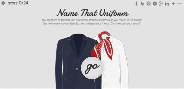
An effective way of reaching users through interaction is to cater to their competitive side. Craft fun quizzes like this Concert Hotels and BlueCotton have done so that users have incentive to follow through to the end, and will be more likely to take action.
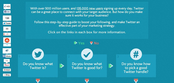
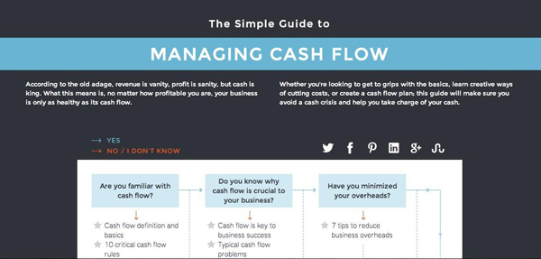
If your goal is to help users through a process, a step-by-step guide that teaches them how is a great way to elicit action. Look at how Simply Business and My Asset Tag have developed guides that allow users to start wherever they need to; they can skip a few steps if they already have a start on the process, and click on the information most helpful to them.
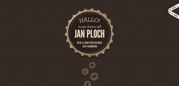
Likewise, microsites are a great way to showcase a portfolio, as Jan Ploch does. No navigation is needed, as all the work and information is contained in the single page and users don’t have to travel elsewhere.
Microsites can also consist of a small collection of internal pages that are linked through click navigation. For example, JN Mediendesign is a small site still has simplified content, but is organized nicely into separate pages that create a unified visual identity.
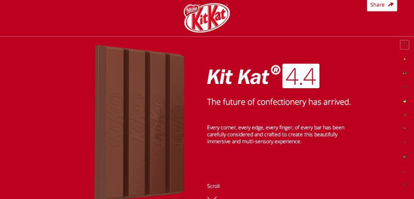
Sites like Bullet PR and Kit Kat show off their design innovation by requiring users to continuously scroll through the page. As they do so, graphics and information are revealed in unexpected ways that keep users enticed and interested in what happens at the end of the page.
Get Started!
Feel free to break the mold of microsites and add your own innovation to yours. Remember, users should leave your microsite with a growing interest in what you’ll come up with next and how to get more involved with your brand.
