3 Things to Consider When Redesigning your Blog
Before redesigning your blog, ask yourself “Why?” If you need an updated look, you’ll need to find a snazzy new theme. If your archives are jumbled and hard to search, it’s time to re-structure your information framework. If you’re not receiving the traffic you’d like (and deserve!), you should take a look at your social media strategy.
Design, layout and network are the three basic components of a healthy blog. Read more to ensure you have all 3 bases covered!
Responsive Themes
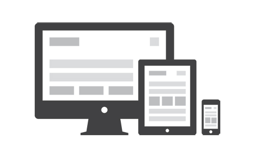
Bloggers everywhere, rejoice! Responsive themes are now bountiful (and beautiful), which means we too can have a Website that shifts in appearance in response to different devices. By applying a responsive theme to your WordPress site, your content will remain consistently appealing across the gamut of popular gadgets used to access the Internet. Many are calling responsive themes the future of Web design, so if you’re due for a redesign, this will definitely give you an edge.

This is exciting news for many in the online community because before responsive themes were available, small businesses and DIY page owners would have to pay someone or break their own backs to create 2 to 3 different versions of the main site to adapt it to the smaller media processors. Once you update content in a responsive theme, it is automatically updated for desktops, notebooks, tablets and mobile devices.
So what exactly does “responsive” entail? The responsive theme is also called fluid or adaptive, and it will automatically adjust content to match the screen size and resolution of the device on which the page is being viewed. No more mobile themes, plugins or stylesheets!
New Navigation
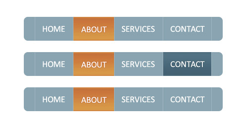
If you’re redesigning your blog, this means that you already have content (and hopefully loads of it!), and a redesign is the perfect time to consider reorganizing your archives and your navigation bar. The easiest way to organize content is to begin with the biggest topics. Stay as general as possible. For example, I often blog about education, and my biggest topics are student lifestyles, degree programs and education news.
These are the topics I would use to form my navigation bar. If you need to use subcategories, you can use your main topics as parent categories. This will allow users to browse topics using a drop down menu and will help them find more specific content.
Don’t forget to include the conventional options. A search bar is imperative for readers who want to find something specific, and the easier it is for readers to find what they’re looking for, the more trustworthy you will become. Also, include a “contact us” or “about us” tab to give readers an insight to the ideas and people behind the site. It may seem simplistic, but when it comes to navigation, simple is the standard.
Social Media and Share Buttons
WordPress and Facebook teamed up last week with the multi-purpose plugin that fully integrates your posts to Facebook. If you don’t already have a Facebook fan page for your blog, it’s super easy, and it’s another way to connect your blog with readers and build organic links and shares.
Facebook’s new plug-in for WordPress allows you to share your posts to your friend’s timelines and add widgets and buttons easily to each post. Other capabilities include like buttons and boxes, activity feeds, a recommend bar and the ability to integrate Facebook comments onto the blog post itself. This plug-in will allow readers to see their friends’ activity on your blog, making it socially interactive. It also allows you to mention other Facebook pages, so you can lean on the liking power of your sources (Mashable is one of my favorites!) to promote your post and keep it relevant to the larger community.
