What Should Always Be in the Footer?
What is one thing every house and building has in common? A solid foundation.
The rest of the building is up to the architect’s artistic freedom. The way it’s designed and built can be unique from every other building in the world. However, your building still needs a strong foundation that will hold it up and make sure it’s around for a long time.
Your footer is the foundation of your website.
It’s what holds everything together and gives your website a sense of completion. It also presents an opportunity to utilize it to your advantage. With that being said, there are some things that should always be in your footer.
Email List Opt-In
You should have an email list set up with your website. It’s the best way to stay in touch with your audience and spread your content when it’s published. There are many places on your website where you should try to get people to subscribe, and your footer is one of these places.

Contently has an opt-in form in the top right of the footer. It fits in with the rest of the footer, but the subscribe button catches your attention because of its color. It stands out from the rest of the footer.
You’ll want to put an email list opt-in in the footer because it’ll get high conversion rates. If someone went all the way down your website to the footer, then they’re invested in your website. They wouldn’t have stayed on your website for that long if they didn’t care. This is the perfect time to convince them to subscribe to your email list.
Make sure you have an email list opt-in form in your footer to increase conversion and give users a chance to receive more content from you.
Contact Information
Whenever I want to get in touch with a company, I usually scroll down to the bottom of its website. This is where contact information is usually placed.
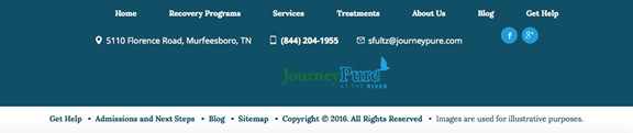
Journey Pure listed all its contact information in its footer. It includes the company’s address, phone number and email, as well as social media links. Journey Pure has made it easy for visitors to get in touch with questions or concerns. Just having your contact information on display shows you care about customer service. This will only benefit your business.
Visitors might have questions for you by the time they get to the bottom of your website. This is why the footer is the perfect place for your contact information. It shows users that you care about them and you’re ready to answer any questions they might have.
About the Company
The more the users know about your company, the better. Unfortunately not many people will visit your About Me page. Tell visitors everything they need to know about your company in your footer.


The Better Government Association gives visitors vital information in its footer. First, it has a copy of its mission statement on the left. This is the first thing you read. It tells you everything you need to know about the Better Government Association and what its goals are. The footer is a great place for this block of text.
More information is given on the right side of the footer. The Better Government Association lists statistics about the company. This gains the trust of visitors because it’s listing proof of how successful it is. The more users know about your company, the more they will trust your brand and become invested in it.
Telling visitors about your company is a great way to utilize your footer. It adds a personal touch that you wouldn’t see in footers of larger corporations. Your mission statement and any statistics or awards you’ve won will look great in your website’s foundation.
Social Media Icons
Social media is a terrific way to connect with your audience. You’ll become a part of their daily lives and build a unique relationship with them. Use your footer to send visitors to your social media pages.
![]()
Content Marketing Institute made sure it put its social media links where people could see them. The icons are located at the top of the footer. Social media icons practically belong in the footer. They’re small and don’t take up much space. This is important because your footer shouldn’t be too big.
They also stand out because the logos grab your attention. You don’t need much text to go along with the icons. When people see the Facebook logo, they know it’ll send them to your page. It’s compact, doesn’t use much space and is important for your visitors to know they can connect with you.
Social media offers a great way to market your content and reach out to your audience. Make sure you’re ready to utilize these platforms by getting people to follow you. The footer is a great place for this so they can stay in touch on their way out of your website.
Strong Call-To-Action
The footer is usually the last thing visitors will see before they leave your website. Place a strong call-to-action as a last-second attempt to get them to opt-in.
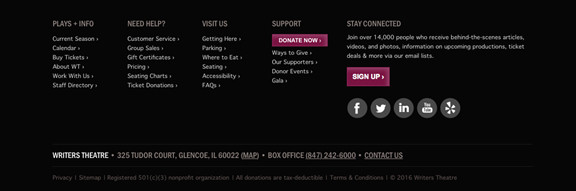
Writers Theatre has two call-to-actions in its footer. One is to sign up for its email list and the other is to donate money to the theater. Both stand out and grab your attention. The color used for the button contrasts with the black background and darker text. However, it still works with the color scheme of the website. It’s well-placed and catches your eye just as you’re about to leave the website.
Your footer is your last attempt to get visitors to opt-in. Make sure you place a strong call-to-action.
Solid Foundation
Your footer shouldn’t be a forgotten part of your website. Make sure you use it to your advantage and create a solid foundation for your company’s page.