The World's Most Beautiful Band Websites for your Inspiration
Today, I am about to show you the world’s best band websites by far. Please note that these bands are not in any way my favorite because of their music. Instead, I admire them because they care enough about their image – that they build themselves a good website.
In all honesty, I was a bit disappointed that some great bands like Metallika, Pink Floyd and others don’t pay attention to how their websites look. It’s a pity as a band website is actually the best way for music fans to know more about the band, the tour dates and so on. It’s a place where people can see the pictures of the band, read the latest news, listen to favorite tracks online or even buy the latest album.
On the same note, find out What makes a good Band Website.
Ready for the showcase? Here we go:
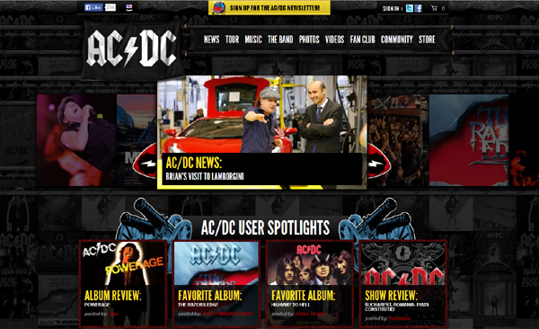
ACDC
Plenty of imagery. Goood retro vibe to it and lots of energy. Good use of classic band photos and colors.
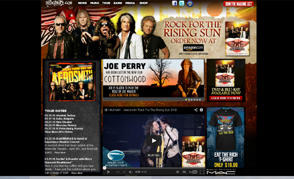
Aerosmith
I especially like the header treatment with the band in it. The carousel with the latest news as well as merchandising all around is a good touch.
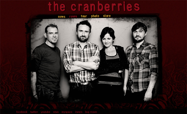
The Cranberries
Good use of the band colors. The burgundy rose background is very nice. The band photo and blog details work well on the overall functionality of the website.
Depeche Mode
Very unconventional layout. Fonts used are out of the ordinary. The inner pages are responsive – and the background has a bit of animation going on. Very minimal and simplistic. Read more on simplicity in web design.

Disturbed
The website truly plays the identity of the band. Good, large graphic background, standard fonts and good use of color. Nice touch to this band’s blog website.

Evanescence
Very professionally done. The site is fully responsive, meaning it looks good in any device. The fonts and colors used blend and compliment each other well. Spacing, graphic elements – all are done very well.

Godsmack
Another band photo in the header. The transition from header to background is really good. The band logo balances the site well and the content below the fold is a common but good touch.

Green Day
I just love the color treatment for this website. The navigation alone is very crafty. The site speaks loud and clear, screaming the band’s message real good. This band website is definitely a favorite.

Guns and Roses
Ahhh, there’s something about this website that completes me. The large background is in every page – very nice indeed. Traditional and classic elements such as navigation, site logo, transparent containers. Best of all – the site responds well to any screen resolution.

Halestorm
Gorgeous website. It’s got that grayscale look to it. Very nice graphic design elements with that “old world” feel. Skeuomorphism at its best is demonstrated in this band website. The storefront also matches the rest of the site. Speaking of stores – check out our post on creative online stores.

Heartagram
As far as band websites – this may be as simple as it gets. Just a large screen capture of the band singer and a list of the band show times. It gets the job done and quick to the point.

Iron Maiden
Another loud site. Just as the band itself – loud is what you want. Big carousel, headings and messaging. Works well to a certain degree. Some may say overly done – but it’s Iron Maiden – nothing is overly done.

Kings of Leon
One word: “Extremely Creative”. Okay two words – that’s because it’s twice as good. The navigation alone is out of this world. The animating background, bokeh effect and scrolling page effect is brilliant.

Korn
More of a splash page than an entire site – the artwork is beautiful nevertheless. A couple of external links that goes out to the band’s iTunes and Amazon store. Simple.

Led Zepellin
Very colorful and flashy. A reminiscent of the golden days of the web. Considering the band is from back in the days – the website itself matches the owner.

Maroon 5
Good solid lines and containers. Heading fonts are beautifully made. Carousel in the homepage is graphically intense, while the inner pages are quite traditional.

Oasis
One of the older “boxed-in” layouts. Elements of the site are perfectly enclosed in their respective areas. Color is awesome – good earth tones with balanced combinations. Overall, a classic site.

One Republic
Another unconventional layout – which is often seen in band websites. Background imagery is good, navigation on the left with good fonts. Simplistic and holistic at the same time.

Queen
There is something about the way this site is laid out that gives the feeling of complete. Plenty of band information, stories and articles. The site is a treasure cove of band details that the average fan will find amazing. The design of the site is good and well done.

RadioHead
A little messy, unpredictable and wild. Almost impossible to navigate with the uncertainty of where the page takes you. Maybe that’s the beauty of this site. Definitely one of a kind.

Rammstein
It’s usually though to pull a website that’s dark background and still make it look clean. Rammstein’s website has metallic textures, block fonts and good color scheme. Check out the history page to see the timeline page layout.

Red Hot Chili Peppers
Another creative website. See the colors change as you navigate from page to page. One thing I notice is that the band’s website doesn’t splatter images of themselves all over the pages. Instead, their focus is on content such as tour info and the fans.

The Rolling Stones
Loud colors, strong graphics and good imagery. The header is more of a marketing space for their latest tour cities and additional information.

Shinedown
A visual delight. A lot of work has gone into this band website. Plenty of graphic design from the navigation to the background, the containers. Job well done.

SlipKnot
Dark, mysterious and scary. Gothic elements from fonts to borders and of course the logo. Overall, the site comes together well.

System of a Down
Not so typical at all. Site navigation and logo is combined into one. Background images are nice and strong. The photo gallery is especially wonderful to browse through. An awesome display of what a band website should be.

The Beatles
Beautiful and responsive. The site itself is a bountiful of information about the band – from history, photos, fans and the store.

The Rasmus
The slideshow in the home page features a timeline of the band’s albums and concerts. A single page website – with modal boxes for news and other links.

U2
Similar to the Beatles’ website, U2’s site is a huge collection of information pertaining to the band. From news, tours, photos, music, timelines – you name it, it’s there. Information is organized very well, site design is top notch.

Conclusion
As you can tell, I really had a good time collecting these band websites for this showcase. All of them had their own unique character, as well as some similarities between them. Most of all, I feel that these band websites do what they’re meant to do. That is to make you want to know more about music, the band’s personalities and their lifestyle.
As far as web design, I hope that this list is a good starting point for inspiration. Please leave your thoughts below.