5 Simple Techniques in Maintaining Visual Consistency in UI Design
A well-designed user interface (or UI) design enable users to interact easily with your website or app. Additionally, it helps users navigate throughout your website or app in a seamless manner. In a layman’s term, user interface design help tells users: how they may interact with your application, including its display screen, set of commands, the content etc.
“User Interface design is capable enough to generate a positive or negative perception about your product among your users.”
Good UI design is one features amazing looks, and at the same time is highly interactive yet easy to use. You can successfully create such kind of user interface design, by maintaining visual consistency between the elements – that are placed in your application. Doing so, will help your users to communicate with your application in an easy and efficient manner. On the other hand, lack of visual consistency in UI design can make your application look cluttered and difficult to understand to viewers.
Therefore, through this post I would like to share some techniques to in achieving visual consistency in your user interface design.
On the same note, you might want to read Common mistakes in UI Design and how to avoid them.
1) Simplicity is Best
There’s no disputing to the fact that, the more controls or elements you’ll display on your website design or app, the more time it will take for your users to figure out the process behind using your interface.
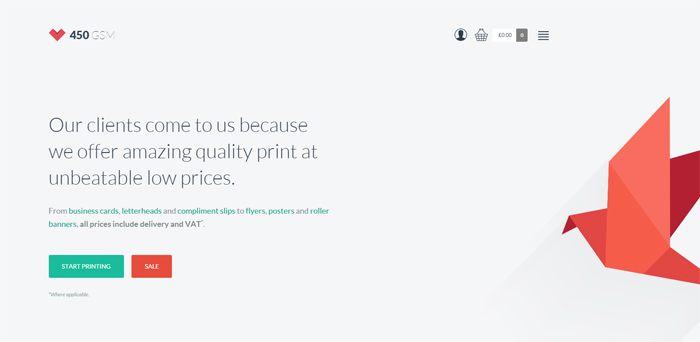
450GSM website demonstrates simplicity
Remember, users want to know about how they can move through your application easily, without having to figure it out themselves.
Keeping fewer choices make the direction and flow of the interface more apparent. One best way to achieve such an objective is to hide some advanced functions of your interface from users. You can display the most commonly used functions, but put the other ones away in the form of a drop-down, which when clicked opens up the hidden functions as well. One good trick to do so is: to mark your content as collapsible or expandable.
While in the subject of simplicity, read Are flat designs getting “Too Flat”?
2) Proper Utilization of White Spaces
White space is, basically, the empty space between and around the design elements of a page. Though whitespace is an essential web design element, but it is often overlooked by designers, as it is perceived by users “as a waste of space”. But, in reality, white space is one of the most crucial aspect of web design that is responsible for increasing readability and scan-ability of the visual layout.
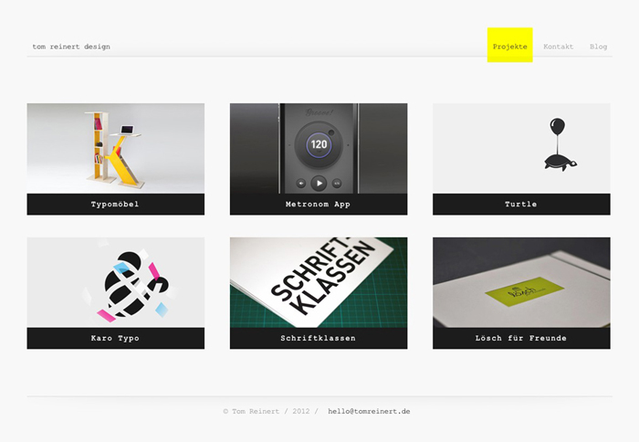
For example, Tom Reinert Design uses white space in their design. The design looks clean and clutter-free, and make the contents placed inside the design easy to read.
What’s more? Proper use of white space helps in bringing the most important elements of your content into focus. In fact, empty space on your website page or application layout can be important just like the space occupied by content and imagery. Essentially, white space can make a huge difference in how your UI looks like to users.
3) Make Use of The Right Color Contrast
The third technique that helps keep up with visual consistency is to make the use of right color contrast, especially for the elements in your UI design – since it helped in conveying even complex information with ease. Most importantly, right contrast helps in reducing eyestrain, by bringing users’ attention on specific elements of your UI design.

Choosing the right contrast creates a visual harmony between elements. The best practice is to make use of the light colored background and a dark color for the text.
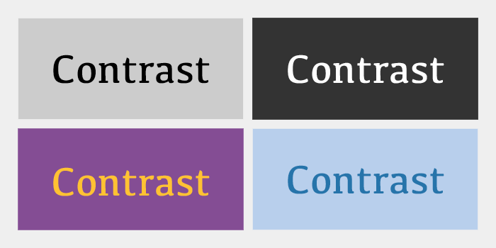
Also, you should also consider using varied types of contrasting colors to increase viewers’ on the most important elements of your user interface design. For instance, brighter colors (ideally darker color scheme for the background) are said to invoke an emotional response.
4) Typography Should Be Clear and Distinct
Typography is an element of visual design that plays an important role in improving the overall first impression. But, most importantly, clear and distinct typography is the major factor that helps in maintaining consistency in the visual design.
The proper arrangement of typefaces, font weight, styles and other typographic elements introduces harmony between the content of UI design, which helps improve user interaction.
Using the wrong typefaces and incorrect font choices results in poorly-worded text, which make your users perceive the interface as bad. Conversely, using modern font style and writing complete sentences will make the text easier to understand. Moreover, clarity in your messages will help users understand how to use your application properly.
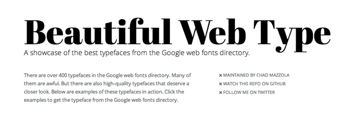
Speaking of typography, see this Showcase of beautiful and free fonts.
5) Use Subtle Animations
Having animation on a site helps add visual delight to its layout and makes it look appealing to the viewer’s eyes. However, in today’s era of modern web design you need to understand how to use animation – in a correct and relevant manner. Especially you need to learn about using animation in intuitive user interfaces as it can help in increasing the usability of the interface, by creating balance in still objects/images.
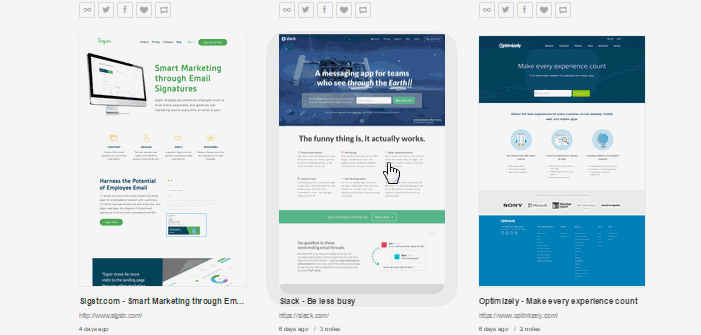
lapa.ninja shows subtle hover effects
However when working on an animation remember not to get obsess over the colors used etc. You need to be sure that the animation used in your website design is subtle. That’s because, the more natural your animation will look, the more consistent experience it will provide across rest of the user interface.
For example, The Journey of data website makes use of subtle animations – that help in guiding users how email works. As you click on the “Start” button on the site’s homepage, you’ll be directed to a page containing dotted lines that will help you focus on a particular action – making you understand how you can navigate through the information.
Don’t forget to check out these Conversion-Friendly Design Tips to learn more about UI.