Your Mobile Menu Belongs at the Bottom of The Screen: Here’s Why
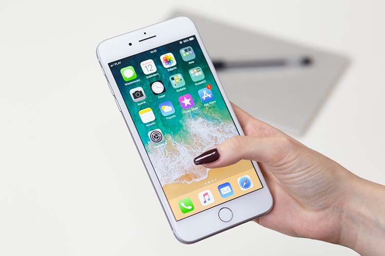
Did you know that you have a somatosensory cortex? That’s the part of your brain that controls your thumb and other digits. If you use your mobile phone on a regular basis, your somatosensory cortex may be larger. However, that’s not universally true. It was once assumed that people held their phones with one hand and used their thumb as a cursory mouse. We now know this isn’t true. Instead, we now know that people hold their phones in a variety of different ways. Exactly how, depends on what they are doing. There are seven primary ways that users hold phones and interact with the touchscreen. We do know that 75% of users are thumb interactors.
In addition to the thumb being the most primary point of contact, most mobile users frequently use the back button located at the bottom of the screen. This means that the center of the screen on down to the bottom of the screen are the primary points of contact for the thumb when using a mobile phone. Because common sense dictates that a menu won’t be in the center of the screen, which means the best place for mobile menus is at the bottom of the screen.
Thumb Reachability And Other Complexities
Of course, things aren’t completely cut and dried. An operating system, device type, device size, and current user activity can complicate things. So can the specific activity the user is engaged in. For example, a person may rotate their phone into a landscape position to watch a video in full-screen, and while they are doing so may hold their hands in one position interacting with the screen in a specific way. Then, five minutes later their phone is in another position and they are cradling the phone in their non-dominant hand while tapping links with their index finger.
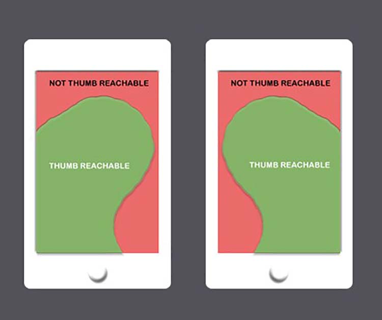
Ideally, the screen design for each app or mobile friendly website will be based upon accurate predictions based upon the actions the user will perform, and common ways of holding devices while performing those actions. For example, a user is more likely to hold the phone in a portrait position and scroll with an index finger or thumb while on a text-heavy web page such as a top writing websites page. However, while watching a video, they are more likely to hold the phone in landscape position and interact with it entirely differently. Whatever position the phone is in, the most easily reached area of the phone by thumb is known as the thumb sweet spot.
Device Size And Operating System
With larger screens, the zone of thumb reachability changes. This is especially true in landscape position. The upper side portion of the screen is going to be less accessible to the user’s thumb. However, that still leaves the bottom accessible. So, even in these instances, app and mobile website menus are best placed at the bottom of the screen.
Does OS make a difference? Not in most cases. However, for Safari on iOS, there are other complications to consider. Interacting with the bottom of the screen results in the OS menu appearing. This means the user has to refocus and double tap. However, using a scroll bar can remove this issue.

Possible Exceptions
If your app or website is designed in a way that users interact with the menu infrequently, you may consider placing it somewhere else. However, as a general rule, bottom placement is usually the best. If you think the menu absolutely should be placed at the top of the screen, this is something that should be tested considerably before you make a final decision.
Another consideration is international users. Many don’t interact with their phones the same way that users in the United States or other western countries do. For example, in Asia, many users have an iRing accessory. This changes the orientation of the sweet spot.
You might want to bookmark: Mobile Design Tips your users will love.
Some may also say that because the bottom of the screen is so accessible that users may get into trouble by bumping the hamburger menu unintentionally. However, if you provide enough padding around the menu button this should not be a significant issue.
A final concern that some may express is the commonality of the mobile menu being at the bottom of the screen. While it’s true that top menus are more popular, bottom menus are certainly not uncommon. They are used enough that the average user should be able to find the menu quickly without too much issue.
Conclusion
With few exceptions, you should nearly always put your mobile menus at the bottom of the screen. If you believe you have good reason to deviate from this, you should test thoroughly before making a final decision. If you have Safari on iOS users things do get a bit more complicated. That’s one area where you’ll have to make your own judgment call.