What Makes a Good Band Website?
This article will explore the components of good web design for bands and musicians. We will look into their common characteristics, what looks good, as well as go through popular bands sites that are already out there.
Keep in mind that these examples are the results of what I’ve gathered through the web as I was looking for inspiration. It does not guarantee the best results, nor yield the highest output. It is simply a starting point of what current band websites are doing.
Streaming Audio or Video
This is your product, the merchandise, the "goods". Every band website must have a form of streaming audio somewhere in their pages. It doesn’t have to play right away as soon as someone hits your site, but it’s nice to have a player that is real accessible. You make music right? So let’s hear it!
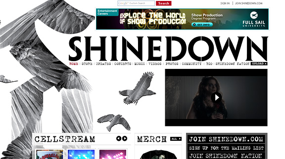
Shinedown
Shinedown’s website features multiple media players right in the front page.
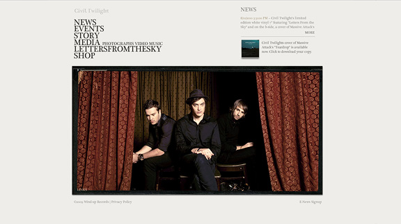
Civil Twilight
Civil Twilight’s streams their latest tracks as soon as the page loads.
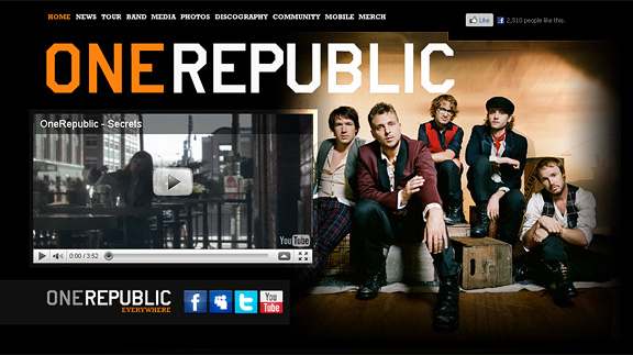
One Republic
One Republic has their video player right with the large header image:
A Blog
Definitely a must have for a band website. This lets the fans know what’s going on with the crew. It can be as simple as their daily ramblings or what goes on behind the scenes. A blog can transform that voice in the radio, into a real human form. It also provides a way for fans to interact through comments and forums.
The Temper Trap
The Temper Trap website is an active blog of the band. You will see a solid following of readers, twitterers as well as facebook fans.
Thirty Seconds to Mars
Thirty Seconds to Mars’ blog features their latest press release and performances. The blog runs a dynamic intense debate commenting system for each post:
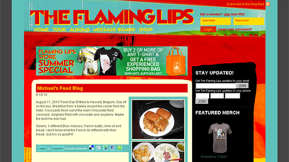
The Flaming Lips
The Flaming Lips’ blog is about anything from T-Shirts, interviews and food.
Unconventional Layout
Classic Rock n’ Roll behavior: We don’t want no rules! Borders? Headers? Footers? – We just want a website that’s cool, fun – a website that rocks!
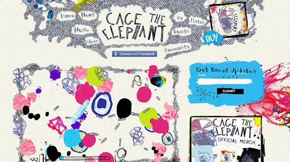
Cage the Elephant
Cage the Elephant’s website has no visible frames, unpredictable patterns, paint splatters as well as hand-drawn elements. Be sure to check the drawing game in the home page – which plays the band’s music simultaneously (quite genius).
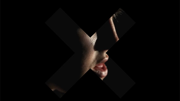
The XX
Another unique setup. This website simply show a large “X” overlay of scenes of the band performing. Very original.
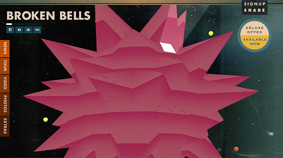
Broken Bells
Be sure to check Broken Bells. See the large audio player with a ball-like-thumping thing in the middle. Pretty cool.
Giant Header
Ahhh, the modern giant header is more like my style and arena. It has more of that "awe" factor which viewers of various niches all agree: It’s simply stunning (of course, if its done right).
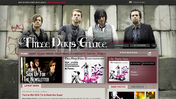
Three Days Grace
Three Days Grace’s band photo is beautifully placed as the website’s header. Big and bold – nicely done.
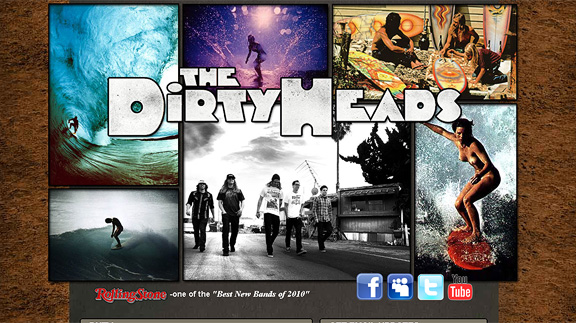
The Dirty Heads
A collage of photos acts as this website’s large header.
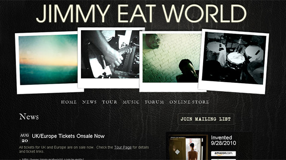
Jimmy Eat World
The same as The Dirty Heads, Jimmy Eat World’s website also has a large collection of rotating polaroid snapshots for the header.
Good Design
I guess this goes without saying – overall, you need good design. Band websites must be appealing, inviting and of course pleasing to the eye. You need reason to attract viewers – which in turn will browse through your site, listen to your material and convert them to loyal fans.
Below are some more musician websites that I think have inspiring designs:
Mumford and Sons
Also featuring a large photo as a the header. Real nice font treatment.
Muse
Busy and unruly backgrounds laced with transparent containers for the content. Muse’s website is very modern and progressive. *Side note: One of my all time favorite bands of all time.
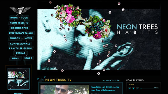
Neon Trees
I’m loving the color schema of this one. Nice solid Futura Fonts – very cool.
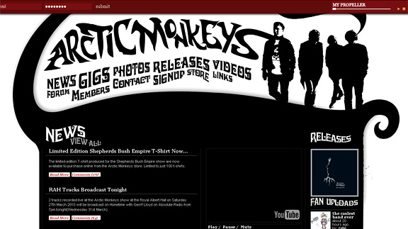
Arctic Monkeys
Artistic logo partnered with a cool swirled navigation. Arctic Monkey’s website is quite traditional and effective.
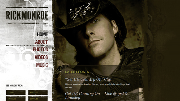
Rick Monroe
Rick Monroe’s website is a mixture of grunge, country and subtle web 2.0 components. Nice large photo backgrounds and gradients, transparencies…the works.
Star Sailor
Bizarre grid structure, loud neon-like color scheme.
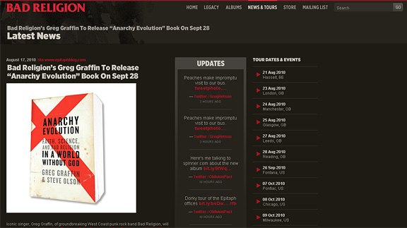
Bad Religion
I’m really feeling Bad Religion’s web blog. Really good grid spacing, and beautiful font (sifr) effect.
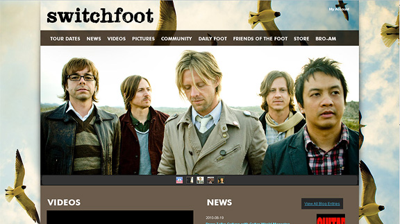
Switchfoot
Beautifully done background of the sky with birds. Color schema is amazing as well.
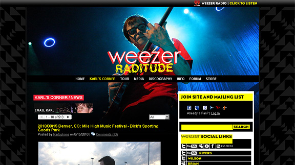
Weezer
Large rotating images as the header / banner featuring band’s photos of their performances.
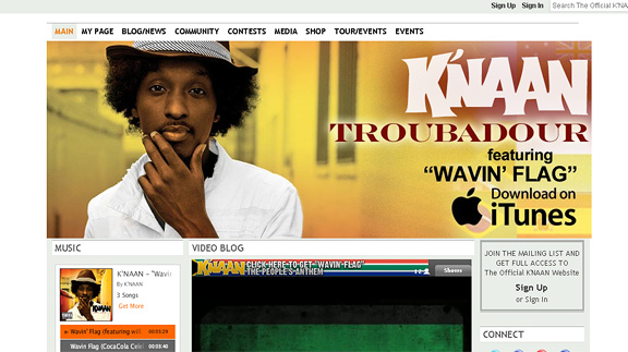
K’Naan
Large header slideshow, video blog and audio players all over.
Conclusion
So the bottom line of a good band website? All of the above? None of the above? You be the judge. The trend is to always push the boundaries outside the norm. Web designers are always faced with a challenge of how to create the ultimate page – one that no one else has. Band websites are certainly amongst one of those challengers. It will be interesting to see what the future has in store for such sites.
Be sure to check these other articles for band design inspiration:
- 25 of the Best Websites of Bands and Musicians
- Top 30 Indie Band Website Designs
- 10 Well Designed Band Websites
Stay tuned for future articles that may include themes, PSD files and tutorials. Subscribe to my feed or follow me on Twitter.
