Secrets to a Successful Banner Design
Content is not the only thing that one should be concerned about while creating a website! The very first thing that grabs a visitor’s attention upon landing is a ‘website banner’. This is the sole reason that makes a banner, a must for every website.
“Content may be the unsung hero, but that’s not all”
Banners have been an integral part of the World Wide Web since many years, and web designers’ today work throughout the night to prepare some of the most compelling website banners. I guess now you realize the importance of a website banner, which is why I draft this compilation of some simple steps that can assist you in designing a successful banner.
Here are some fruitful tips that can offer you some of the most successful banner designs:
Compulsion
Of course you cannot force your way into a customer’s mind to make him or her like your design instantly; however, creating a psychological compulsion is something that can be done virtually. In order to create compulsion through a website banner, one needs a slender understanding of human psychology too. For instance, using some provocative texts can help you in easily initiating a response from a visitor. Let me give you an example of my own, as I happened to visit a random website where I saw a ‘Don’t Click’ slogan. I assume as most of the people might have done, I too clicked on it!
So, what did actually made me come to a decision so quickly? To my knowledge, it was the hidden element of ‘compulsion’ or the sheer curiosity of knowing what was actually on the next page! This is why I consider ‘compulsion’ or creating urge/desire as a vital inclusion, when it comes to designing a website banner. It becomes almost impossible for a visitor to ignore the element of secrecy present on a website and this is where a designer needs to score.
A Design That Is Like Water
A design should be like water, although it is flawless but it can take the shape of the container it is kept in! A design should never be too specific that leads to the alteration of the website objective itself. On the other hand, a designer should make sure the design gets easily equipped with the theme of the website and does not seem awkward to a visitor.
Participation/Interaction Is A Game Changer
Apart from making the design compulsive, keeping things interactive is not a bad idea at all. Visitors over the years have grown smart and choosy, which is why we now need a design that can speak for itself and appeal to the mass audience effortlessly. Designers can use interactive technologies such as Flash in their respective banners to invite visitors to participate in the action.
This interaction or participation can be achieved through even a simple flash game to indulge the user in your website and showing the brand message at the right time to initiate ‘call-to-action’. However, do not try to make things too participative, as it can distract visitor’s attention from the web page content quite easily and your true motive will be lost in between.

Go Retro
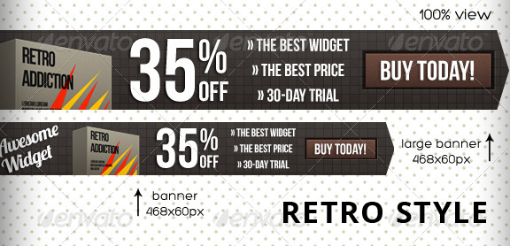
If you go with human psychology, then the best colors for your banner would be blue and yellow. For those who are still confused with color selection, I would suggest them to go ‘retro’ or ‘black n white’ for their banners to give them a simple yet elegant look. Even though this retro trend is not a permanent thing, websites still prefer it to the normative colorful look. What I wish to convey through this point is to try something different from others, to ignite the curiosity of the visitor and make him click on your banner.
Just KISS (Keep it simple silly)
This is considered one of the basics and my favorite, which is to keep it simple for the sake of the visitors. A banner is not the only thing that a visitor sees when he lands on a website, which is why it takes only a matter of seconds for a person to read the banner and move on. Therefore, what we have to do is make that seconds count in a manner that works in your productive favor. Moreover, the best way to do that will be to keep the banner simple and specific, so your message is delivered within a single gaze.
To be frank, simple messages like ‘Find Out’ or ‘Click Here’ can let the visitor know of any information that you have for them, thereby initiating an immediate ‘call to action’.
Keep It Light
Website banners need to be light in terms of memory, so that they load at a much faster rate. It is better to keep the banner size in between 45 to 70 kb so that it can load before your audience leaves your website.
Brand Building
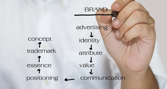
No doubt, website banners are one of the best tools for building a strong brand in the market. This is why I would suggest you to use your company logo, aesthetics and if possible, a tagline so that even if the banner is not clicked, it will remain in the visitor’s mind.
Placement is also a major concern, as you should place your banner advertisements on niche websites that have your target audience. Competition analysis is a different thing but before that, you have to make sure whether you are having the right audience for your services or not.
Conclusion
Website banners often prove to be ‘one-hit-wonder’ kind of a thing, which is why I have mentioned some very simple tips. I hope these simple secrets help you in designing a perfect and above all a successful banner in future.
