Designing for the Visually Impaired
Unless you know someone who is visually impaired, or you deal with serious eyesight issues of your own, it’s easy to take seeing clearly for granted.
Considering the internet is a largely visual medium, this is becoming more and more of a factor online. Designers always want their work to stand out and look good in their own eyes, but how often do they think about how it will look through the eyes of someone with visual impairment?
This question shouldn’t be taken lightly — vision impairment is a growing problem in the U.S., particularly among older Americans. Not counting those who are blind, there were 2.91 million Americans age 40 and older with vision impairment in 2010, according to Prevent Blindness America. That was a 23 percent increase versus the 2.36 million who were visually impaired in 2000.
While it may be a bit more challenging, those with visual impairment like to go online as much as anybody else. The experience can be hampered, of course, by graphic design that doesn’t keep eyesight ailments in mind.
With that in mind, here are five things to consider when designing for the visually impaired.
1) Make Wise Font Choices
This can be challenging at times, because a designer’s font choices may be limited. For example, if you’re designing a piece for a particular product or brand, there may only be a few options that align with what the client wants.
Still, there are a few guidelines to consider when looking to design with the visually impaired in mind — and most are sound advice no matter who you’re designing for.
This includes basics such as font type. Stick to more basic fonts like Arial while avoiding the more decorative or flashy fonts that can be harder to read. Also, if possible, choose a sans serif rather than a serif for maximum clarity.
Make sure to consider the size of the font as well. You don’t want to dominate a design with words, but you do want to make sure they’re large enough for everyone to read. Consider using bold for thicker, more legible print.
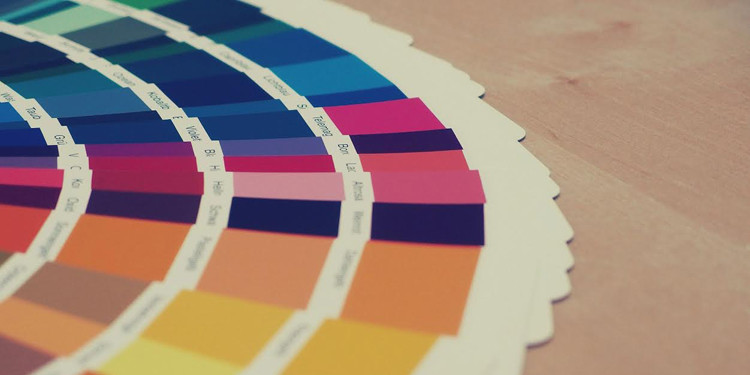
2) Use Contrast to Your Advantage
Designers know that color contrast can help certain elements of a design stand out, and this can be particularly useful when designing for the visually impaired.
One simple method to test whether your contrast is strong or not is to physically squint your eyes when examining and editing your work. This of course won’t exactly replicate what it’s like to have a visual impairment, but it can at least give you a decent idea of which colors stand out next to each other and which might need a little work.
It also helps to keep colorblindness in mind. Bright red next to bright green might be perfectly fine for most of your audience, but as the NFL found out last season, it can wreak havoc on those who deal with colorblindness.

It won’t always be possible to design without breaking some of the rules for those who are colorblind, but these color combinations can be most difficult for that segment to see: red and green, green and brown, green and blue, green and black, blue and purple and light green and yellow.
3) Incorporate the Power of Sound
This may be a bit of a cheat because it relates more to audio design than visual design, but consider using various sounds or audio cues on your site, particularly if those with visual impairment are a key part of your audience.
One basic tip for using sound in your design is to select tones that are generally midrange. Both very high and very low sounds can be hard for certain folks to hear, so choosing sounds with midrange levels gives the best chance of being heard by a wide audience.
Also, since you’re a professional designer, don’t use amateurish sounds. Make sure whatever sounds you use are mixed, edited and mastered at professional levels to ensure the best clarity possible.
Another advantage of using sound is you can pair audio with visual cues to help make your message that much clearer.
4) Choose Colors with Care
This relates a bit to the above issue of contrast, but color choice is also key for things like clickable items on your site. For example, if you have two buttons side by side on your site that read “OK” and “Cancel,” use contrasting colors for each — not just one — to make it clear that each button has an action associated with it.
Of course, color choice sometimes includes not choosing a color at all. Utilizing the right amount of white space in your design can be very helpful for the visually impaired since just about any color stands out with a white background.
There is a fine line, however. On one hand, you don’t want your site to look crowded or cluttered, but you also don’t want it looking bare. This is where a good editing eye is important.
5) Utilize Strong Patterns
Patterns often come in handy in design, usually to convey some sort of message without necessarily using a lot of colors.
One example of this could be a seating chart on a ticket sales site. Instead of using a color to signify a seat that has already been sold or is otherwise unavailable, you might consider filling in sold seats with diagonal lines. Alternatively, you could note that seats represented by circles remain unsold, while those that look like an “X” are unavailable.
Even when you’re not designing specifically for the visually impaired, it can be tough to execute work that’s visually pleasing to everybody. Both art and science are involved in designing work that’s eye-catching to as many people as possible.
Designing for the visually impaired imposes an extra layer of difficulty to that challenge, but be assured — employing these tips will set you on the right course for design work that’s accessible to just about anyone.