All you need to know about Parallax Scrolling in Web Design
Yes we’ve all seen it at one point. A webpage that seems to be moving – with large and awesome background images. The more we scroll down, up, left or right – we get this magnificent effect. We become a part of the screen – as the page takes us to a “mini” journey. The effect is known as Parallax. And if you want to know more about it – then read on.
This article will look at parallax scrolling in web design, how it works, resources as well as examples.
First, a brief History
The Parallax technique was first used in the 1940’s to create an illusion of depth within 2D video games. Later on it grew in popularity in the 1980’s – with the rise of arcade games. Today the Parallax effect is seen as a part of the scrolling feature of a web page – where the background image (the page background) would move slower than the foreground images (the page image content). This trend is relatively new in web design – which makes it exciting and fun.
Parallax Scrolling in Web Design
Parallax was popularized in web design as internet technology is now more advanced than ever. This is also good indication that user expectations about what they see in a browser, have risen a great deal. Viewers now want to be entertained – and using this feature contributes to an entirely different memorable browsing experience. Parallax scrolling gives an ideal setting to form engagement through story telling. Many companies and brands are using this technique to guide their users through their websites. The scrolling behavior creates an element of surprise. In result, users can now interact with websites and explore products and services using the interactive nature of this technique.
How it works
Parallax scrolling allows images to move around the website at different perspectives and speeds. This gives a creative faux 3D effect that adds a sensation of depth. This technique is a lot like working in layers – so everything has to fit together piece by piece. Consider the illustration below:
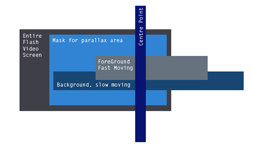
As you can see, a viewer’s focus is on the Center Point. Multiple backgrounds move at their own speeds – thus creating an illusion of both depth of field and motion. Think of it as a fake way of animating background images.
Resources
As you can imagine, the most common way of animating elements in a web page is by using Javascript. Although external third party tools such as Adobe Flash is available – but is not recommended. The reason is – Javascript is installed automatically in all modern web browsers, while third party plugins are not. Now knowing that Javascript is needed, we need to look at some tutorials that can guide us on how to create a Parallax effect in our web pages. Here are some good sources:
Tutorials:
- A Simple Parallax Scrolling Technique – is a short and simple tutorial – and will require you to know a little bit of code.
- Build a parallax scrolling website interface with jQuery and CSS – written for this very topic.
- Tutorial: How to implement the parallax scrolling effect, part 1 – is a series of tutorials. Also quick and easy to follow.
- Parallax Scrolling tutorial – is a video of how to integrate a parallax plugin
- Super Easy Parallax Effect With JQuery – one of the more detailed walk-throughs. Good to follow and well documented.
If you don’t want to write everything from scratch, there are some pretty good plugins (or combination of) that will help you write your Parallax web page. Although, some more complicated than others, a good time combing through the authors documents may be required. Here’s a good list of jQuery plugins, that will help you with Parallax.
Plugins
Note that the plugins may not entirely dedicate itself to Parallax – but will help you with the task of scrolling. This eliminates the intricacies of this method – which makes parallax easier to achieve.
Examples
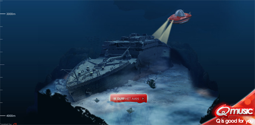
You will see that the examples below – different brands and companies have implemented parallax. This collection ranges from personal websites that tell a stories; to big brands that engage customers through a different yet creative experience. For the maximum effect – you would have to click on the links and start scrolling.
Business Bee
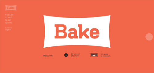
bakeagency.it
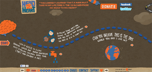
head2heart.us
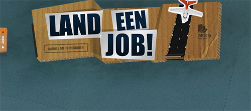
landeenjob.be
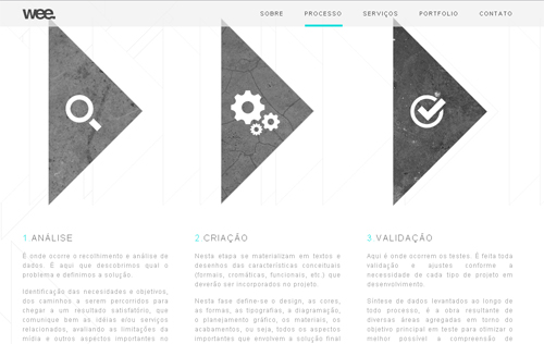
agenciawee.com.br
soleilnoir.net

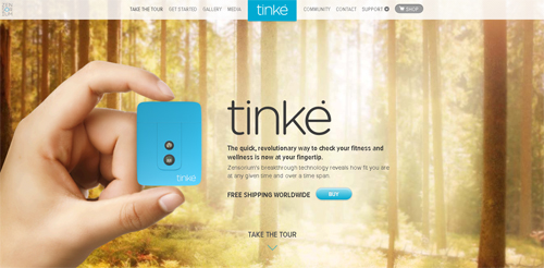
zensorium.com
pitchfork.com
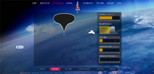
redbullstratos.com
jessandruss.us
artofflightmovie.com
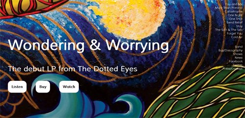
thedottedeyes.com
droptest.com
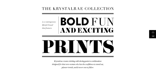
krystalrae.com
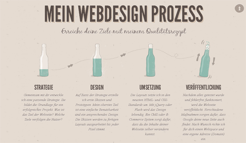
janploch.de
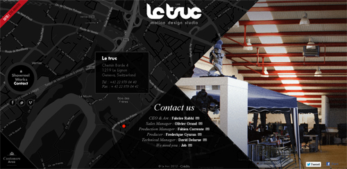
le-truc.ch
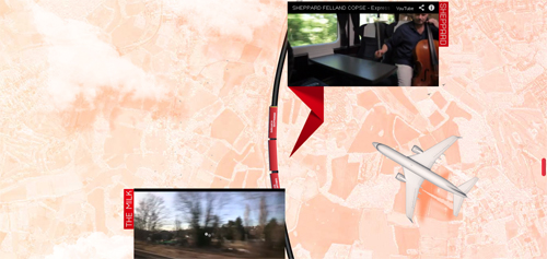
gatwickexpresstracks.co.uk
ikayzo.com
dangersoffracking.com
whiteboard.is
titanic.q-music.be
Conclusion
Hope you learned a lot about Parallax in web design. As mentioned before, this method is particularly new so integrating into your pages is an exciting feature. Parallax will definitely add some spice into your site, resulting into a deeper engagement from your visitors. Remember, like web design itself – Parallax is only limited to as far your creativity goes. So dig in and code – let your pages come to life with Parallax!
We would like to know what you think. Please let us know in the comments section below.

