A Showcase of Light and Clean Website Designs
Simplicity in web design is practical on so many levels. It also helps your site load faster, as so many elements don’t need to be downloaded. Faster site speed improves search rankings and conversion rates, which is important to any online business.
More importantly, of course, a light, clean website looks amazing.
Keeping web design light and simple is not as easy as just not putting a lot of design elements in place. You must build and maintain a two or three-column grid, and you must ensure there is plenty of whitespace to keep the focus on the few design elements there are. Fonts should be kept as simple as possible whilst supporting the feel of the site, and illustrations should be kept to a minimum.
That may all seem too complicated, but below are fifteen sites that show how to make light and clean website designs look beautiful.
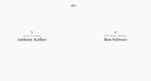
ab+c
This website, for design and development team ab+c, is as minimalist as it can be. The heading is a link to email them, and the two names are linked to their own individual websites.
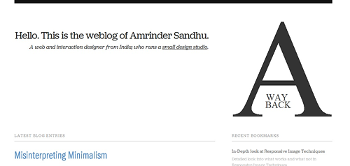
A Way Back
A Way Back is the portfolio site for web designer Amrinder Sandhu. He doles out loads of great advice, but he clearly uses the site to demonstrate his expertise in designing beautiful, clean sites.
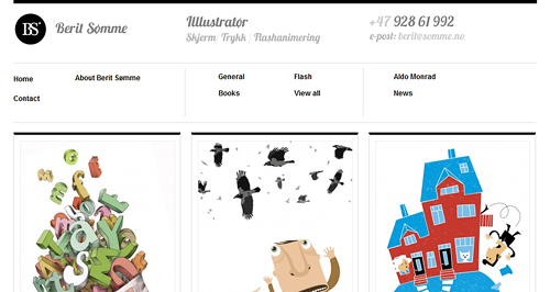
Berit Somme
This Norwegian illustrator showcases all the different styles clients can choose from, without making the site look fussy or messy.
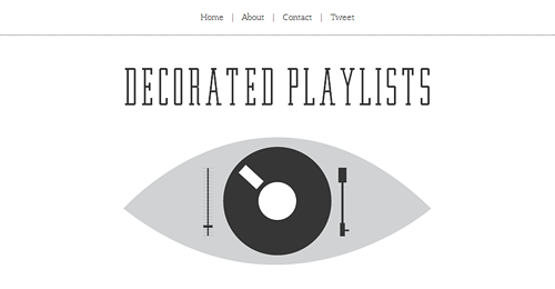
Decorated Playlists
This site was set up by designer and former DJ Simon Foster to showcase his design skills through his passion for music.
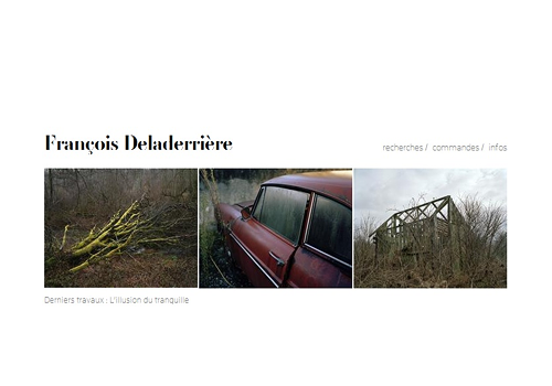
François Deladerrière
This site showcases the photography of François Deladerrière, a renowned French photographer. The site uses extensive white space to make sure the viewer’s attention is all on the photographs.
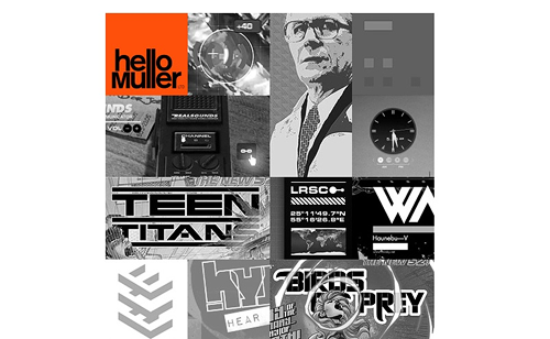
Hello Muller
Graphic design and art direction company hello muller turned their work into a collage of sorts, and then put the whole thing in black and white to simplify the look of it. They then made sure their name popped by putting it in a red block.
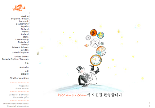
Hermes
Hermes is of course famous for designing gorgeous fashions, and they bring their design expertise to bear in this pretty, clean website.

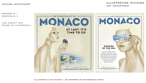
Illustration Division portfolio for Autumn Whitehurst
The portfolio page for illustrator Autumn Whitehurst keeps the white space large and the font simple so the illustrations really stand out.
Makr Carry Goods
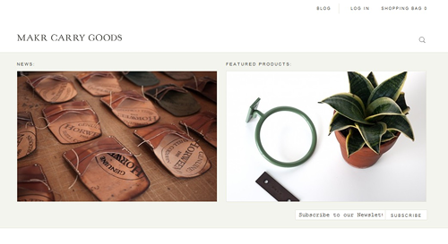
Makr Carry Goods makes really simple bags and leather accessories, and their site reflects the company’s commitment to simple design and craftsmanship
SMeltery
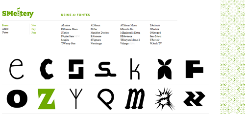
Smeltery designs fonts, and they know how important it is to have clean layouts. The home page showcases the various fonts they have designed simply and beautifully.
Studio Antwork
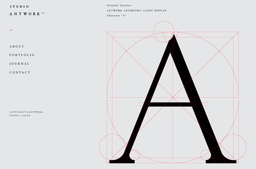
This Japanese typeface design company uses the geometric properties of one of their fonts as the main illustration on their home page. This shows the company’s dedication to simplicity and detail.
Touch Agency
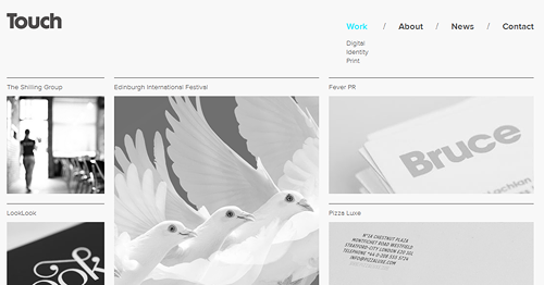
The Touch website has a very firm grid to show off the Scottish creative agency’s projects. The greyscale images keep it from being too loud and busy.
Vnsaga
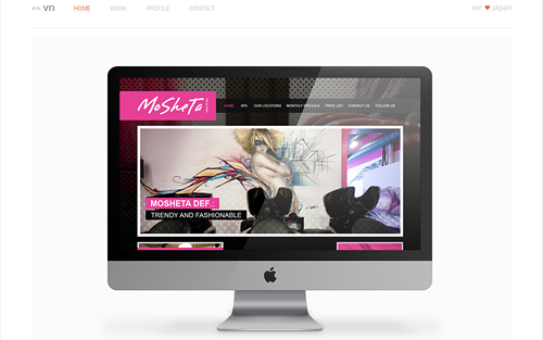
Designer Vee Lee uses images of the websites he has designed on an illustrated desktop to show off his web design portfolio. The Apple computer is known for its clean, minimalist design, making it the perfect frame for his clean, minimalist portfolio site.
Weltunit
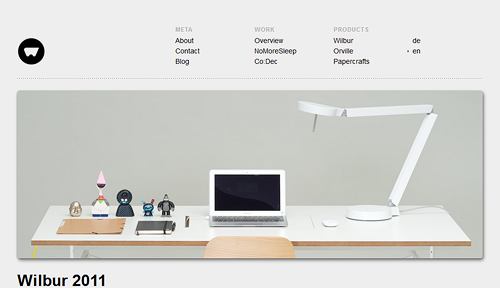
This Berlin-based design studio does just about every kind of design work there is, and their website demonstrates this with its clean illustration of any designer’s dream desk: a computer, a good light and toys and notebooks for inspiration.
Yuna
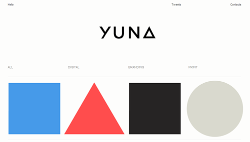
Designer Yuna Kim uses HTML5 to great effect in this portfolio site. Each shape is a different project, and clicking on it brings up photos and a description of the finished result. That means the function of the site is as clean as its look.
