9 Tips for Creating Better Sitemaps
The underlying structure of your website is something that is easy to ignore. More than likely, you put great thought into the structure of your site when first building it. Over time, however, it becomes easy to throw your sitemap on the back burner and forget about it.

Even though a sitemap doesn’t have the bells and whistles of call to action buttons or exciting new content, it is an integral part of your website. The sitemap serves as a way for search engines to index your website effectively.
If you need to create a sitemap, or you want to create a new one and revamp what you’re already doing, you may not be sure where to start. These nine tips will get you started on building the best sitemap possible.
1. Link to Sitemap from Home Page
Make your sitemap easy to find for both site visitors and search engines. Add a link to your sitemap on your homepage, and it will be picked up automatically by search engine spiders.
Also, those who are looking for something very specific on your site might not be able to find it with search. The title of the page might be different than what they are searching for. A sitemap allows the user to browse and see what you have to offer.
2. Ignore Lesser Elements
You don’t need to add every single little element on your site to your sitemap. For example, if you have a search box, there is no need to link to that or even mention it on your sitemap page. Similarly, you wouldn’t link to a signup for your newsletter. If the link doesn’t lead to a page with some type of content, then it probably doesn’t need to be included in your sitemap.
3. Sidebar
Make navigation from your sitemap easy for the site visitor. Even though you are also aiming your sitemap at search engines, you want visitors to be able to navigate your site easily. Perhaps the visitor lands on your sitemap and realizes they just want to go to your shopping page. Offering a sidebar that allows this makes navigating much easier for the site visitor.

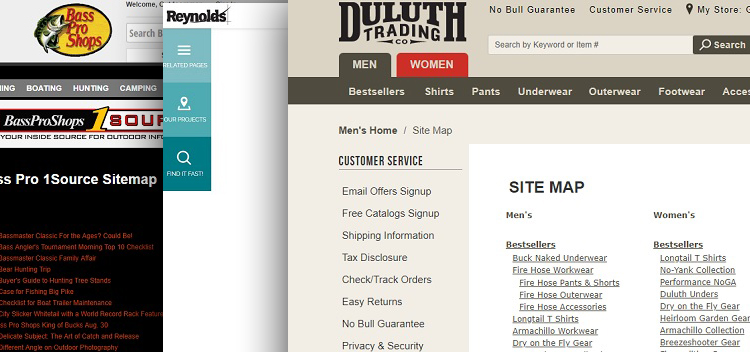
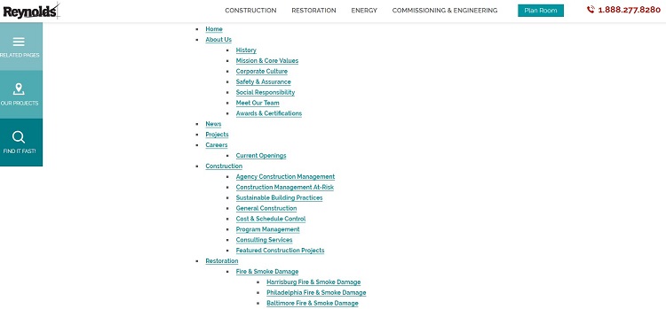
Take a look at Reynolds’ sitemap. They show the hierarchy of their website in a very simple and straightforward way. However, they also feature a sidebar on the left side to help the site visitor navigate quickly to their product page or jump to related pages. They even have a search function in the sidebar so that visitors can search for a specific item.
4. Stay Under 200 Links
While you can add as many links as you’d like to your sitemap, doing so may not be in your best interest. Search engines might assume you are a link farm and gig your ranking. Also, site visitors will find it difficult to locate the exact category they most want to find. Instead, figure out your site’s hierarchy and limit your links to what is important. Your site analytics will show you which pages site visitors most want to see.
5. Reflect Site Hierarchy
Well organized websites have a natural hierarchy. One way to organize your sitemap is by focusing on the main categories you already have on your website. This gives your site a natural flow and signals to both visitors and search engines the main categories of your site.

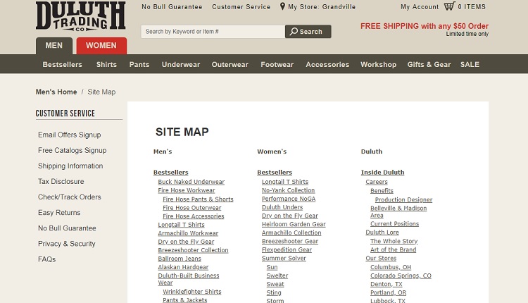
Note Duluth Trading’s sitemap. They break the map into their main categories of men’s and women’s clothing. They then have a third category for company information. Under the men’s and women’s clothing categories, they focus on the bestselling items in that category.
6. Check for 404 Errors
Take the time to click on every single link listed on your sitemap. There are few things as annoying as clicking on a link and going to a not found page. Site visitors may just bounce away from your site if this occurs. At a minimum, you need to explain why there is a not found error on your site, but do your best to make sure you remove any broken links from your sitemap.
7. Check for Duplicate Content
Once you have your sitemap created, take the time to look it over carefully. Are you duplicating content? This can weaken the power of both pages of content and confuse site visitors.
If you notice any duplicates, try to combine it into one piece of content. Alternately, you can use a rel=canonical tag to indicate which page is the main page on your site. You should also remove duplicates from your sitemap and focus only on the main article to which you’d like to drive traffic.
8. Include Social Media Links
Social media grows in popularity from year to year. Today, many sites see almost as much traffic from social media links as from search engines. Your marketing plan more than likely includes a social media campaign to drive traffic to your site from the biggest platforms. While you don’t want the sitemap itself to include links to outside sites, you can include a sidebar to your social media pages.
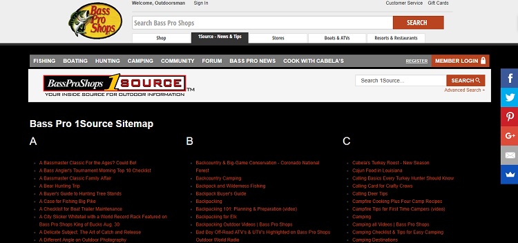
Note how Bass Pro Shops includes a sidebar with links to their social media pages. This allows site visitors to share a product they like with family or friends easily or to navigate to the social media platform of their choice and see what Bass Pro has to say. There are probably too many links on Bass Pro’s sitemap, so focus on the social media sidebar as the best part of this particular example.
9. Keep It Simple
Don’t try to make your sitemap complicated or overly cute. While it should be visually pleasing and match the overall design of your site, the last thing visitors want is a complicated sitemap that is difficult to navigate. Lay things out in a way that makes your site hierarchy clear and save the cute design elements for landing pages and other features on your site.
Creating a Better Sitemap
Making a sitemap is a fairly straightforward process. It simply takes time and forethought to organize it in a way that makes sense for the site visitor and search engines.
Adding a sitemap helps search engines better understand what your site has to offer and can also serve as a guide that allows you to make sure you’re staying within the categories you’ve assigned your site and within your specific niche.
Before you go, you might want to see How to improve your CRO.
