Get Inspired with this Roundup of Flat Logo Designs
A style that’s really become popular in the last 12 months – a Flatter Logo.
Flat Design has become more famous than ever. It’s become mainstream, and has stretched out all the way from UI design, to product branding. Logos are among one of those that has picked up from this fashion. And it looks like it’s making a splash.
I myself is a huge fan of this style because there’s something very refreshing about seeing a design that’s simplified, uncomplicated and uncluttered. One that makes great use of color. In addition, every tiny design decision made when crafting a flat logo is magnified. One can have a huge bearing and appreciation, on how your design comes across.
What makes a logo Flat?
Flat logo designs use less shading and gradients. Instead of trying to make designs that aim to look realistic, they instead favour approaches that arguably appear better suited to the screen. Designs that remove excessive layers, and instead use a flat approach often have to rely on a colour palette that’s bolder. In lesser words: a flat logo is simpler, bolder and in many ways – better.
So here is a collection of some of my favorite flat logo designs. Many of them are for genuine brands, while others have been done mainly for practice and experiment. Nevertheless, the process of adapting to the newer, flatter design trend is always a delight to the eye. And as you will see, each them have been meticulously crafted by some of today’s extremely talented graphic designers.
Source: http://dribbble.com/shots/1090905-Ark-Design-Logo-final
Source: http://dribbble.com/shots/1182992-Flat-Geo
Source: http://dribbble.com/shots/1246274-SurfShell
Source: http://dribbble.com/shots/1132720-HackerRank-Mark-Overlay
Source: http://dribbble.com/shots/1259242-Reportly-Time-Tracking-App-Logo
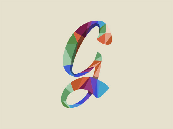
Source: http://dribbble.com/shots/1257166-G-Lettering-logo
Source: http://dribbble.com/shots/1115898-Hudddle-Logo-hudddle-co-uk
Source: http://dribbble.com/shots/1142655-Playbox
Source: http://dribbble.com/shots/1234389–WIP-Minimal-Pricyme-Logo
Source: http://dribbble.com/shots/1226174-Hooked-on-climbing

Source: http://dribbble.com/shots/1240843-Tiny-Quiz
Source: http://dribbble.com/shots/1134369-North-Side-Fitness
Source: http://dribbble.com/shots/1140509-Reflect-Architecture-Logo
Source: http://dribbble.com/shots/994770-Impala
Source: http://dribbble.com/shots/1251981-P-R
Source: http://dribbble.com/shots/1013292-Infinity-Mountain-Bikes
Source: http://dribbble.com/shots/1214799-Second-Sight-Logo-GIF
Source: http://dribbble.com/shots/1060892-French-Make-Beautiful-Branding
Source: http://dribbble.com/shots/1077562-PushUp-Charity-new-Logo
Source: http://dribbble.com/shots/1240336-Peak-Data
Conclusion
As you’ve seen, flat logos can take a great deal of work. I surely think that they do a good job on the brand’s personality, ethos and of course, attitude. While it’s true that there are ways you can go about brand identity (from quirky hand-drawn designs to “tired” traditional corporate styles), it is quite refreshing to see – simple, yet packs a lot of punch.
So I hope you find the collection interesting, and if you know of any other examples – the turn is yours. Which of these designs do you like best? Have you got any logo designs that you’d like to add to the list? I’d love to hear what you have to say in the comments!
