Top A/B Testing Tips for Better Website Conversions
Did you know that even tiny tweaks on the headline of your website can produce up to 200% increase in visitor response? Alongside, you can boost your leads by 100% if you know all the right components to adjust. You can also reduce shopping cart abandonment by 30% if you can properly optimize your checkout process.
Ultimately, this means that you can latch on continuous influx of profits if you can make webpage adjustments based on your clientele’s preference.
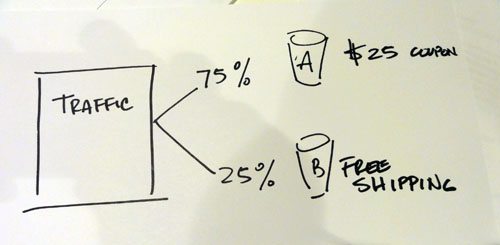
With the tight competition in the market, however, entrepreneurs leave room for mistakes. As such, trial and error should be ditched. Rather than feeling your way around while blindfolded, you can run an A/B test and see which change can bring greater conversion rates. You can learn more here about the successes of software testing.
How A/B Testing Contributes to More Conversion
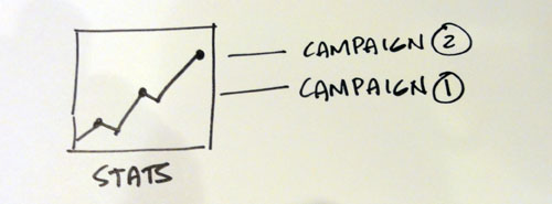
Successful experiments allow numerous entrepreneurs to enjoy higher volume of sales. As long as you are well-rounded in testing and optimizing appropriate conversion elements, you can have a slice of superfluous benefits:
- Spike in sales and number of subscribers to mailing list
- Greater leads and profiteering potential
- Decline in the website’s bounce rates
- Increased customer satisfaction
- Eliminates potential errors in the website design
“The Best Headline” vs. “Get $25,000 a Month from your Headline”
The top of the page is the first thing that catches audience’s attention. Headlines are the first line of text that the visitors get to read. This part of the website therefore holds the greatest opportunity in hooking up potential customers and producing more conversions.

It is therefore crucial to make the headline reflective of what can be benefited from the product or services. Rather than being descriptive, make it more conversational and catchy. As oppose to “The Weight Lost Wonders of Product X,” write something like “Lose As Much as 10 Pounds in 2 Weeks!”
The trick is to write 5-10 headlines and choose the best two among the bunch. Test which of these can generate more sales through split testing.
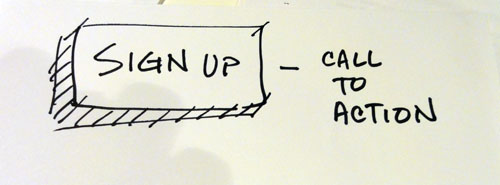
Using Call to Action Buttons
This is where you ask the customers to sign up or make a purchase. Studies show that crafting the call to action in a button is more effective in leading them to landing pages than simply placing a text link. This is because you are freer to integrate ideal colors, shapes, font styles, and size that can possibly ensnare customers.

When using the buttons, you also have to be wary on where to place them. Be sure that it is visible but not too flashy.
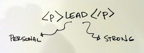
Lead Paragraph: Strong and Personified
Each product from the catalogue should come with effectively written description. Most entrepreneurs commit mistake of starting with “Product X is made of all-natural ingredients, etc.” While there is nothing wrong with the text, having a lead paragraph as plain and blah can turn off short attention spanned audiences.
Instead of describing, include the most amazing benefit of the item in the first paragraph: “Product X can make you twenty years younger while reviving your vigour and glow. This is because of organic ingredient Z known to instantly fix cellular damages upon application.”
This way, you can rouse the consumers’ interest and curiosity, prompting them to read on and find out more.
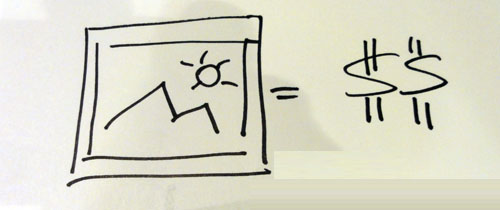
When a Picture is Worth a Thousand Bucks
Images are one of the biggest eye catchers in a website. Past experiments of web developers reveal that photos placed on the left of the product descriptions (or teaser) is the most effective way of amassing more conversions. In addition, you can also place powerful captions under clickable images that lead visitors to landing pages.
To get the most out of A/B Testing, choose two striking photos and check which of these generate the best response from viewers.
Again, it is crucial to choose hero shots that show the benefits of product. Rather than showing the bottle or capsules, you can upload a “before and after” photograph. You may opt to test its effectiveness against hero shots that show flat tummy or clear skin (these types of images are just as efficient in boosting conversions).
More Tips for A/B Testing that Works in Enhancing Conversion Rates
- Experiment with the placement of action buttons in reference to the text. Evaluate where the buttons can be easily seen without cluttering the page.
- Find a page where you can place sign-up forms other than the homepage. You can run the A/B test to check whether things would work better if the sign-up form link can be found on the tabs, etc.
- Gauge whether “boastful” text really does work for your conversions: “Join 15,000 more members!” vs. not placing anything at all.
- Check which background color works best.
