10 Stunning UI Design Concepts in Mobile Devices
Mobile devices are locked in a battle. Apple, Android, Windows Phone, Blackberry and other platforms each want to corner the market, and they all seek to stand out from the pack to do so. Within each of the platforms, too, smaller companies and designers seek to make the most of their talents to create amazing visual experiences for users to see.
The result, a proliferation of distinct and often gorgeous UI. Designers use layouts, typography, iconography and color to create this eye candy we’d like to have in our mobile devices.
Continue reading to see what we mean. Below is a showcase of 10 user interface designs for Mobile that are simply stunning.
Product Detail and Shopping Cart
Virgil Pana’s lovely design is a gorgeous example of how style and usability can work with one another. The clean design at the top of the page just makes the stunning product image pop, and the buttons at the bottom of the screen make it quick and easy to buy the product right from the product page. It really is the perfect marriage of form and function.

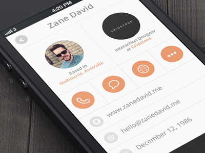
Profile Screen
Designer Zane David created this profile page layout for an app he worked on. The clean lines, modern color palette and font and the circles arranged on a firm grid work to make the person in the profile look better. Instead of junking up the space around the person’s picture with lots of colors and information, the pared-down design lets the person’s photo – and personality – shine through.
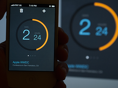
Mobile Countdown
This design is for a countdown app. It is a simple app that requires a simple design. Kerem Suer gives the app design the simplicity it needs, but the use of black, orange and a light turquoise shade give the design a sense of urgency, like the countdown display on an explosive device in a movie. Even the photo of the design looks exciting and motivating.
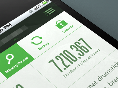
Sub-Navigation
Rally Interactive came up with this design. The layout and colours might seem a little standard in the photo, but when users navigate the page, something amazing happens. The secondary navigation in the scrollable page locks under the title bar as users scroll through various sections. That means part of the page are static whilst others are moving at the same time.
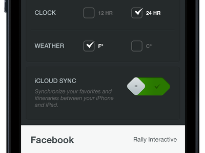
Settings
Designers have to consider things users don’t usually look twice at, and this design is a perfect example of that. The settings page of the National Geographic app, this page features a design that is clean, visually appealing and easy to use. It’s almost a guarantee that most of the app users won’t notice how stunning this design is, but they certainly would notice if it were rubbish. Sometimes that is the best thing a design can be, though – generally unremarkable, yet incredibly useful.

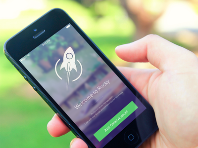
Login Screen
A login screen is another example of design that would probably be more noticeable if it were rubbish. Luckily, Ionut Zamfir’s design is gorgeous, fun and inviting instead. And that is everything a login screen should be.
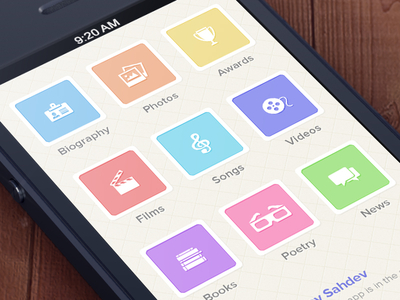
App Menu
App menus can be tricky beasts because the apps need to look both distinctive and yet visually coherent. This design, by Nuruzzaman Sheikh, manages to do it all. The app icons are the same shape and have a candy-coloured palette uniting them, and the icons pop enough to make it easy for the user to scan the icons and find the app they want.
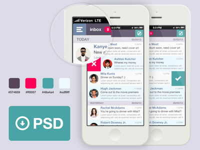
Could you imagine a world where email inboxes are things of beauty before seeing this design by Regy Perlera? With this design, the layout is clean and organised, and the colours are soft and inviting. The result is an email widget design that looks more like a social media page that you browse than a list of emails you have to find the time to get through.
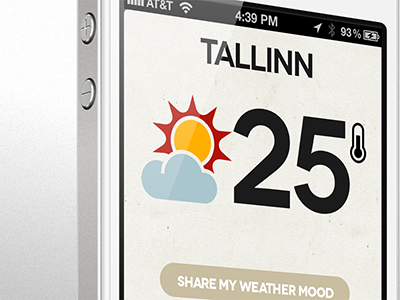
Weather App
A weather app is a weather app, isn’t it? Just get up-to-the-minute information and throw in an icon or two, and you’re finished. This design by Cesar Zeppini challenges that assumption. By using minimalist, modern graphics, colours and fonts, he has created a weather app that is as great to look at as it is easy to use. Not many weather apps can claim to do the same.
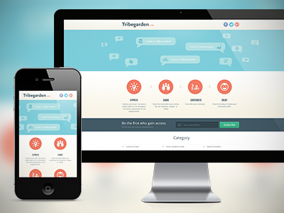
Responsive Landing Page
This responsive design, created by Bota Iusti, takes the feel of the desktop site and translates that for mobile. The lines become boxes and the white space shrinks, but the overall feel and usability of the site remains. It just gets a little reconfiguration for mobile users.
Conclusion
As these 10 examples show, creativity and versatility is a perfect combination. Mobile UI that make email beautiful. App menus that are clean and visually coherent. Profile screens that sleek and sharp. And finally, product pages that make you want to buy instantly. As the mobile market gets bigger, we can all look forward to more groundbreaking UI – thanks to the work of these talented designers.