Common Mistakes to avoid when using Web Design Templates
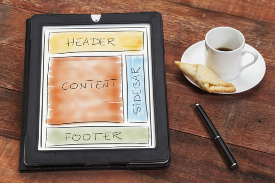
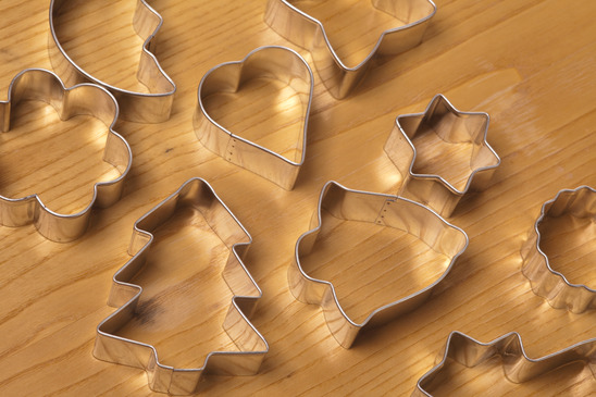
Before I begin, let us first know what a website template is. A website template, also known as a “theme” – are ready made designs that web designers use to “make fit” a new or existing web project. It serves as an envelope, or a “cookie cutter” – where you can produce an entire website with little or no effort. I’m sure there are plenty of advantages on using web templates, but that’s not the scope of this article. Instead, let me focus on it’s bad side. I’m not here to discourage people from using it, but to avoid the mistakes that come with it.
Here are some common errors that web designers commit when using templates:
Following the mob
Let us start with one of most obvious. following a trend. By following trends, you are basically giving up that right of freedom in creativity. Chances are, when following a trend – it has already been seen in a lot of places. Hence the word “trend”. Using a template may limit you from what you may actually have the ability to create.
You may have that power to create your own trend. Uniqueness is what I vote for and it’s what separates us from others in the market. Web designers should not depend on popular and trendy design templates.
Over customization
The second most common mistake that a web designers make in templates is too much customization. This ultimately defeats the purpose of templates. If you were to spend fifty hours on customizing a template – I think you’re better off starting from scratch.
The whole idea is to save time and effort. When you use a template on a website, all you need to do is slap on a logo and maybe some color changes. Maybe shift things here and there – but major alterations is definitely a no-no. I’ll say it again – customizing a template too much defies the purpose of a theme.
What to put here? What to put there?
This has been seen many times. You fall in love with a “magazine” layout template, usually one that has three columns – multiple containers. A scrolling feature section, with five or more articles. But your project simply doesn’t have any content.

Furthermore, it takes years of dedicated writing for a blog to fill up with categories, archives and sections to “fill up” those spaces in a magazine layout. “But it looks so good in the demo!. This brings me to my next point:
Templates are made to look good in the Demo
That’s right. If you haven’t yet noticed, designers ONLY use “Lorem Ipsum”. In other words, they have no problem stuffing their demo with complete junk because it doesn’t matter. All that matters is that it looks good in the demo.
Once you buy the theme – it doesn’t look the same!. That’s correct – now YOU have to come up with REAL stuff to put in that template. Or even worse, your client has to. Now you’re stuck with a nice skin – but EMPTY content. Now what?
Spark a Discussion?
I’m sure if you’ve been reading up to now that many of you agree and disagree. Like I’ve said in the beginning, I don’t discourage the use of web templates. I think they’re great! But I’ve seen these mistakes happen too many times. I’ve seen plenty of websites that has a recognizable template – customized too much beyond appreciation. I’ve seen a website – too many empty containers. And last but not the least, the typical “trendy” website – with that large slideshow – but no real substance in it’s content.
What do you think? Do you think templates are bad? Good? Let us know in the discussion below: