What You Need to Know About Mobile and Tablet Design
Your site can’t afford to lose this growing demographic
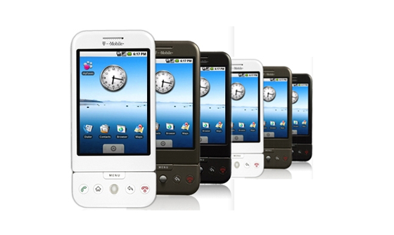
Whatever your business model, mobile and tablet users are a demographic you should target relentlessly. They spend more time online than the average user, they have more discretionary income, and their share of web traffic is growing every month; and a comfortable mobile interface is as vital to holding their interest as good content. It’s also pretty easy to create, if you consider these simple rules.
1. Start from mobile design
The easiest way to ensure that your site reaches all users intact is to start thinking about design from the most limited, constrained interface—and that means considering smartphones first. If you’re starting from scratch, this is also a good way to ensure efficient web design: you’ll see very naturally what is essential for your UI, and what is just window dressing or distraction.

Even if compatibility isn’t the primary challenge, your UI will benefit from the care and thought required to create a smooth mobile interface.
2. Give your links room to breathe
This is a two-fold problem, because not only are mobile and tablet screens smaller, but a fingertip is nowhere near as precise as a cursor—so users who want to click your links or comment boxes have to hit a smaller target, using a clumsier tool. Some sites have made the mistake of forcing mobile users to download an app to circumvent this problem, but most multitasking users rightly view standalone apps as a bigger headache than a lousy mobile interface.

Mozillas home page
It’s easy enough to create a separate mobile version of your site, but if that’s more investment than you want to put in, just consider mobile users as you design your UI. Take a look at Mozilla. They don’t have a dedicated mobile version for their site, but they don’t need one—their interface is open and breezy, no trouble for even the beefiest of butterfingers. Give everything on your site a healthy amount of empty space, especially around things you’d like users to click, and test it out on a tablet or phone to see which parts of your site are likely to trip up mobile users.
3. Design for 1000px
Ignoring this rule just creates (at least) one more step for users every time they visit a new page—zooming in to make your text readable and your links clickable. If you’re reading this from a phone or tablet, check out this egregious example: A Wiki of Ice and Fire, a site I’m constantly fumbling with from my tablet to find out what’s going on during Game of Thrones.

A wiki of fire and ice homepage
Navigation is just about impossible without zooming, even in landscape orientation, because it’s just too big. You don’t have to create a tablet-targeted version of your site, although that would solve the problem. Another way to go is adaptive CSS, which can change things up to fit your user’s platform and resolution.

4. Steer clear of plugins
The best way to keep your site accessible to the maximum number of mobile and tablet users is to stick to HTML and CSS, and avoid anything that requires additional players or plugins.
As handy as Flash can be, Apple doesn’t like it, and they hold 70% of the tablet market, and 30% of the smartphone market. By leaning on Flash, you don’t just sacrifice a huge swath of your potential mobile and tablet traffic—you lose the wealthiest sector of that traffic, the users who spend, and attract advertisers.
5. Accommodate portrait and landscape
The accelerometer can make browsing much more convenient for users if sites are designed correctly, but it can be a pain if they aren’t. Make sure that users can see the most important stuff on each page, regardless of the device’s orientation. The two most egregious ways this problem shows up is when the user flips to landscape orientation and only half the screen is visible, or when the text is tiny and illegible in portrait orientation.
6. Test-run your site on as many platforms as possible
The diversity of device resolution, format, and operating systems means that a one-size-fits-all approach is no longer practical. Before you go live, test your design from every device you can get your hands on—bumming your friends’ phones for ten minutes isn’t that hard, and it can save you a lot of time and complaints in the long run.
Make sure you test with both Android and iOS, both tablets and smartphones, as well as your notebook. The good thing about mobile design is that if something isn’t working right, you’ll know right away.

