How to Improve Your CRO on Your Website
While every step in your marketing process is important, conversion rate optimization (CRO) makes the difference between simply driving traffic to your site and funneling that traffic toward conversions. Knowing you need to improve your CRO and understanding how to do so are two different things. Most businesses are not happy with their conversion rates — only 22 percent are satisfied.
Cracking the code to great CRO takes time, determination and consistent effort. The last thing you want is to waste time trying things that don’t work. You’re probably already trying some A/B testing to see which elements draw visitors in and which are ineffective, but sometimes it’s hard to even know where to begin with website improvements. Fortunately, there are some specific steps you can take to improve your conversion rate.
Reduce Form Fields
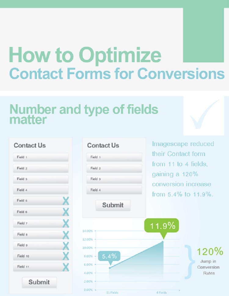
Your goal with conversions is at least partly to collect information. This allows you to contact the customer in the future and offer specials, discounts, free shipping or a friendly reminder to come back to your website. However, some sites get so excited at a warm prospect that they create a form with lots of fields for the site visitor to complete. The truth is that the visitor may grow weary of endless fields and bounce away. The average number of form fields is 11, but reducing that number to four increases conversions.

One good example of how effective reducing fields can be is illustrated by an experiment where Imagescape reduced its form entries from 11 to four. It saw a 120 percent increase in conversions. Conversions increased from 5.4 percent to 11.9 percent, essentially doubling the number the site originally had.
Create Individual Landing Pages
The typical website may target more than one user persona. For example, your business might attract young married couples, but couples getting ready to retire might visit as well. Because you can have more than one target audience, particularly as you grow, having more than one landing page helps you target each audience in a very specific way.
Offering different types of incentives and specials also creates the need for more than one landing page. About 48 percent of marketers indicate they start a new landing page for each marketing campaign. This also helps websites track specific CRO for each campaign. With separate landing pages for different deals, you can clearly see which pages are converting better than other pages.
Offer an Incentive
If you want visitors to give you their information, you need to offer them something valuable in return. As a whole, most people are tired of their inboxes being filled with email after email from companies trying to sell them something. For the site visitor to give you his or her name and email or pick up the telephone and call you, you are going to have to offer something they really want and feel is worth giving up this personal information for.

Haynes Plumbing does a really good job of offering some incentive for the customer to call for details. In the footer of its site, right next to the contact information, it offers a printable coupon for $65 off any water heater. There is also a link to view other coupons, such as a discount on a sump pump, new toilet or outside faucets. This is a great way to attract new customers. It’s a strong incentive for the consumer to phone them over the competition.
Use Stronger Headlines
The headlines you use on your landing page might be just as important as any other element that’s there. The headline has to be concise, to the point and strong enough to pull the visitor in and make him or her stay long enough to see what you have to offer.
Headlines can even help draw visitors to your site, and they are easy to test as far as how well they are working. You can easily swap out headlines and do some split testing on different ones.
Add a Video
Adding a video to your landing page can increase your conversions. A video can help users better understand who you are and what you have to offer. In fact, 72 percent of businesses report that adding video improved their overall conversion rate. In a highly competitive global market, every few percentage point improvements in conversions helps.
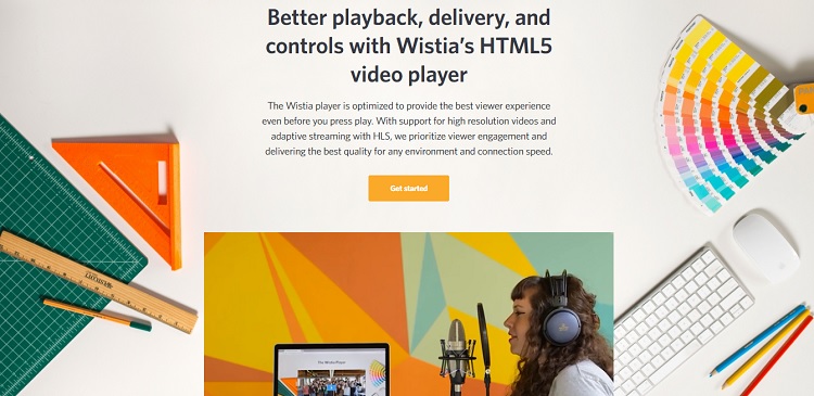
Take a look at Wistia’s landing page. It wants you to get started with its HTML 5 video player. Rather than spending paragraph after paragraph describing it, it just inserted a video right below the CTA button to show you Wistia in action. Make sure your video adds value to your landing page, enticing the visitor to get started or whatever call to action (CTA) you use.
Choose CTA Button Color Carefully
It isn’t easy to choose all the finer details of a landing page. You know you need a CTA button, but what color should you use and how does it tie into your overall conversion rate? The CTA button needs to stand out from your background, so you’ll want to ensure there is enough contrast between the two.
This is related: How a well designed CTA button can lead to conversions.
The best way to make your button stand out is to be sure the colors contrast a bit. You can look at complementary colors on the color wheel to get a sense of what color to use. Orange is opposite of blue on the color wheel, so you might use a blue background with a bright orange button. There is an entire science to figuring out the location, color, shape and text for CTA buttons, so try different styles and see what converts best for your website.
Testing, Testing
If you want fast results, you can easily start by changing up your CTA and form fields. Those are two simple changes that can have a big impact on your conversions. Then, keep tweaking and testing different elements of your landing pages to see what works best to convert your website visitors into contacts and customers.
