A collection of the Most Creative Online Stores and eCommerce Websites of 2013
You think Zappos and Apple made the cut? Think again. These are pretty awesome online stores.
This article will show you some of today’s most creative shops online. We have beautiful product pages, original category lists, responsive layouts, big carousels, alternate product views – one store even let’s you try on the products virtually. We have another shop that tells you how the product is made step by step. It seem that the sky is the limit when it comes to designing the eCommerce web sites of tomorrow.
Keep in mind that we primarily focused on user experience, overall design, originality as well as functionality. We guarantee that you will be inspired with our collection. Don’t forget to let us know what you think in the comments area after the article.
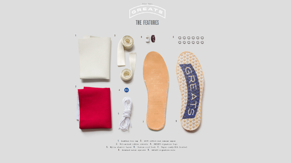
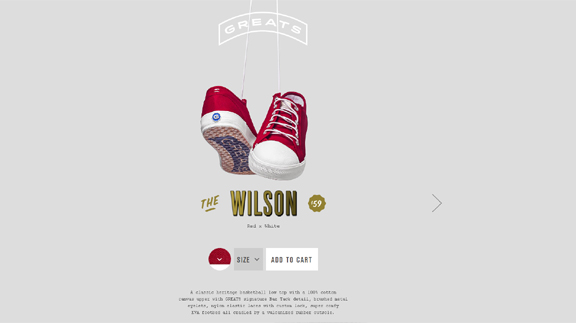
Greats Brand
Plenty of room to breathe. The Great Brand website features just a single product at a time – on the entire page, with plenty of information and surprises as you scroll down. Try rotating the pair of shoes by swiping it.
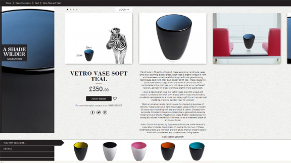
A Shade Wilder
Very unconventional, yet creative layout. Navigation is hidden until you click. Plenty of focus for each product, examples and showcase.
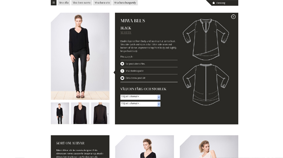
Ahlvar
Simple, flat and minimal. The models of the products follow the same style and look. Simple – but far from plain.
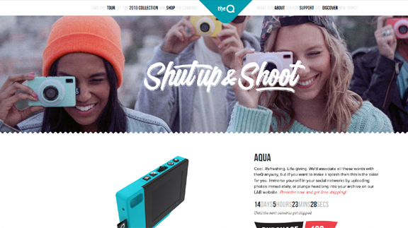
The Q Camera
Just one product, with plenty of options. Lots of icons, good product photography and high quality imagery. I especially like the parallax effect.
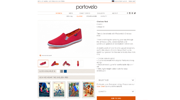
Portovelo
A more classic layout. Portovelo features clean sharp lines, good random fonts and beautiful imagery.
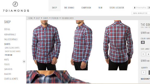
7 Diamonds.com
Beautiful full page width online store. All responsive – complete with animation as you re-size the screen. Good product images as well.
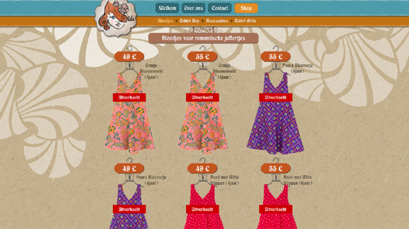
Olalateljee
Nice and crafty page elements. Plenty of background use, textures and styles. The product images must have taken a while to build because they had to be sliced with a pen tool – one at a time.
Wootten
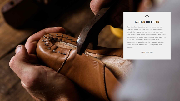
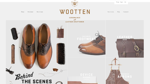
Again, plenty of information about the product. Scroll down the page and it will take you through the creation process of the product. Plenty of parallax effect, good typography and beautiful photography.
Ditto
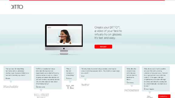
A must see website! A web cam is needed for the full experience. Automatically detects your face for a profile look of how the glasses would look on you.
Skinny Ties
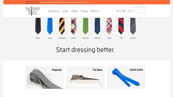
Guess what this website sells. Beautiful navigation system. Try hovering over the menu and you’re presented with plenty of visuals. The website is fully responsive as well.
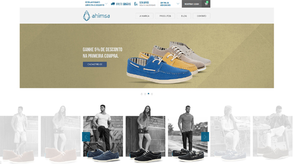
Ahimsa
Ahimsa’s store uses just about all the tricks of modern web design. Full width slideshow, parallax, carousels and more. Good images and product modeling.
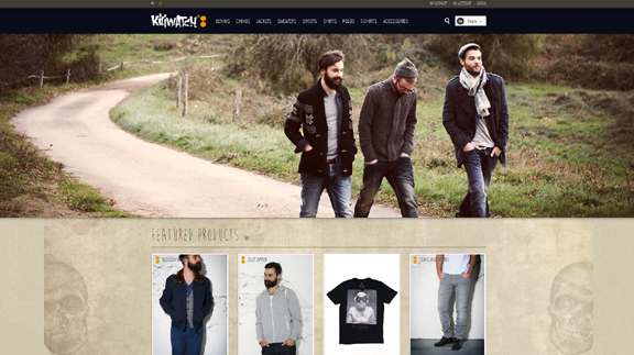
Kiliwatch
Nice overall style. Fonts are unique, photos are random and color scheme works well.
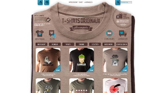
Avomarks
The large T-Shirt background is a bit much – but I’m sure plenty of viewers will enjoy it. Good menus, thumbnails and text.

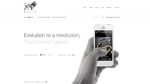
Mujjo
Really nice and modern. Effective use of large images. Good product photos and plenty of useful information and imagery on each product details. Scroll down and you’ll see what we mean.
Kipling
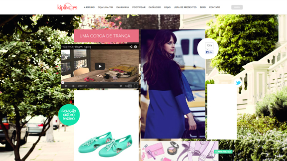
A little on the busy side when it comes to layout. Slow on load times – but once it’s there, its a real treat to the eye. Good effects and many surprises as you click and hover around.
Coucoushop
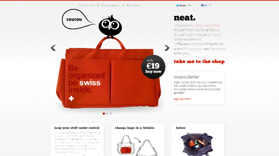
Nice hand drawn elements, illustrations and graphics. Beautiful grid style layout, typography and personality.
Hard Graft
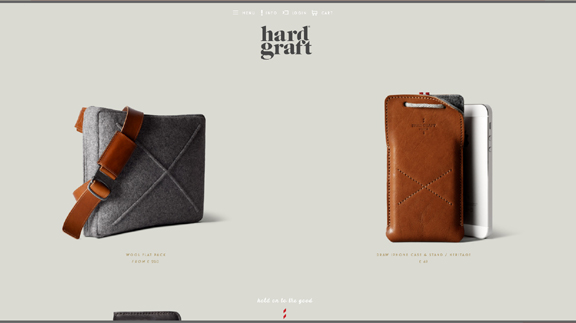
Nice large product images. Highly detailed especially on the single product pages. You really get the feel of the product per view.
Satorisan
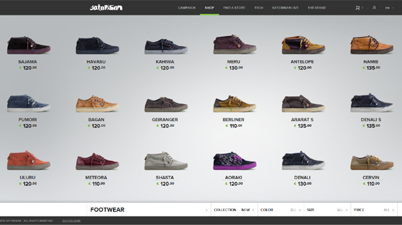
This website displays their products beautifully. Shoes in a nice grid that fill the whole span of the page. Hover and a litte zoom-in effect. The product details is especially nice.
Jun Duffy
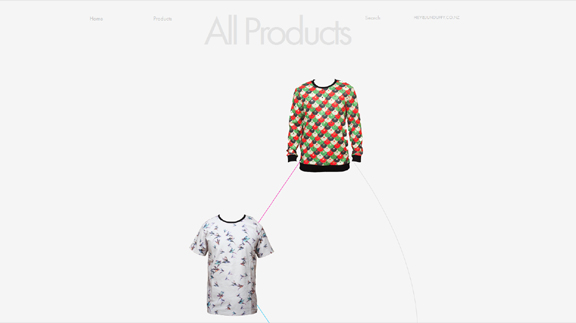
Highly creative. Every product page is presented well. No grid layout – more like a “connect the dots” type of layout.
Bellroy.com
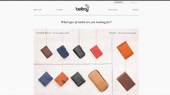
Good presentation and examples of wallets and its contents. Again, plenty of detail for each product: videos, illustration, photography – the works.
Minga Berlin
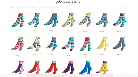
Awesome responsiveness of the site. Looks especially good and big on a desktop, scales well on a mobile phone. Modern and flat design elements.
Malberry Seeds
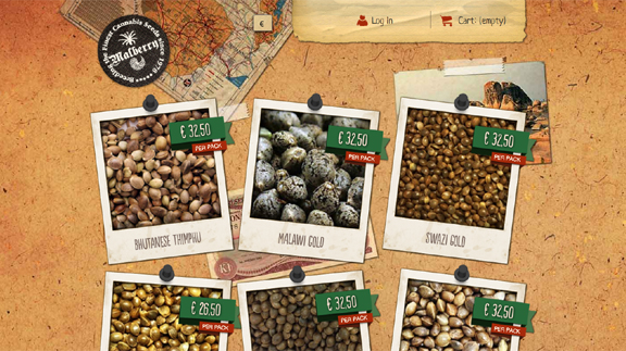
Who would’ve thought of selling marijuana seeds online. Plenty of graphic elements on the page including Polaroid style thumbnail backgrounds, paper and cork board textures. Try adding an item to your cart and see the nice effect.
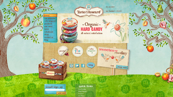
Torie and Howard
Very nice and plenty of personality. Good illustrations and use of color. Visualization effects work well – including the hover motions and background animations.
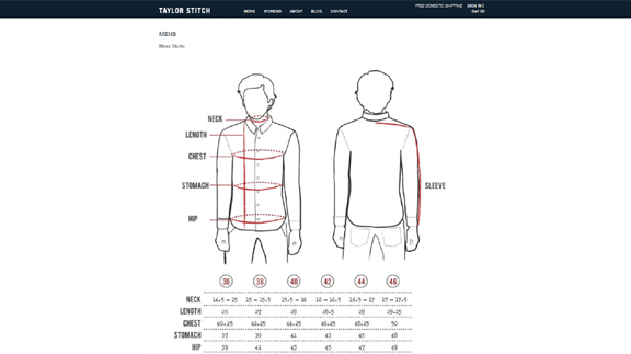
Taylor Stitch
Such a delight to look at this website. On top of the simple product presentation, high quality images and solid grid layout, this website has a good responsive technology. Try resizing your browser to small – see how the elements think for a minute and re-positions themselves. Awesome.
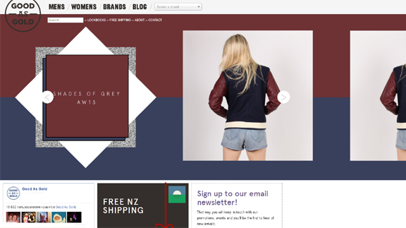
Good as Gold
So many surprises to web designers when browsing around this online store. A grid-based layout, however – one that is not common. Product presentation is good, typography and minimal graphic elements.
In Closing…
As you’ve seen from the list above, today’s stores online have definitely raised the bar. Shopping online have become even BETTER than real shopping. With faster ways to find stuff, accessibility from any device and extremely detailed product information – online shopping have been a real positive experience.
We hope you enjoyed our showcase of creative stores. Let us know which one is your favorite from the list. If you think there’s an store that didn’t make it, please leave a note below.
