Here are 8 Florist Websites for your Design Inspiration
When it comes to web design, there’s always the cream of the crop. Florist websites already give web designers great fodder to start with; after all, what’s more stunning than bouquets, whether they’re made of blooms or chocolates? I’ve scoured the web to find the most incredible florist web designs around the US. Consider it a little inspiration no matter what your business is.
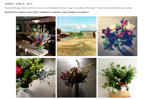
Fieldwork Flowers
Search for a local florist and you’ll notice all the sites look pretty similar. They don’t make the best use of the photos, they’re clearly a Blogger knockoff design and the chances of responsive design being utilized are slim to none. Enter Fieldwork Flowers, which looks more like a professional black and white photography studio than a florist. It’s elegance defined.
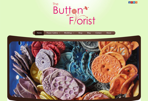
The Button Florist
Utilizing 2013 web trends such as sans-serif fonts and neutral colors, The Button Florist is everything a florist’s website should be, except the bouquets are made out of buttons. It’s simple and elegant and features incredible images that aren’t confined to thumbnails. In fact, with just the right amount of flash and plenty of white (green) space, it can be used as a model for any business. There’s no reason florists should pepper their homepage with images, because just a few of the right ones can draw in customers.
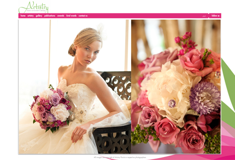
Artistry Florist
Besides the simplicity of this site, responsive design is clearly at the forefront with users being able to choose between the full flash site or the site designed for smartphones or tablets. For browsing purposes, I recommend grabbing the laptop and enjoying the beauty of the flash site. The photos are incredible and highlight the bouquets in the best way possible. Other florists can take some pointers on the importance of photography from this site.
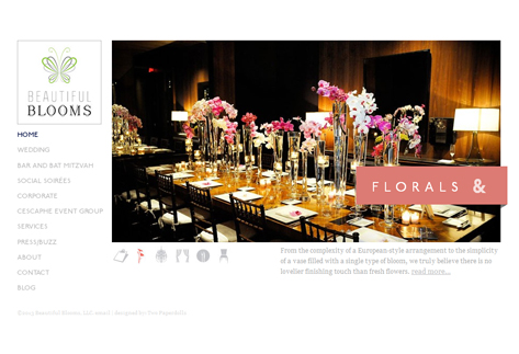
Beautiful Blooms
With just the right amount of pastel colors and white space, Beautiful Blooms clearly demonstrates knowledge of web design best practices and trends. The side menu allows users to browse easily, and it’s clear the site will fit any size screen from a lumbering PC to the smallest smartphone. It’s timeless, just like a florist should be. It also shows off the options with plenty of high-quality photography.
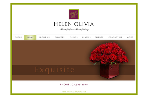
Helen Olivia
This site follows the same general formatting as Beautiful Blooms but incorporates a little more flash into the mix. The contact page is especially impressive, making it easy for customers to reach out and place orders. The font choice is a little more old-fashioned, but it works when combined with a contemporary layout and other design choices. It’s a style that would work for any florist.

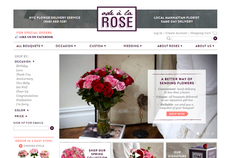
Ode A La Rose
Ode A La Rose uses a border on the top of the page that harnesses the use of dark purple and grey. The purple use throughout the website matches the theme, and continues to apply a sense of royalty on the page. The slideshow on the home page features photos and text that fit the theme and provide elegance to the eye.
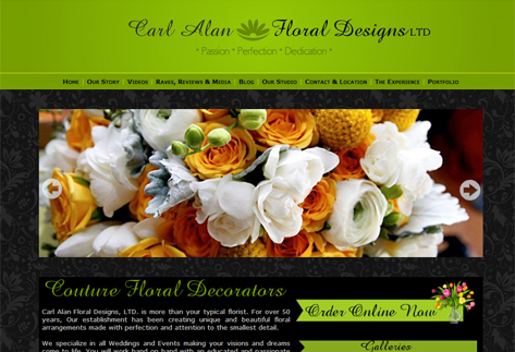
Carl Alan
While most florists embrace a white background to set their photos against, Carl Alan lays out a black posterior that accentuates the color and vibrancy of the arrangements. The array of photos across the website are crystal clear and match the color scheme on the page.
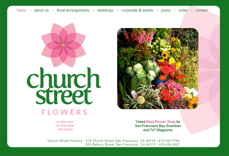
Church Street Flowers
With a logo that catches the eye, Church Street Flowers uses colors that invoke floral want in the audience. Pink and green together create a sense of floral satisfaction that pleases. Throughout the webpage, these colors are used to make a concise site.
Conclusion
If you manage a floral shop, image is everything for your business. Redesign a website to include best practices, responsive design and a few trends that will stick. You’ll get many more customers placing orders if you have the right look. What about you? Do you know of any florist websites that should be included in this list? Please leave your comments below.
