The Importance of Color Choice in Web Design
There are many theories about color and how it impacts us visually and emotionally. While no theory has been proven, I think we all can agree that colors do seem to have some effect on us psychologically. For example, I chose purple as my favorite color when I was one year old, and that color has been “my” color throughout life. Purple and I just go together like peanut butter and jelly. I’m sure you have a favorite color, too, and that it also has some sort of impact on your feelings.
In design, color choice is usually more about how well two or more colors look placed side by side and less about their emotional impact. However, designers can still use colors to convey a message or emotion to their customers, and it’s actually a very important marketing tool that should be used by web designers.
Deliberation is Key
We have all heard that red makes us feel irritated or bold and makes us think of danger or love, blue makes us feel tranquil and makes us think of water or clearness and yellow makes us feel happy or bright but can also make us have anxious thoughts. The truth is, though, different colors can mean different things for different people, but the various meanings are usually related. Hence, color choice in web design should be deliberate.
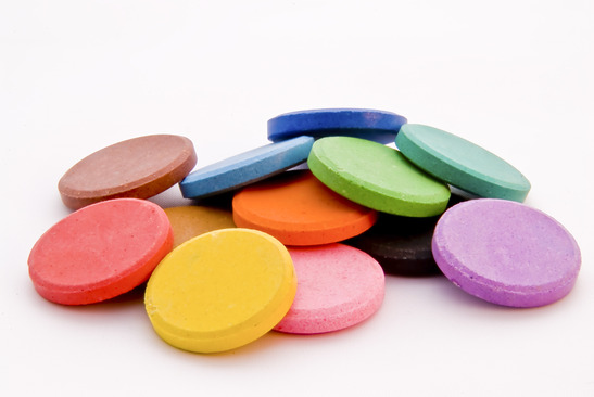
If you are designing for a website that sells baby clothing or toys, you want to use bright colors that encourage happiness and lightness. If you are designing a site for a high-end restaurant that only serves dinner, you want to choose deeply saturated colors that create thoughts of richness and luxury. In addition, whatever business you are creating a website for, make sure you only work with two to three colors that complement each other well. Otherwise, your page could end up looking a bit busy.
Work with Existing Palette
The examples are endless, in terms of choosing colors to represent the website’s purpose. Generally, it is fairly simple to decide which color hues and saturation represent the website well. If you are designing a site for a business that already uses a branded set of colors, you should use those colors in your design.
One great thing about web design is that you can create multiple versions of a page using different colors. This allows you to test the effects of each page by asking others for their opinion, ensuring that your end product accomplishes its intended goal.
Use External Tools
Believe it or not, there are plenty of online services that will help you determine the right color blends for your website. Although you shouldn’t rely heavily on such tools – it doesn’t hurt to get suggestions from them. You should always gain other insights on deciding on color schemes.

Examples of such websites are:
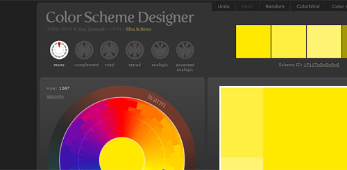
Color Scheme Designer
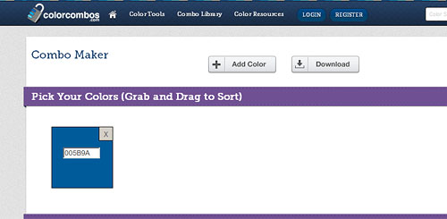
Color Combos
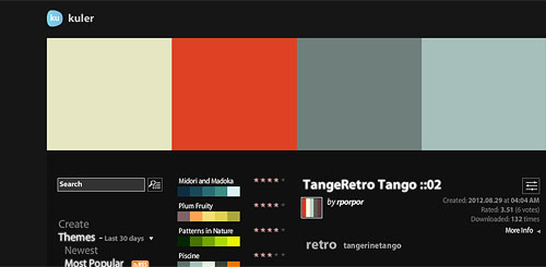
Kuler
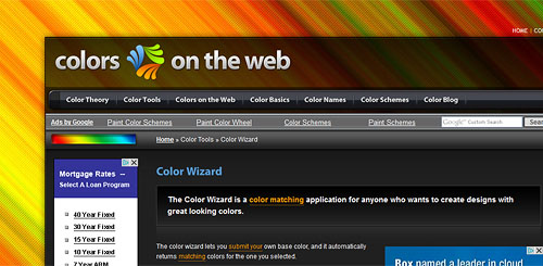
Colors on the Web
Color Theories
Finally, color is a powerful psychological medium that influences people a great deal. Color can encourage actions, soothe and calm emotions, send positive messages and can even make you angry. Given the right knowledge, the use of color theories can drive significant results to your designs.
A fantastic article that discusses color theories and usage inWeb Desing can be found in Smashing Magazine’s article: The Ultimate guide to Fantastic Color Usage. It also includes examples of web pages that incorporate certain color theories in their design.
To learn more about color theory and psychology, it is best to read a professionally written book. One great book that covers both color theory and how to master the technique of color mixing is Color by Betty Edwards. You can purchase this guide at any major book retailer both in-store and online.
