25 Awesome College Websites that will definitely WOW you!
Educational institutions, particularly universities and colleges have definitely increased the quality of their web pages. In terms of design, usability and accessibility -you will notice that the designers of these sites mean business. Either to publish the latest school news, attract new students, or simply to show some school pride, the following websites will leave you in awe (or wish you can attend a class or two).
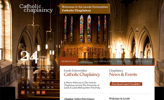
Leeds Universities Catholic Chaplaincy
This one came first for a reason. The beautiful background photography is simply stunning. Combined with awesome typography, transparent menus, and that excellent calendar in the sidebar – Leeds University is a real treat to the eye.
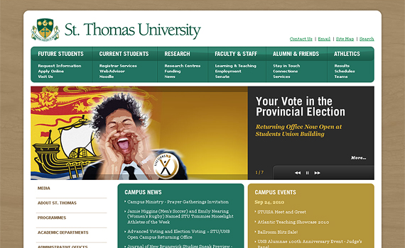
St. Thomas University
A more traditional form, St. Thomas University sports a nice wooden background, rounded corners and excellent containers within.
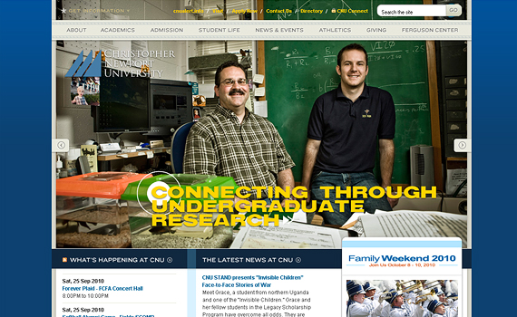
Christopher Newport University
If that large slideshow in the homepage doesn’t awe you… Also make sure you notice the crafty navigation menu and beautiful inner pages of Christopher Newport’s website.
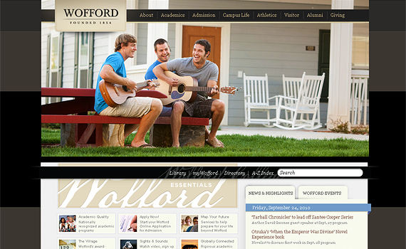
Wofford College
Pay attention to the finer details of this website. Check the headings, the logo, borders and background elements – very well done.
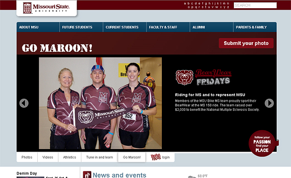
Missouri State University
Not to focus so much on visuals, but Missouri State’s website has so much activity going on. That slideshow in the homepage is dynamically updated daily with user submitted photos!
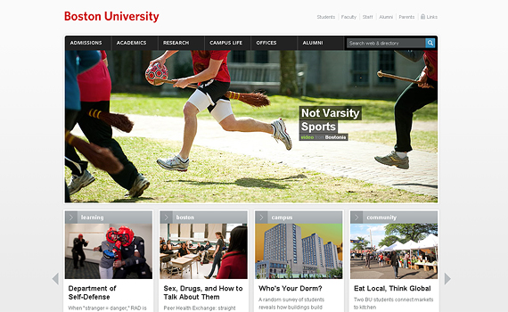
Boston University
Boston University’s website is very simple yet elegant and clean. The site itself is minimalistic, which enhances the content photography all the more. Note that the thumbs in the homepage( beneath the large image) is a javascript slider. Also, Try clicking the “Not Varsity Sports” link and it leads to an even more amazing page.
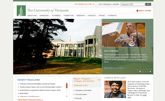
University of Vermont
University of Vermont’s website is more traditional, yet effective design. Good sharp edges, sufficient spacing and fine typography.
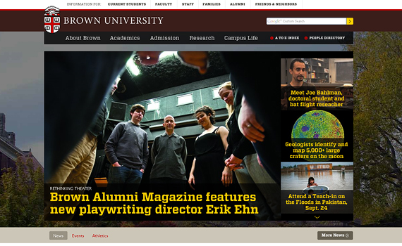
Brown University
Ahh, Big, Bold and Brown. I love the feature area in the homepage especially the chosen fonts – bright yellow blends beautifully with brown. The background may be a bit overkill, but it works I guess.
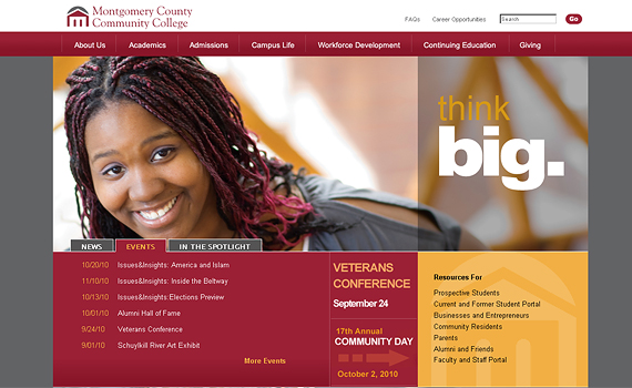
Montgomery Country Community College
A large rotating image in the homepage spans snuggly across your screen. It’s quite conventional, but works really well. Good tabbed containers, color schema and of course – photography.
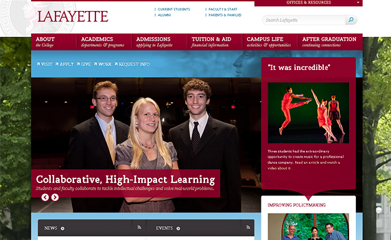
Lafayette College
This by far is my favorite from the list, the Lafayette website is filled with CSS 3 and javascript wonders that stuns developers like me. I especially like the switching content in the homepage – which drives the containers in the sidebar as well. Good job Lafayette!
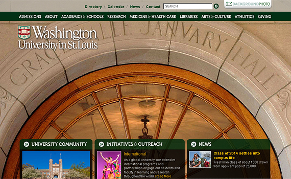
Washington University St. Louis
Another favorite! That large background photo of the school grounds can be viewed with a short story once clicked. A link to the archived background photos can be seen as well (the photos are swapped weekly). The rounded containers, excellent color schema, and effective font types all contribute to this awesome work of art.
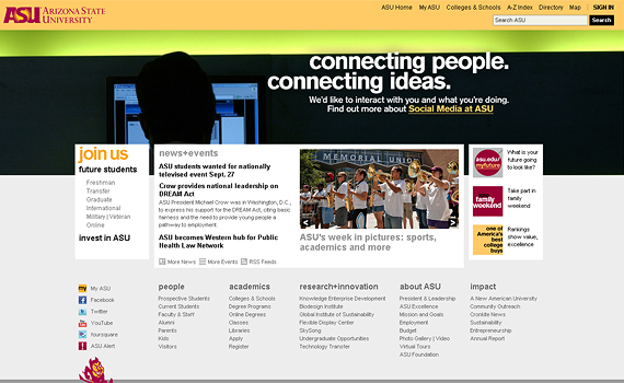
Arizona State University
There is something about Arizona State’s website that is pleasing to the eye – but I can’t quite pinpoint. There may be some misaligned elements, line spacing issues – minor things. But overall, it is still good work.
Lethbridge College
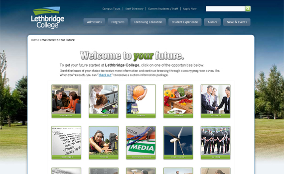
I like the blue / green combination – especially with the nature background which fades into white. The Lethbridge College is an example of a well crafted web design.
Eastern Kentucky University
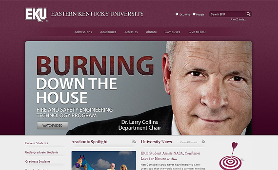
Sporting large headings, slogans and photos is always eye candy for me. School colors are well represented, nice fades and textures – EKU has done a good job on their website.
Nazareth College
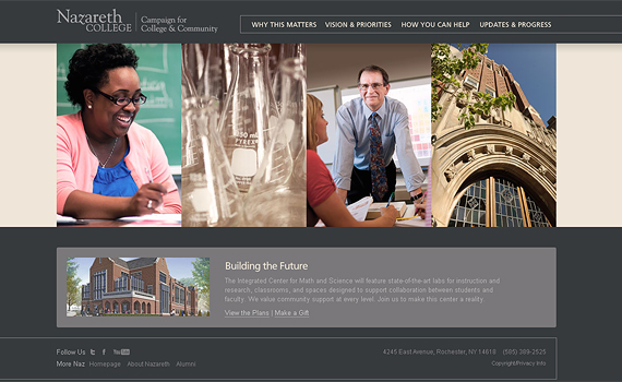
Simple and serene, sharp and clean – enough said.
Wayne State University – College of Education
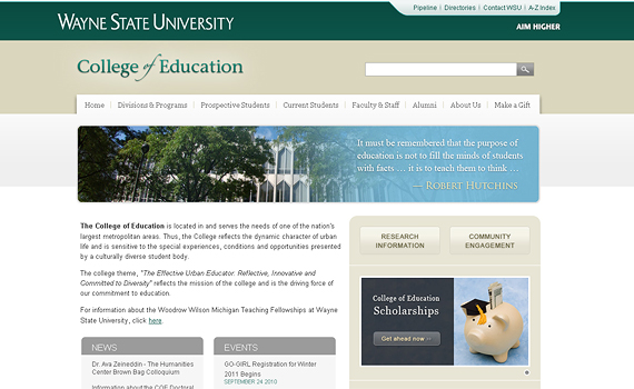
Color scheme is well planned, good use of fonts and soft shadows and gradients. Wayne State is a thumbs-up.
University of Southern California
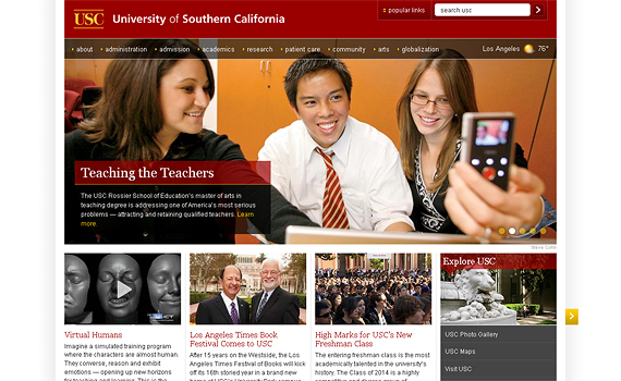
Another favorite: I say this because if I was to build an esteemed University’s website – it would be along the lines of USC’s fabulous design. Exceptional use of javascript scrollers, menus, and overall placement of content puts USC on top of my list.
Journalism & Tech Communication – Colorado State University
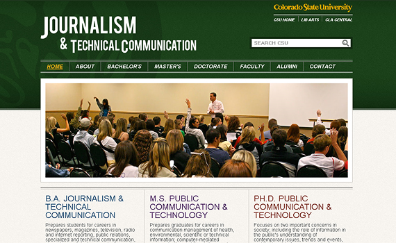
The Journalism page at Colorado State University gets the fundamentals of modern web design. Nice rotating slideshow in the center, bold headings, text treatment – the works.
Century College
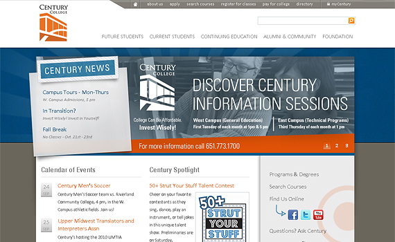
Definitely out of the ordinary, Century College’s design pops out of the crowd. Overalpping containers, shadows, beautiful fonts – very modern, sleek and unorthodoxed. I like it.
Eastern Washington University
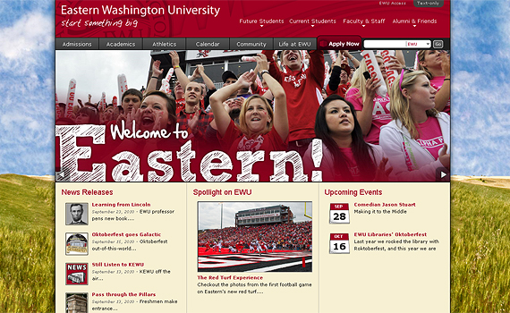
Vivid and Loud – Eastern Washington wants to be heard. Good execution of hand painted elements such as the background, welcome message, and icons. What I really liked is the footer of the pages (nice mini scrollers) – be sure to check it out.
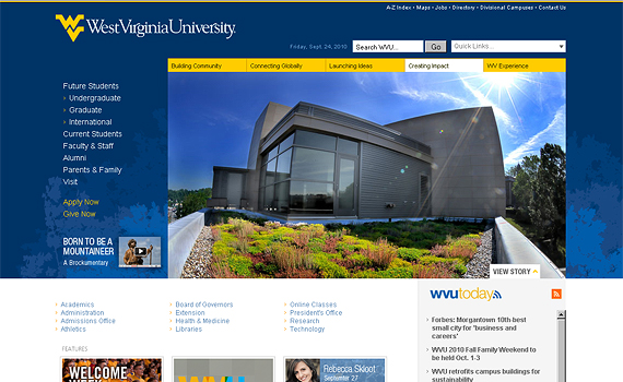
West Virginia University
Nice representation of school colors, good thumbnails. Notice the rotating image in the homepage when refreshed.
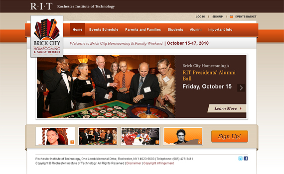
Rochester Institute of Technology – Brick City Homecoming
Beautiful. You can’t miss the coordination of colors, the nice folded elements, extraordinary font treatment and text shadows. Mad props to the designer of RIT.
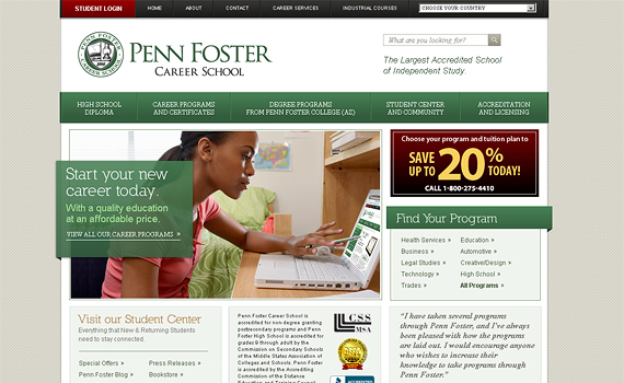
Penn Foster Career School
Subtle folds in some of the containers, very sophisticated, well executed. Penn Foster’s website is a symbol of prestige and high reputation. Masterfully designed.
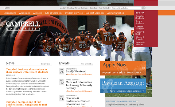
Campbell University
Campbell’s website is quite an eye pleaser – especially to web designers like me. It is a classic left justified page – which you don’t see often enough of, large rotating background images, excellent use of negative space as well as nice overlapping containers. I love it.
Stanford Center for Professional Development
Another sleek display, be sure to hover over the thumbnails in the featured flash image – notice the blurring effect in the background. Nicely done.
Conclusion
There you have it, 25 of the most attractive college websites I can grab. What do you think of them? Do you know of one that is not included in this list? Please let me know your thoughts in the comments section below:
Be sure to check out the following websites for further college web design inspiration:
- Edustyle.net – an online gallery for campus web design. Users submit and showcase their sites to get reviewed. Note that most of the sites in my list are from this excellent resource
- 25 of the Best Websites for Educational Institutions – Vandelay web design is a very well known website for web round ups such as this
- Top 11 Best Designed University Websites – Another roundup about the same topic. Pretty good websites in this list as well
