Showcase: 30 Beautiful websites created using Bootstrap
Free, easy to use and packed full of powerful features, Bootstrap is an amazing resource for web designers of all skill levels. With built in ready-made components such as buttons, navigation bars, progress bars and more, it is also a huge time saver.
Another huge draw is how easy it makes building a website with responsive design in mind. Thanks to Bootstrap, responsive design is no longer the preserve of advanced coders; we can all do it now. Created by Twitter, Bootstrap is open source and you can download it free via Github.
To show what is possible with Bootstrap and a little bit of imagination, here are 30 of the most beautiful websites that use Bootstrap to inspire you before you create your own awesome site.
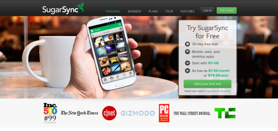
SugarSync
Having a user-friendly site is a must; no one wants to waste precious time trying to find their way around your site. SugarSync’s is extremely user-friendly thanks to big, clear fonts and carefully placed call-to-action buttons.
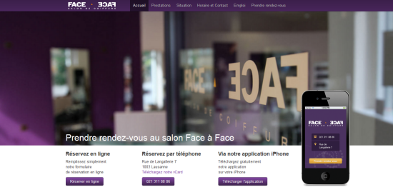
Face-A-Face
This French site looks great. It uses Parallax scrolling on the homepage and keeps the same background image throughout the page as you scroll down, which gives it a nice effect. Check it out!
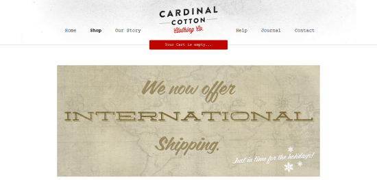
Cardinal Cotton
Cardinal Cotton is a simple yet fantastic t-shirt e-shop. Scroll down to see the featured items and click on the images to see more details.
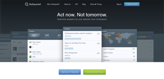
GoSquared
When you first enter the site, it may look pretty basic – a navigation menu at the top and a tagline with the description of the service. However, at a closer look you’ll see that they’re not using static images, but a couple of widgets that allow them to share stats.
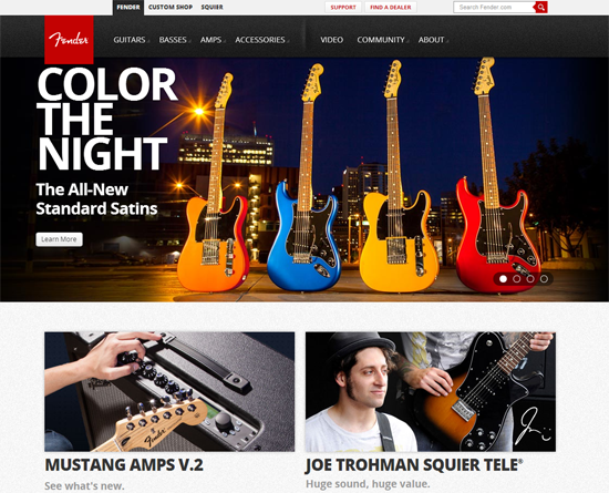
Fender
One of the leading guitar manufacturers in the world, Fender’s use of images makes it stand out from the crowd and give it some character. The big slider and call-to-action buttons makes it easy for visitors to navigate.
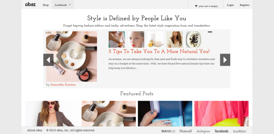
Obaz
Here’s an interesting design for a woman’s e-shop inspired by Pinterest. Obaz includes a slider at the top and, as you scroll down, you are presented with large images of featured posts that instantly draw your attention.
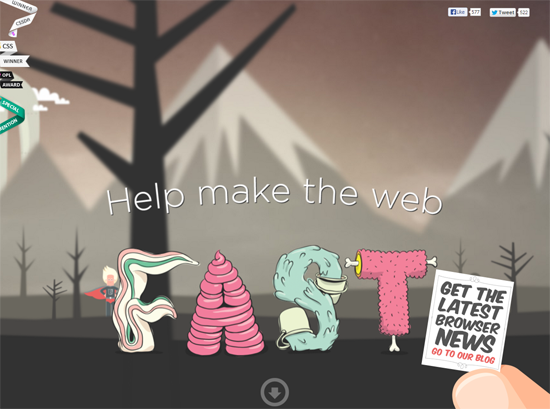
Browser Awareness Day
Winner of multiple awards, Browser Awareness Day is one page website that uses CSS for its slider effect. This site looks awesome and it’s also interactive with visitors being asked several questions as they scroll down.
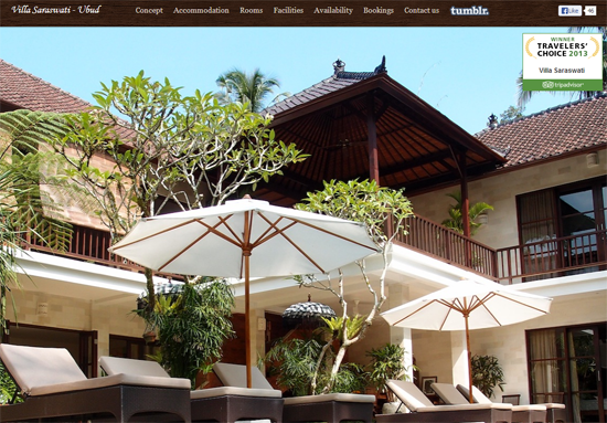
Villa Saraswati-Ubud
Even if you’re not planning a holiday, this site may just change your mind. It’s an elegant single-page site and as you scroll down you find more information and a gallery of the villa.
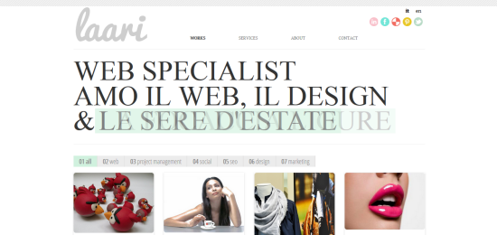
Laari
This is one seriously good-looking site! Using interactive tiles to showcase your work is an ingenious way to promote yourself. Clicking on the navigation numbered 1-7 enables a fantastic transition effect with tiles moving across the screen.
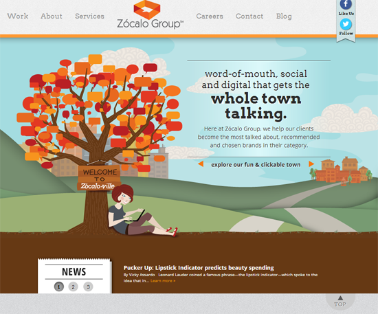
Zocalo Group
Marketing agency Zocalo Group have created a marvellous one page site with some very flashy CSS and JavaScript features for the homepage slider.
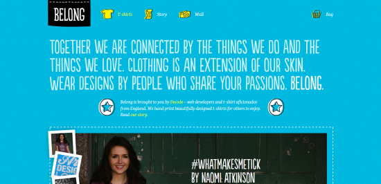
Belong
Here’s a cool online store that really stands out because it’s not crowded with lots of clothing items. Instead, they have used large images with the designers presenting the t-shirts. Click the “stamps” next to the images to see the collection of t-shirt designs.
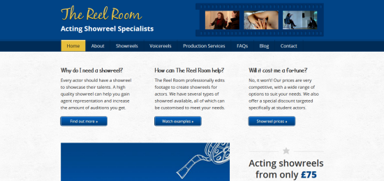
The Reel Room
The Reel Room creates show reels for actors and actresses. The design is rather simple but what’s cool about this site is the film-like image showcase in the top right corner of the homepage. It also includes a presentation video to show how it works.
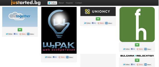
Justarted.bg
Inspired by Pinterest, juststarted.bg is a pinboard for start-ups from Bulgaria. You have the option to spread the word about each start-up included on the site by simply sharing it on various social sites. The site’s minimal design allows start-ups to shine, making it a great way to promote your business.
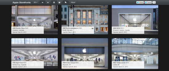
Apple Storefronts
Built using Google App Engine, Bootstrap with Bootswatch, and jQuery with Jail, Apple Storefronts showcases a gallery of all the Apple Stores available. The navigation drop-down menu at the top is simple yet effective and you can also filter stores by country or sort by oldest and newest. An attractive site and an interesting idea that was covered in Gizmodo and in Time Magazine.
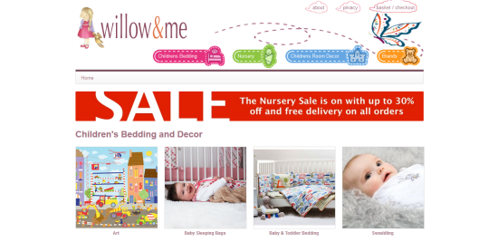
Willow & me
This is an online shop that sells interior decor for children’s rooms. The colourful design and kids themed menu gives the site personality.
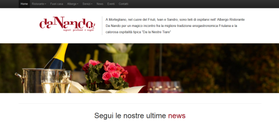
Da Nando
When you think Italian, you think elegant. The homepage is filled with images of delicious dishes and what gives it a nice touch is the zoom-in feature when you hover over the images.
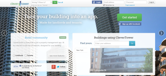
Clever Tower
The site’s design is as simple as it is attractive thanks to the striking images of buildings changing in the background. Clever Tower offers a web app for landlords who have a place to rent and tenants who are interesting in renting a flat and also want to find out who else is living in that building.
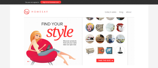
Homesav
Another e-shop, this minimalistic designed site uses large attractive images and has a great layout. The shop sells beautiful home furnishings to decorate your living space. The site’s theme is extremely stylish and visual so, beware, you might just end up buying something!
Brasil IMDT
When you visit the site of a creative agency, you know you’ll find a gorgeously designed website, and this one is no exception. The site uses a slider at the top presenting the agency and their services and as you scroll down, you can see a wonderfully designed gallery showcasing previous work.
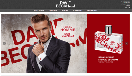
Beckham Fragrances
One of the most attractive sites on the list and created for one of the best looking guys on the planet, Beckham Fragrances uses some fancy parallax effects, a large slider and some great contrasting colours.
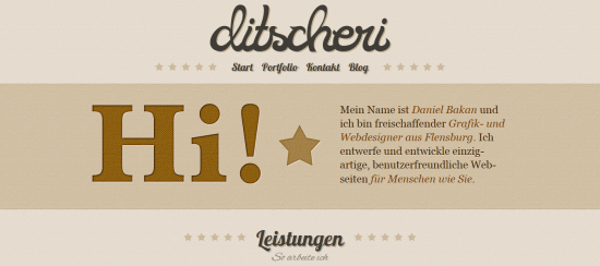
Ditscheri
Ditscheri is an online portfolio created by Daniel Bakan. The neutral colour scheme, fonts and the attractive graphic elements make this site stand out. If you’re looking to build your own site to showcase your work and your services, this site is bound to inspire you.
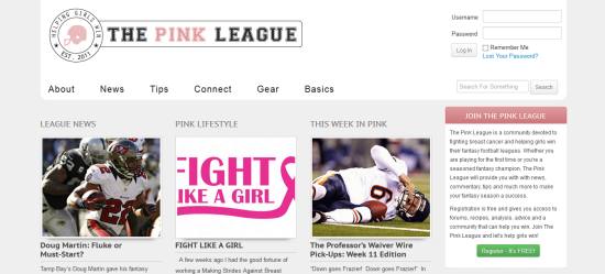
The Pink League
The Pink League is a community created to help fight breast cancer and also help girls win their fantasy football leagues. The site features a 3-column layout with soft colours which works perfectly for the cause.
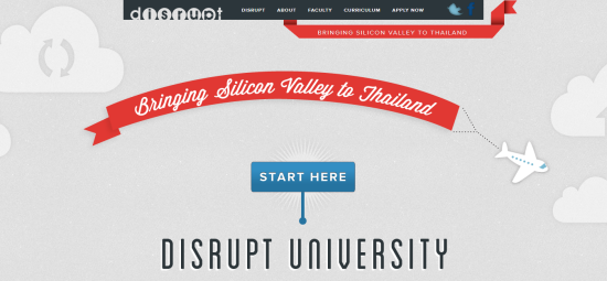
Disrupt University
The Disrupt University’s website is a fantastic one page design. Using parallax scrolling, users are asked questions that send them to the correct section for enhanced engagement. The graphic elements and colour scheme make the site extremely attractive.
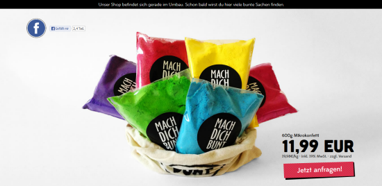
Holi Farben
This simple yet alluring single product page site certainly has a festive feel to it. With bright colours and a scrolling effect with gaps in the background revealing images of the people taking part in the festival Holi, Holi Farben is a one of the most striking sites created using Bootstrap.
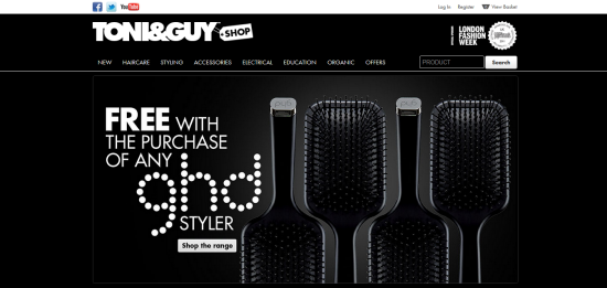
Toni & Guy Shop
UK based hairdressing company Toni & Guy have created this extremely stylish website using dark colours and contrasting whites. Gradients are used for images in the slider giving the site a very modern appearance.
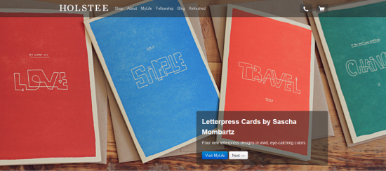
Holstee
Holstee is one of my favourite sites built with Twitter’s Bootstrap. A large attractive slider with call-to-action buttons and a simple navigation with no drop down, Holstee is simple, clean and very eye-catching.
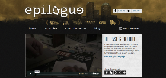
Epilogue
Epilogue is a TV series produced by students from the Dept. of Media, Journalism & Film at Missouri State University. Dark colours are used to portray Epilogue’s apocalyptic theme which is complemented by some nice roll over effects too.
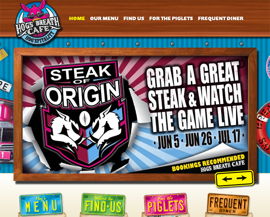
Hog’s Breath Cafe
Another site that uses bright colours, Hog’s Breath, an Australian café, couldn’t be any more fun. The graphic elements used in the navigation below the slider in the form of vehicle registration plates add a nice touch.
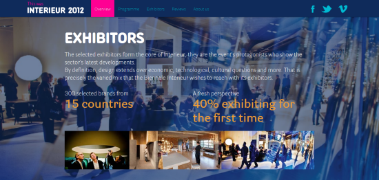
Interieur
One of the best looking sites on the list, Interieur is a leading biannual design event. Navigating through the site couldn’t be any simpler, just use the left and right arrows. The site’s design is stunning and it’s exactly what you’d expect considering they’re covering a design event.
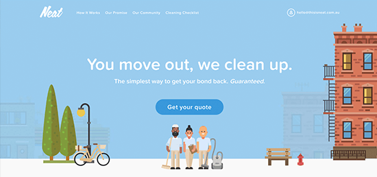
This is Neat
This Sydney end of lease cleaning company uses illustrated images to introduce their playful branding. Check out their quote form to see how animation can be used to create a better user experience.
Over to you
So what do you think? Are there other web sites created with Bootstrap that deserves to be on this list? Go ahead and share them with us below and we will create another list for you! Don’t forget about this awesome collection at Themeforest for Bootstrap!
