20 Amazing Educational Institution Websites for your Inspiration
Educational institutions like schools, colleges and universities are all aware of the role their websites play in attracting new applicants and maintaining their reputation. Websites are not only excellent for marketing, but communication as well – institutions can use them to keep in touch with students, their parents and even donors. Here’s a collection of 20 amazing educational websites that will inspire you in your own work.
California Institute of Technology
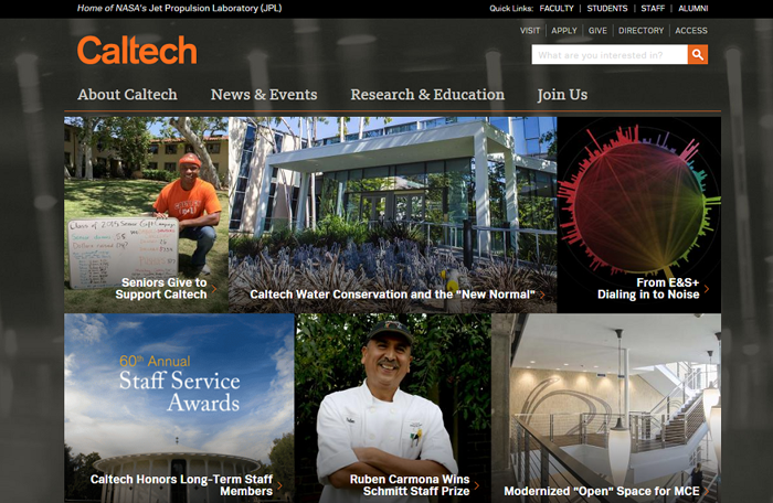
Caltech website is mostly about visuals – an eye-catching design matched with simple navigation ensures the website’s high usability and understandable UI. It’s pretty amazing that such a vast institution like Caltech was able to squeeze all its subpages into just 4 different categories that help users to understand the general structure of the website. Caltech took excellent care of its social media buttons as well – you’ll see a moving frame at the bottom of the page with links to all its social profiles. Placing your cursor over it, you’ll get a Flickr feed showing photos of the campus.
University of Amsterdam
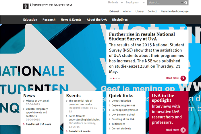
Large photos in the background and attractive card design in the foreground make this design really attractive. The navigation is spot on – users can choose from 5 different categories and easily get all basic information by clicking on links at the bottom of the page. The search bar is really smart because it allows users to instantly choose their search category from ‘Subject’ or ‘Employee’ – no time lost browsing a long list of unpractical entries.
Open Universities
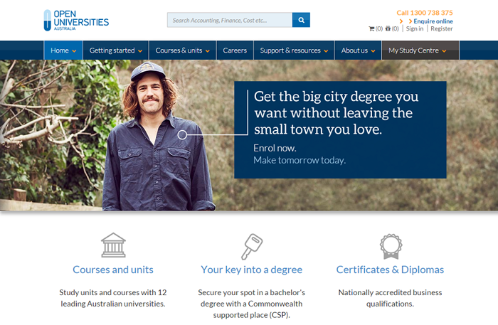
Clear layout, blue accents and a simple, but powerful message make online education a very attractive alternative to traditional schooling. The website offers a selection of understandable navigation buttons that are clearly aimed at the target audience of this institution – students who are interested in online education. The very bottom of the page offers an intelligible sitemap, which really helps to make sense of the page.
Virginia Tech
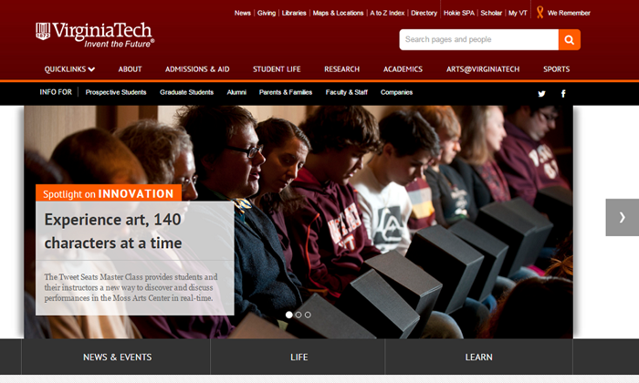
This is a fun and intelligible design that boasts seriously easy navigation, showing top news in its moving header. The Quicklinks feature is really smart and allows different groups of users to quickly get all information they need. The website features a smart search engine, which categorizes search results in several different groups, helping users to easily find people or specific pages.
Stevenson University
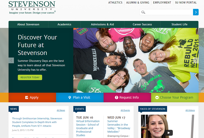
This website makes excellent use of color – even though we’re confronted with a relatively large palette, it looks orderly and helps users to make sense of the website. The UI is clearly addressed to prospective students – practically all navigation buttons lead to specific information-rich pages that help in the application process or give further information about the university. The website has a very clear structure, which is an accomplishment given the amount of featured colors, photos and videos.
Rhode Island School of Design
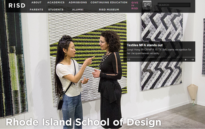
With an amazing range of large background images and a transparent dashboard on top of the page, this website is simply bound to attract all kinds of creative minds. With everything contained in a single page, the website offers a very simple and clear navigation. It also presents the institution as an exciting and lively place to study – just check the bottom cards that feature a calendar of upcoming events, the section of exhibitions and school news.
University of Chicago
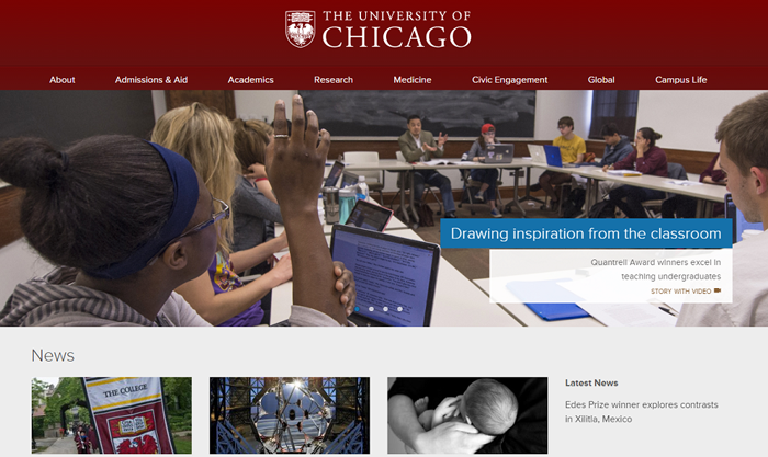
This website boasts a clear layout that manages to pack lots of information on one page. Top events and news are displayed in a feature wrap with some high-quality photos. The website is slightly more complex, but the quicklinks section is of great help in navigation. Users will be able to quickly browse the news and events section of the page, and watch some introductory videos from the selection offered on the main page.
Oberlin College
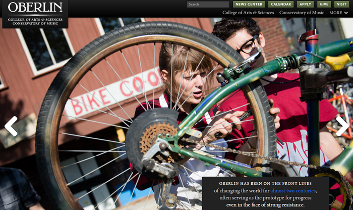
Another mecca of the creatives, Oberlin College chose to build their website placing a large image in the background and emphasizing its mission in a black box that instantly draws users’ attention. A real treat for the eyes. To see a larger list of links to academic subjects offered at the institution, it’s enough to click ‘More’ button in the navigation block. Using the arrows placed on the background image, users will get a selection of different pictures portraying the institution’s values.
Speaking of large images, you might be interested in this post: The Ultimate Guide on Creating Large Images for your website.
Mendoza College of Business
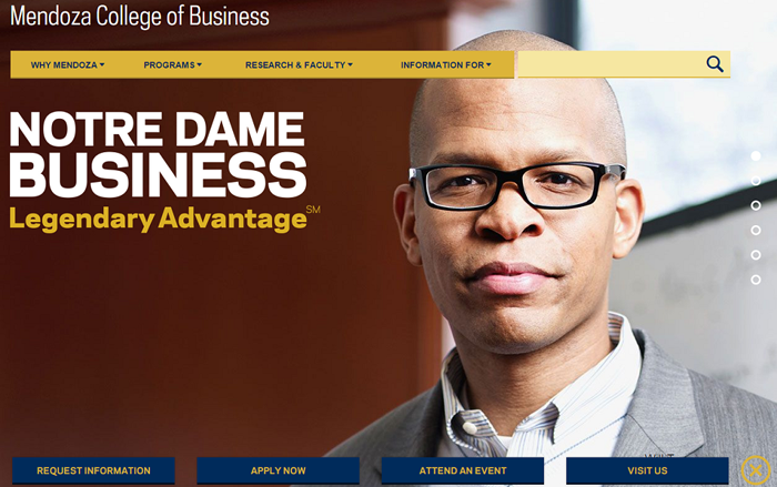
Another website relying on large background images, Mendoza College of Business opted for a limited color range made up of hues of blue and yellow. The scrolling design offers easy access to the content of the website, offering intuitive navigation by means of well-organized buttons. The events section of the website features a really smart visual design, helping users to see which events they’re able to attend at the institution.
The Cooper Union
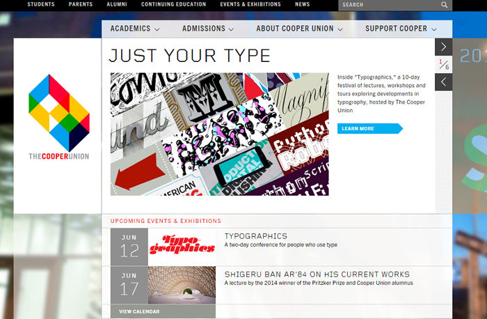
This is a really beautiful and interactive website, where the institutions’ logo is constantly in motion and makes up for a really attractive element on the page. A smart navigation bar on top helps to make this design even more attractive. The clear structure helps users to easily browse information of one of the institution’s four schools – the bottom bar features a host of practical data and social media buttons to easily find and follow the institution’s social profiles.
Deakin University
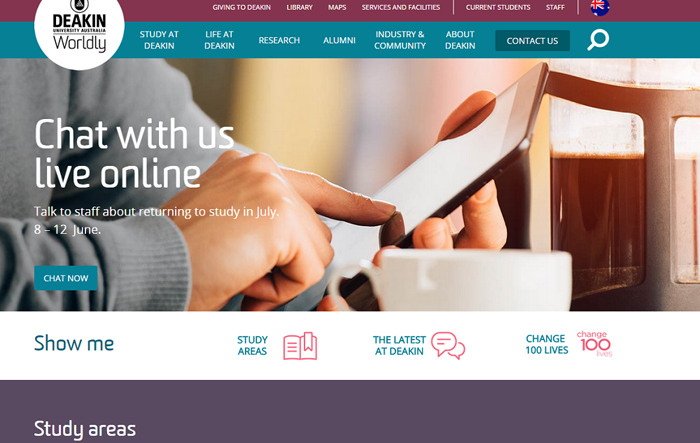
A simple color palette and easy pictorial navigation are combined here in a beautiful scrolling design, which renders the structure of this website easily understandable. The news section is a combination of smart card design and attractive visuals. The page also features a section dedicated to potential donors and a practical info section at the bottom with links to relevant social media.
Queen Anne’s School
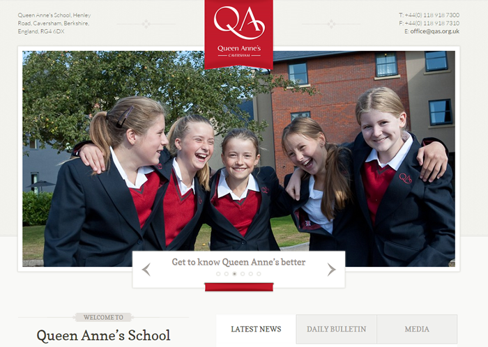
This British school opted for a bright background, clear layout and a selection of attractive visual materials to make browsing its offer a real treat for the eyes. It features a smart box with the latest news, event calendar and links to multimedia content helping users to gain a quick understanding of what’s happening at the institution. It also features two effective call-to-action buttons to help parents in gaining more relevant information.
Davidson College
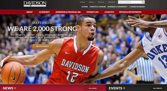
Dark hues in combination with red, intelligible layout and high-quality photography – who would want more? This website uses contrasting colors to build a really clear page structure. The bottom of the page features a host of links to practical information, social media buttons and three call-to-action buttons that motivate users to get to know Davidson College better.
Thinking of designing your College’s WordPress site? Here is a great theme from Themeforest that is built specifically for that purpose.
Biola Undergrad
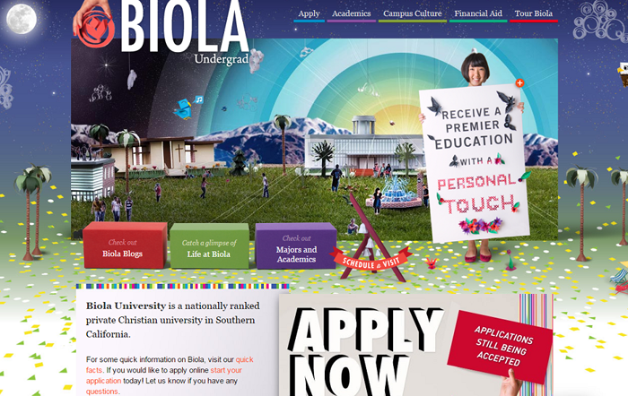
Easily the most colorful and visually attractive education website out there. Its complex visual design doesn’t get in the way of great navigation – users can choose from 5 different categories, including an online tour of Biola. The bottom of the page includes links to its social media profiles and the latest news features about Biola.
AUC School of Medicine
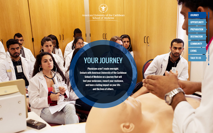
Large background images, top-notch quality and scrolling design make this website look professional and really attractive. A smart navigation bar located on the right side of the page helps users to easily browse different categories and find information they need. All these pages can also be accessed by simply scrolling down.
Florida International University
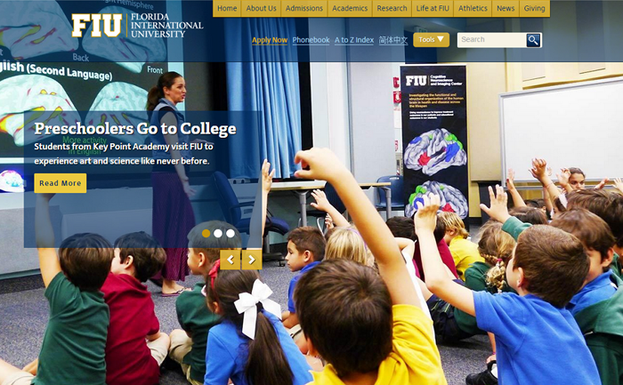
A bit of scrolling, a few high-quality images and you got yourself a really great design. The top yellow bar with the most important links is easily visible and one look at the page is enough to understand its structure. Scrolling down, users see latest events in the institution’s calendar, a selection of news features and a comprehensive ‘About’ section.
Johns Hopkins University
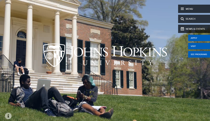
The only website out there that dares to use a design element that is bound to explode in web design this year – lightweight background videos. Three category buttons and three call-to-action buttons located on the right side make up for the entire system of navigation, which works just perfectly. Scrolling down, users will get an insight into the institution by means of various engaging graphic designs to finally arrive at a simple Explore search bar and a section delineating the structure of the university.
Langara
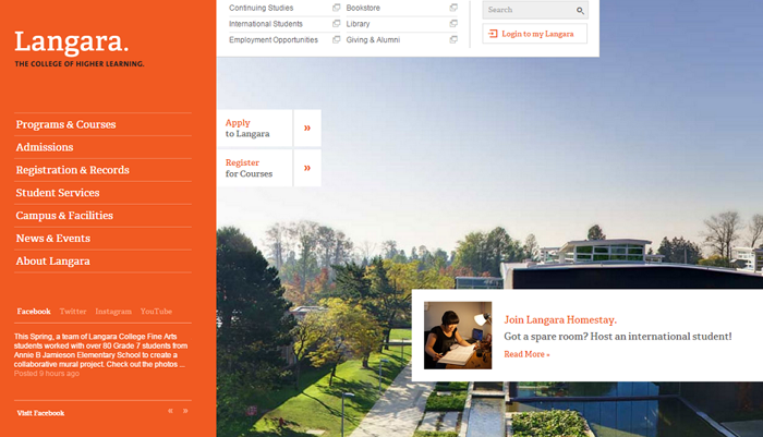
Simple orange navigation bar on your left and compelling visuals on your right – a really nice setup. The left-side menu features links to the institution’s social media accounts and offers recent feed from each profile – including YouTube and Instagram. The placement of Apply and Register call-to-action buttons is spot on.
Regent College
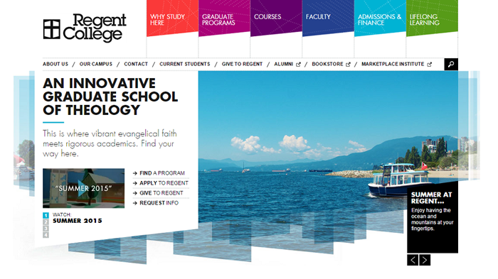
It feels innovative, fresh and technological – simple design and excellent use of color. Regent College built a slightly more complex website, which bases its structure the contrasting colors – especially black and white. A neat search bar is easy to use and offers a great help in finding specific information.
Cornell University
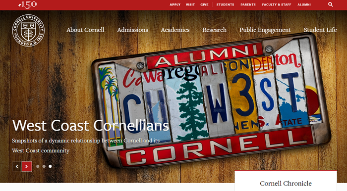
The best use of card design in education context, Cornell ensured that their website uses all the hottest web design trends to make up a well-integrated and informative structure. Features recent feed from Cornell’s social networks, and scrolling down users can access a selection of university news structured in a beautiful card design.
It’s clear that educational institutions are investing in their websites and will soon surprise us with even more daring and innovative web designs.
Don’t forget to check out our older post 25 College Websites that will Wow you.