How a well designed CTA Bar can lead to conversions
You’ve likely heard of a call to action (CTA). This can be a button or text that invites the consumer to take some sort of action. However, the CTA Bar is a bit of a different animal. The general idea of inviting the visitor to take action is the same, but the bar is located in a widget area, such as the header, footer or sidebar.
There are many locations and ways you can utilize a CTA bar to convert visitors into lifelong customers. Looking at the specific reasons some CTAs are more successful than others can help you figure out what changes to implement within your own CTA Bars.
1. Above the Fold
Around 90 percent of visitors who look at the headline on your landing page also take a look at your CTA copy. That means you need to put just as much work into crafting the best CTA possible as you do into crafting headlines that grab a reader’s attention.
A CTA bar can be located near your headline to really grab the reader as he or she enters your site. By placing the CTA above the fold of your page — near the top — you can maximize how many visitors see and potentially act upon the CTA.
On a similar note, read “Micro-interactions in UI“.
One good example of a call to action above the fold is Netflix. Its primary goal is to get people to sign up for its video streaming service. It makes sense, then, that when you land on their front page, there is a CTA button that says “Join Free for a Month.”
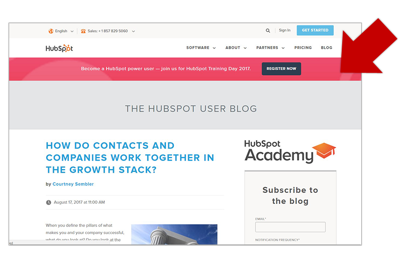
However, if you’re looking for an example of a CTA bar, then look no further than HubSpot. HubSpot places its call to action bar very strategically near the top of the page on customer pages. It is a bar that goes across the width of the page in a vivid pink that grabs the visitor’s attention and the CTA button is within the bar. It says people who want to join them for training day should “Register Now.”
2. Color Matters
CTAs are a vital part of gathering leads for your business, but using orange over, say, black can increase your conversion rate by as much as 32 percent. Red is also a popular color for CTAs. Choose your color carefully, making sure it complements your site’s design, but stands out at the same time.
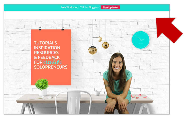
Design Your Own Blog website utilizes a top call to action bar quite effectively by adding a pop of red with the actual CTA button, set on a pretty blue bar that matches the overall look of the site. One key to making sure your button will blend is taking the time to look at a color wall and ensuring the colors are complementary — across from one another — on the color wheel. This will also create some nice contrast for the page and draw even more attention to your CTA.
3. Include Social Media
Your CTA bar is a good opportunity to include links to your social media accounts. Your followers on social media will get an update every time you post something new. If you plan to reach younger customers, especially the 18-29 crowd, then social media marketing becomes even more important. This is because 90 percent of people 18-29 use social media and a third of them say it’s their favorite way to communicate with businesses.
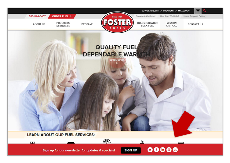
Social media buttons can be fairly small, but should be easy to find. Foster Fuels accomplishes this with its bottom CTA bar. Note how the call to action is focused on getting visitors to sign up for the newsletters for updates, but the social media buttons are included right next to the CTA, showing that users can follow the company in a variety of places. The choice of white against the red bar offers heavy contrast that draws the eye.
4. Make your CTA Bar Prominent
If you plan to host a giveaway to encourage visitors to sign up for a newsletter, make that bar a bit bigger than people are used to seeing out of a navigational-type bar. You can also use the same concept with any type of service you provide to site visitors. This will naturally draw the eye to the bigger area that is set off and draw attention to the giveaway CTA.
While a number of designers argue that a larger call to action draws attention, studies have shown that a large button actually causes a 10 percent conversion rate drop. Creating a larger CTA bar may be the perfect solution to draw the eye and offer information, but keep the actual CTA button a bit smaller.
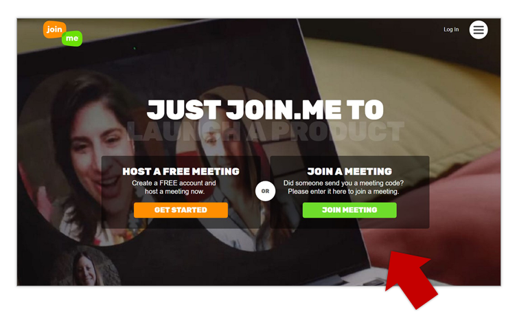
Take a look at Join.me for an example of using a larger block to create a strong CTA. The box on Join.me is a bit darker, but blends well with the rest of the background. The text on top is white, which contrasts nicely. What really draws the eye is the pop of orange and green that gives you two CTA options of “Get Started” or “Join Meeting.”
5. Moving CTAs
If you really want to capture the reader’s attention, you can make the CTA follow them wherever they go on your page. You can do this with a floating bar, or you can create more than one CTA for the page.
The more often you put your brand in front of a consumer, the more likely he is to buy your product, especially if those experiences are positive. There is an old rule of marketing called the Rule of Seven that states the consumer must hear about the product seven or more times before they buy. It makes sense that you also should get your CTA in front of the consumer to really grab her attention.
It can’t hurt, unless you make it so annoying that she bounces away from your site, such as with too many annoying popups. One example of a site that uses CTAs strategically is Influenster. It places a small-button CTA at the top of its site, but after about 30 seconds, there is a bar CTA that slides in across the bottom and encourages you to sign up for samples and product reviews.
Creating a powerful CTA can be a real challenge. Be sure to split-test different versions, trying out placements and creating buttons in a variety of colors. This will allow you to see which ones perform best for your particular site visitors.