Practical Designing Tips For Mobile Friendly Email Templates
The soaring trend of mobile use for viewing email templates has created the requirement of developing mobile friendly email templates. The current stats suggest that nearly 53% of email templates are opened on the mobile devices with users checking their email now and then. More to it, smartphone usage is sky-rocketing and it is the best time for marketers to capitalize on this aspect. For the same, marketers require designing templates that are mobile-friendly.

Technically, mobile-friendly templates are those that scale well over a number of devices irrespective of their sizes. It ensures a great look of the email templates regardless of where clients are reading them. A marketer’s job with a mobile friendly email template is not only getting the template read by the clients but also to offer them an excellent experience.
With this point in the mind, there are a number of techniques that are already practiced by marketers to make their templates worth for the readers. Here is a brief on all these practices.
Be Concise With The Design And The Content
Remaining concise with the design and the content of the template is among the best practices that must be kept in mind while designing the templates. It gets extremely important to clarify the message you wish to deliver to your readers.
In addition, the design must be a simple piece of wok that establishes the right connection with the content. A great design can also be the reason for some readers to consider templates and read the same till the end. On that note, here are simple techniques you can incorporate in you visual designs.
40 Characters or less for the Subject Line
The biggest problem with mobile friendly email templates is the concise space for displaying the subject line. The email clients in the majority will not display the complete subject line if it is a long piece of writing. Since the subject line is the gist of the templates as a whole, it must be placed precisely over the top as the heading.
The solution is to keep the subject line short. The rule of thumb is 40 characters or less. It is also good to position the most important phrase of the template within 40 characters.
Consider Single Column Templates
Multiple column templates over mobile devices look condensed and users face difficulty while navigating to other sections. It is sure to create a bad impression on the readers and they may abandon the template. In the worst scenario, readers might unsubscribe from the services.
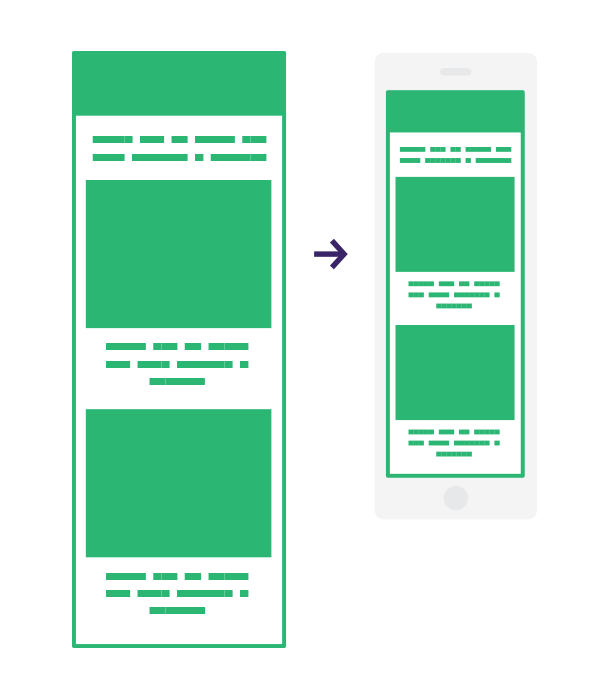
The best way to remain on the safe side is to design single column templates. Such templates make emails cross-device compatible no matter of whatever email clients the templates are viewed on.
Maximum width should be 600 Pixels
It is a nice trick to keep the email templates’ width under 600 pixels as users won’t face problem while viewing the templates that are formatted for computers with larger screens. Setting the width attribute in the email templates’ table tag to 600 pixels or using CSS width property to make this adjustment could yield positive results.
It is always good to remain on the safer side by using the tricks that are already in practice.
Appropriate Font Size
The ideal font size that is easy to read on the mobile device is 13 or 14 pixels. This font size makes the email template readable on different mobile screens. You can also choose to include larger font sizes.
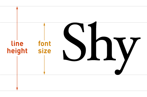
With slightly larger font sizes, the template can easily be viewed on both mobile and desktop screens.
Incorporate An Engaging Call To Action
Call to actions prompt users to do something. This “something” generally refers to clicking a button that leads the subscribers down the path where service providers would like their users to land ultimately.
The call to action should be large enough to effortlessly help the clients tap the same on the mobile screens. If the users would require tapping the button more than once, there are fair chances they may not bother to even view it.
It’s a NO For Stacking Links
Stacking links may create navigational problems. Including stacking links within a paragraph may accidentally lead clicking on the wrong link. In case, it is really important to stack different links with the para, ensure previewing the same to offer optimal experience to the users.
The ultimate aim with designing such email templates is to offer exceptional experience to the users that is only possible when things have been positioned at the right place.
You might also want to read Psychology based copy-writing techniques for your pages.
The Bottom Line!
Think how would you feel if you fall victim to a poorly designed email template even if it has arrived from a source that has always engaged you with its content. You are sure not to consider the template. It is the same feel your subscribers would go through if they are sent a badly designed email template.
Therefore, do not let such mistakes ruin your ever growing clients base. Consider all the practices that are mentioned here for increasing the clients’ interest into your business.