7 Ways to Design Better E-Commerce Stores in 2017
More consumers are shifting their spending online than ever before.
Online shopping is certainly appealing as it offers numerous advantages. All it takes is a simple search and a few clicks, and you could have the latest products sent right to your doorstep without having to drive down to the store. Or better yet you could do your shopping right from your smartphone on the go as more shoppers are now doing.
The following chart from Statista shows the explosive growth that e-commerce has undergone just in the last few years alone:

Those figures are only expected to continue in an upwards trend.
But make no mistake: E-commerce is an incredibly competitive field.
All it takes is a poor browsing experience for visitors to hit the back button and search for another store to shop from. This is why web design matters as visitors are quick to make impressions based on what they see. Even having low prices may not be enough to drive sales if customers are unable to navigate your site.
Here we look at how to design a better e-commerce site and attract more sales in the process.
1) Focus on Navigation Structure
Most websites tend to attract the most traffic to the homepage.
Visitors should be able to immediately get a handle of your site. Otherwise you risk them bouncing out due to poorly designed pages. This is why having a cohesive navigation structure is so critical. Because it serves as a guide to point visitors to exactly where they want to go.
Keep the following in mind:
- Make the navigation bar accessible on all pages
- Limit navigation choices to only the most important pages
- Use categories and subcategories to organise pages
- All pages should be accessible within three clicks or less
Here is an example from UGG that puts these into practice:
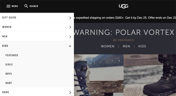
Visitors are easily able to find the right category of products and additional navigation options are accessible in drop down menus.
2) Highlight Search Functionality
Sometimes visitors want to go straight to the product they want without having to click through multiple pages.
The search box serves exactly that purpose so visitors can simply type in what they are looking for. Just like the navigation bar, the search box should be clearly visible on all pages. Many popular e-commerce stores (including Amazon) tend to place the search box at the top of the page but putting it in the sidebar can also work depending on the site’s design.
Including search suggestions is a nice touch that visitors are sure to appreciate, similar to what Amazon does:
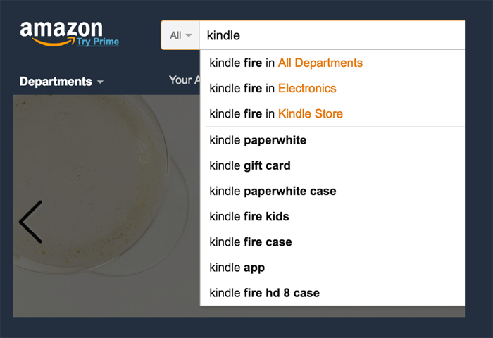
Dynamic search is an emerging design trend that is becoming more popular. As visitors start searching, products begin displaying dynamically. Search suggestions and dynamic search are both a great way to add more functionality to your site.
3) Allow Purchases With a Guest Account
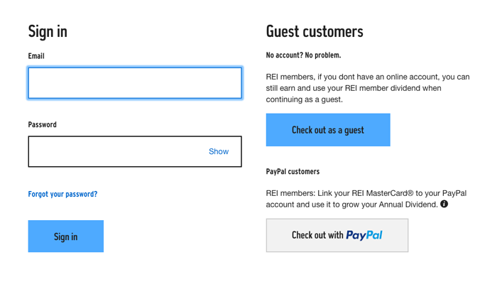
Signing up for an account just to make a purchase can be a tedious process. If your site requires an account before visitors can buy something, you could be losing sales as a result. Instead, allow visitors to be able to checkout with a guest account to make it more convenient for them to complete their purchase.
Here is an example from REI:
One company was able to dramatically boost conversions (to the tune of $300 million by simply including the following message:
“You do not need to create an account to make purchases on our site. Simply click Continue to proceed to checkout. To make your future purchases even faster, you can create an account during checkout.”
Let visitors purchase without creating an account but give them the option to do so.
4) Make it Clear When Items Are Out of Stock
You finalise a purchase only to be sent a notice that an item is out of stock.

Sound familiar?
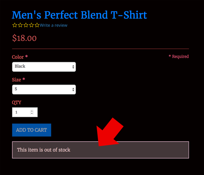
Nothing is more frustrating than purchasing an item and having to wait a few weeks for it to arrive because it wasn’t in stock at the time. If you are in a rush, you have to go through the hassle of contacting the store owner and getting the order refunded. If certain items are out of stock, make it clear on your site so shoppers can plan in advance.
Here is an example from Zeke Gear:
For more popular items, you may want to include an estimate of when the item is expected to be in stock again. Implementing this feature is relatively simple to do with most e-commerce solutions and is beneficial for both online shoppers and store owners.
5) Enable Breadcrumb Navigation
Breadcrumb navigation is nothing new in web design. But it can have a profound impact on how visitors navigate your site. Visitors are able to grasp where they are and can easily navigate back to previous pages without having to click the back button.
One area where breadcrumb navigation is a must is the checkout page.
When placing orders, customers should be able to see where they are in the purchase process, what information they have provided, and how many steps are left. Using a breadcrumb navigation makes each of these clearly visible and also allow visitors to go back to a previous step to edit any information.
Here is an example of this in action from Amazon:
Making this simple change can have a positive impact on conversions by making it easy for visitors to navigate through the checkout process.
6) Use Quality Photography
The downside with shopping online is not being able to inspect a product in person.
Use quality images for each product so visitors have a better idea of what to expect. Many e-commerce owners make the mistake of using images directly from the manufacturer. The problem is that other online stores are likely using the same images.
To make the design of your e-commerce store stand out even more, investing in professional images is well worth the cost as it also helps to distinguish your brand from your competitors.
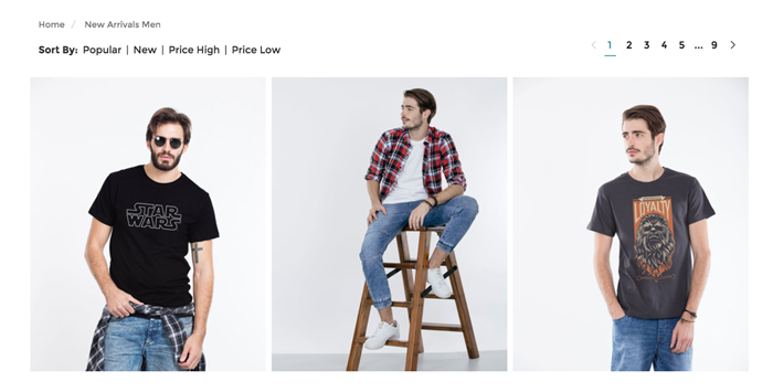
Here is an example from Bewakoof:
The picture quality is great and hovering over the images shows additional angles, a nice interactive touch that draws more attention to the image.
7) Make the Shopping Cart Visible
Some visitors will simply want to purchase a single item, but others will undoubtedly want to browse around and add more to their shopping carts. So it is important that the shopping cart be visible at all times from every page. This way visitors can easily return to their carts to complete their purchase or make any changes to their order.
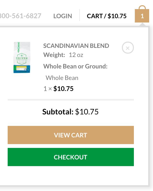
Here is an example from Driven Coffee:
Hovering over the cart icon at the top gives visitors a quick snapshot of what is in their cart and what the subtotal is. There is also a button for visitors to checkout and review their purchase.
Bonus – Watch this if you’re just getting started with your own ecommerce store and need help with design.
Conclusion
The design of your website matters a great deal.
Visitors are quick to make impressions and will not hesitate to click the back button if your site does not meet their expectations. Implement these ideas here to design a better online shopping experience and boost more sales to your store.
