Keep these 5 Important tips in mind when building a Responsive web site
Responsive websites are here to stay. By adjusting to most appropriately fit the device the website is being viewed on, responsive design blows fixed-width sites out of the water. If you’re not clued up on how to create them, the time to learn is now.
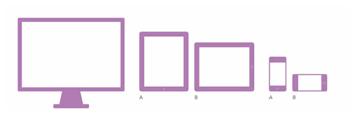
Mobile browsing is set to overtake desktop browsing by 2014, and with such a variety of smartphones, tablets and netbooks (all which feature web browsers in various shapes and sizes), how should we design to see our work shine from wherever it’s viewed?
Mobile-specific sites seemed like a great idea – creating a bespoke site for smaller screens – but then, along came Ethan Marcotte with responsive web design, a set of techniques that allowed websites to adapt beautifully along a gradient of different viewing experiences.
But what are these techniques? And how should we use them?
Here are five tips to get you started with responsive web design.
1. Use a Fluid Grid
The first technique to master in responsive web design is the use of a fluid grid. This improvement on the liquid layout responds appropriately to the huge number of screen sizes available in today’s market, and tomorrow’s, for that matter.
Fluid grids are designed in terms of proportions, so no matter what the screen size, the elements in the layout resize their widths in relation to one another.
The key to fluid grids lies in this handy little formula:
Keep that in mind for a moment. Now, create a high fidelity mockup of your site in a pixel based image editor. Using this, you can measure a page element (say, a title) and divide that number by the full width of the page.
Multiply that by 100, and you have the percentage of the page that element takes up.
Whatever answer you get, don’t round it up! Computers like mathematical precision a whole lot more than we do.
This percentage will now define the width of your element, and can be dropped into your style sheet to maintain the size of your element in relation to the size of its container. Big viewport? Big title. Tiny viewport? Well, this brings us to our next topic:
2. Use Media Queries
With screen resolutions ranging from 320px (an iPhone) to 2560px (a large monitor) simply scaling to fit isn’t always the answer. Text elements in fluid layouts can appear squashed and undecipherable on cell phones, and downright ugly and imposing on widescreen monitors. Media queries prevent this pesky problem from occurring by allowing us to adapt things such as the typography and layout of web pages according to the device viewing them.
They do this by identifying the device and checking for certain conditions in order to apply an appropriate style sheet. So, you could have one style sheet for large screens that will display elements in a certain way (say, double-column view), and another specifically for mobile that will display them totally differently (such as single-column).
Media queries allow introspection into the browsing environment based on:
- Browser Dimension
- Device Dimension
- Browser Orientation
- Color Information
- Device Specific Details (such as resolution or display base)
So that’s what they are, but how to use them?
Queries need to be incorporated into a linked style sheet’s media attribute to question the browsing environment. If certain conditions are met, the device will then load a corresponding style sheet; if not, the link will be ignored.
For a more detailed look at this, Smashing Magazine’s in-depth explanation is particularly useful.
At this point it’s important to note that CSS3 media queries are supported by a significant number of contemporary browsers but not IE8. Although, Microsoft has committed to media query support in IE9.
3. Use Responsive Images
Fixed-width images don’t flow so easily into different sized containers, especially if they’re too big. They simply aren’t aware of their surroundings, and with no constraints applied to them, will overflow and exceed the width of their containers.
This looks bad. Ethan Marcotte has written another excellent piece on exactly how bad.
But thankfully, it’s possible to apply the necessary constraints to force images to fill only the space available to them. All you need to do is set the width of your image as a percentage of its container:
img {
   width: 100%;
   height: auto;
}
Using responsive images in this way even works on older browsers, so it’s a pretty handy method. However, there are several factors to consider when implementing responsive images, including bandwidth and aspect ratio, which are essential to consider when designing for mobile.
4.Use Elastic Videos
Fixed-width videos will create the same problems as fixed-width images so need to be dealt with accordingly.
If you delved further into Ethan Marcotte’s piece on responsive images, you might have noticed the max-width: 100% rule (skimmed over in favor of width: 100% due to browser compatibility).
This rule works when using HTML5 video elements, which is great as a ton of mobile devices now support it. However, this rule doesn’t work if third parties force you to embed their content using iframe or object tag (like YouTube and Vimeo videos).

To get around this, iframes need to be wrapped in a container that can be targeted with CSS in order to allow them to resize fluidly, even if the iframe has fixed pixel values.
To examine the principles behind this, see Thierry Koblentz’ article on creating intrinsic ratios for video.
5. “Responsify” Your Navigation
Intuitive navigation through a website is imperative to great user experience, but you’re not just designing for landscape monitors and mouse clicks anymore. Your site needs to look and feel consistent across the gamut of devices it’ll be viewed in, so there are a few things to consider when it comes to responsive navigation:
- Make all your content accessible (don’t be tempted to hide a part of your website from smartphone users)
- Make icons easy to decipher (even on small screens)
- Make buttons easy to tap
- Take advantage of creative elements to hide/show content according to size
- Remember: You can’t hover on a touchscreen device!
There are lots of code samples available to help you implement responsive navigation into your designs, just remember not to get carried away and use what’s most appropriate.
There are still a lot of issues to be worked out when it comes to responsive web design, but the fact is, it’s not going anywhere.
Hopefully, these tips will have encouraged you to at least dip a toe into the responsive ocean, and for the braver amongst you, will have given you the nudge you needed to jump right in.
A web site is just not a new static photograph. The designers of a web page need to policy for how a consumer interacts with the application, additionally how a website interacts with the device.
Certain types of businesses are more likely to get mobile visitors than others.
Good post
Luke! Would like to add that keeping the layout simple by avoiding pointlessly intricate Divs, Inline styles, Critical JavaScript and float positioning is also a good idea. By defining the break points, keeping it simple and avoiding modern tricks we can create a successful responsive website.