5 Things Your Company Website Needs
If your business is like most others, you try to improve your company website and online marketing plan from year to year. The beginning of a new year is the perfect time to take a look at what you are already doing right and what might need improvement. When it comes to website design, there is always room to grow.
2017 was a year where designs become more minimalistic — with a move away from complex graphics and a focus on clean, crisp layouts. Expect to see similar trends in 2018 as website owners strive to simplify and speed up delivery. Site speed is always a factor that improves your site, so each year you should stop and consider if you can increase your page load time.
Five other things your website is probably begging for in 2018 include:
1. Consistent Header
Your website header should be simple but also consistent throughout your entire site. No matter what page a visitor initially lands on, he or she should immediately identify that page as part of your site. If you don’t have the same header across each page of your website, this is something you should definitely implement in the coming year. You should also have consistent elements in the header, such as the same navigation layout.
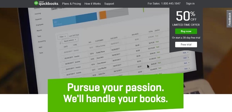
Although the elements on the actual page change, the header of QuickBooks stays the same no matter which feature you click on. It is a pretty simple header featuring the logo, contact info and some basic navigation. If someone lands on the plans and pricing page, the site is still recognizable as QuickBooks.
2. Sliding Images
Although sliders have been around for a while, they are becoming more prominent. The ability to showcase top products is a smart move for most business websites. Consumers will see more than just that one static image when they land on your page. They’ll see multiple images, which can help you target the different types of personas that visit your site. Sliders also give you the opportunity to feature your top-selling products or new releases.
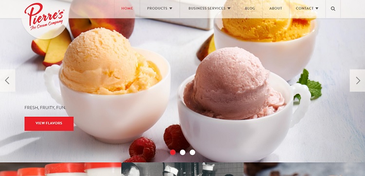
Take a look at the Pierre’s Ice Cream Co. landing page. When you first land on the page, there is a mouthwatering image of different sorbets. The slider then goes to an ice cream cone at a Cleveland Indians game, and finally to a carton of ice cream in the grocery store. Each image is a vivid depiction of the product and makes the user want to run out and buy that product. This is an excellent use of the slider feature to show off the best you have to offer.
3. Flat Icons
Getting back to simplicity, many sites are using flat icons to represent different areas of a site or to indicate social media links. This allows users to see navigation at a glance. It also translates well to mobile devices, because users are often scrolling and can quickly see what they’re looking for at a glance. Images also speak more loudly than text for some, so a combination of the two is powerful.
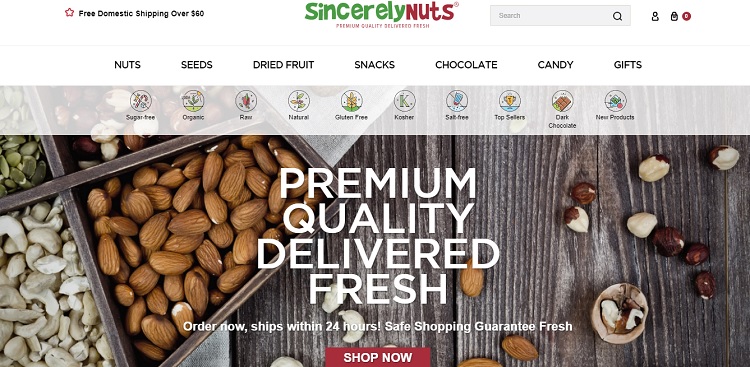
One site that uses flat icons effectively is Sincerely Nuts. Note how the icons for the different types of nuts are listed across the top with images and text. This allows the user to find what he or she needs very easily.
4. Updated Testimonials
Many sites make the mistake of putting up testimonials and never updating them. If you haven’t updated your testimonials in a while, 2018 is the perfect time to do so. You might even want to feature current clients or projects to show visitors that your customers aren’t just pleased with you, but that you’ve had happy customers for many years and still do.
Even better, you could add a review area, particularly if you sell products. This will allow customers to share their thoughts on your products with potential customers. Approximately 88 percent of online shoppers look at reviews before making the decision to buy a product. Reviews matter!
5. Micro-Reaction Opportunities
Social media has created an atmosphere where people love to react in short snippets. Instead of having a static website without interactions, you can incorporate these micro-reactions from social media into your website. This can include scrolling from your Twitter or Facebook feed, using easy-to-click icons to visit your social media pages and having the ability to share content with others on social media.
You might be interested in Micro Reactions in Web Design.
A site that is integrated with these social media micro-interactions allows the user to quickly like or share something on your website without having to leave your page.
Take Your Website to the Next Level
2018 is the perfect year to take your website to the next level. These five ideas are a great place to start in revamping your website for the new year. However, there are also many other things you can incorporate. In addition, you’ll want to pay attention to emerging trends and make changes as the year goes along. If you stay on top of updates throughout the year, you’ll only have to make minor tweaks in the future.
Well described post. Thanks for sharing this useful information about company website needs. As always awesome content, I love reading your articles, much appreciated!
yes, using latest design with some elements mentioned above will leave good impression on visitors. you can also use live chat support widget and feedback collection form for better service.
Thank you for your article and information. Great post.
God Bless You!