5 Responsive and Trending Frameworks You Might Not Know
Embracing a RWD (or Responsive Web Design) approach has not been so important, the way it is today. Whether you’re building a one page site or large size website, it has become needful to create a responsive design that can adapt and adjust to different screen displays.
The rise in demand for a responsive design can be attributed to the development of a variety of devices that are being used for accessing a site. In fact, the search engine giant Google recommends using the RWD approach, since it removes the pain from having to write code again and again for each device that is used to view your site.
Creating a responsive design requires to focus on aspects such as media queries, grid-based layout and re-sizing images. But, what if you lack the required skill set needed to build a responsive website?
Fortunately, there are several great responsive frameworks available online that help both designers, as well as, developers to explore their potential in creating responsive and highly functional websites or web applications. These frameworks, basically, saves a lot of development time by ensuring that your site scales across all the devices properly.
Here in this post, we’ll discuss 5 of the best responsive and trending frameworks that you might not have used till date:
1. Cardinal
If you’ve been searching for some new approach to scale your specific layouts across many different devices, then Cardinal may prove the best resource for you.
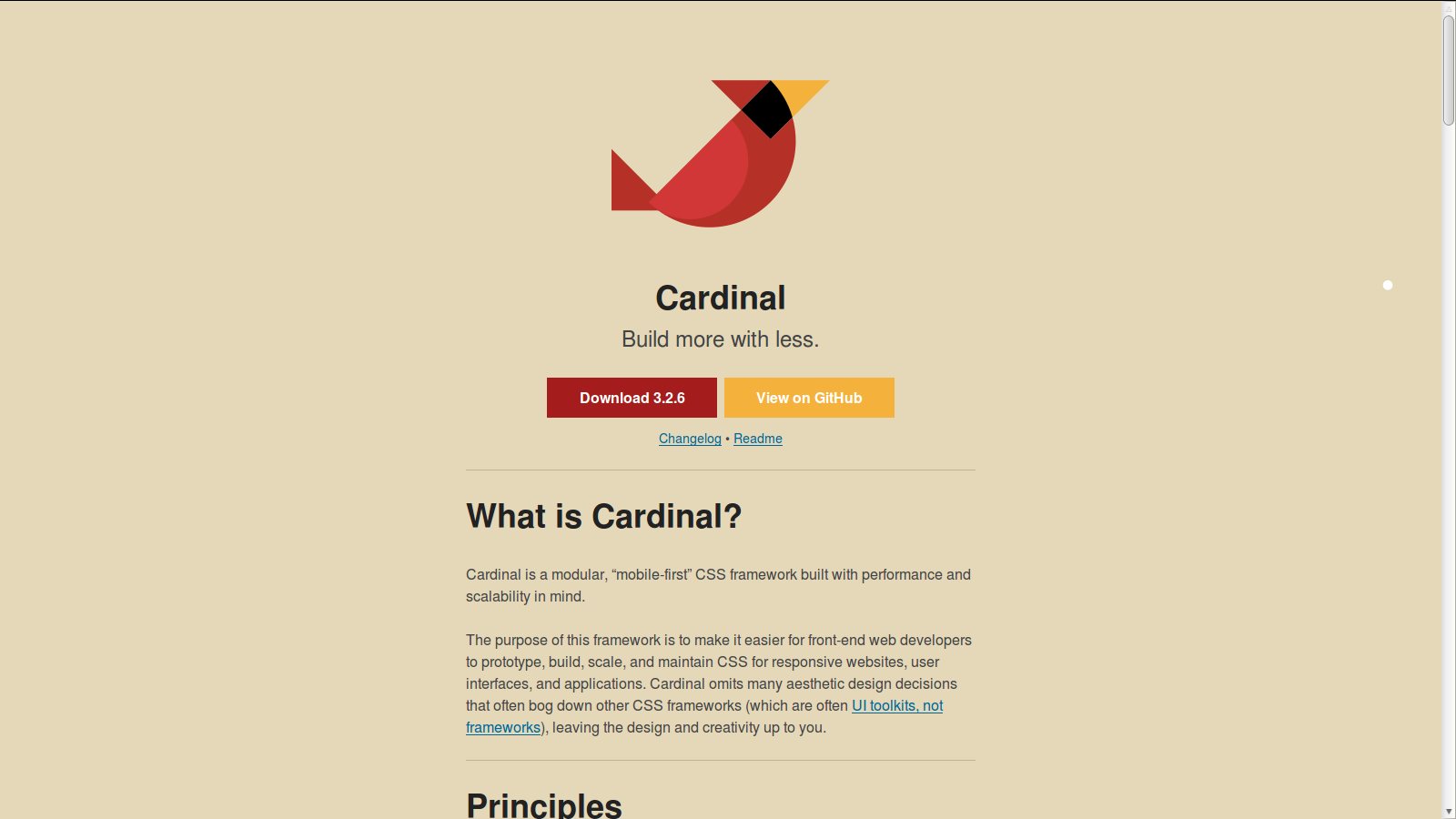
It is a CSS framework that provides a CSS based on the “mobile-first” approach, and is mainly designed to improve performance and scalability of the design.
The basic purpose of the framework is to provide ease to front-end developers to create a prototype that easily scales and makes changes to the CSS to correct it for responsive websites.
2. Base
If you want a framework that helps in creating fluid and fixed grids based on your set of specifications – be it width, offsets, columns, padding, etc., then Base is exactly what you need.
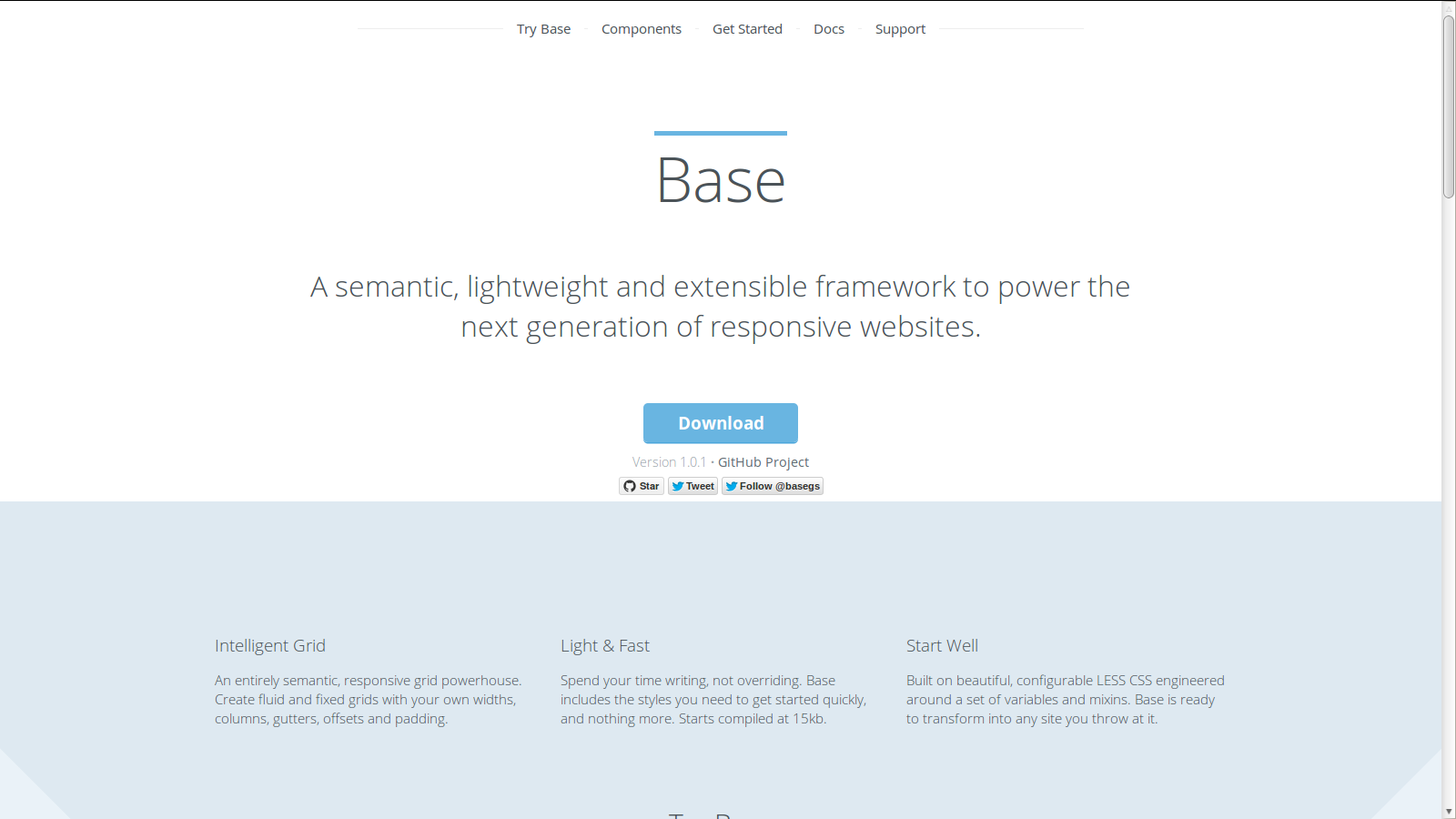
It is built on LESS CSS pre-processor that enables to write clean and easy to maintain CSS that helps in creating next generation responsive websites.
The framework is designed to be used for multiple devices like Smartphones, tablets, PCs, etc. Additionally, it comes loaded with several styles for typography, lists, forms and many other foundation elements.
3. Responsive Grid System
Grid systems seem to have become an important part of the web design process, since they help in deploying content throughout a page in a consistent manner. These systems basically comprise of rows and columns that helps in controlling the layout of web pages via CSS classes.
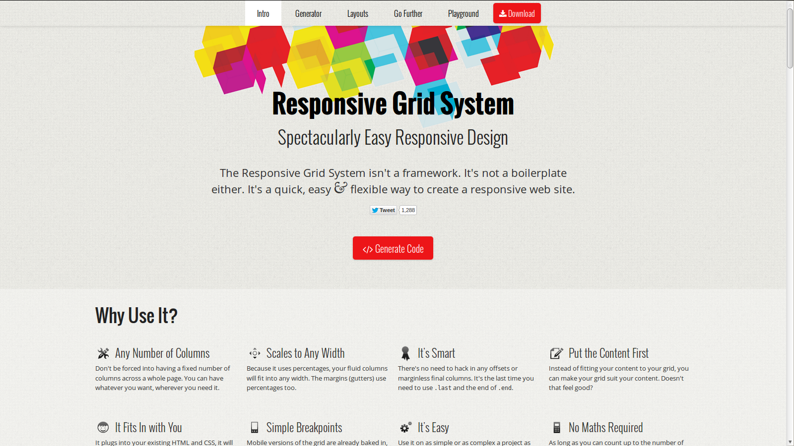
If you too want to make use of a grid system for creating your responsive website, then the Responsive Grid System is the right choice for you. It isn’t a framework, but rather a useful grid system that helps in creating a responsive site quickly using an easy and flexible way.
Whether you’re working on a simple or overly complex project, the Responsive Grid System will help you get your responsive design ready in no time. The best aspect about this grid system is that gives the ability to set up to 12 columns, without having to hack any offsets or columns without any margin.
4. Pure
Simply creating responsive layouts isn’t enough to expand your business reach to the mobile users. You also need to focus on creating beautiful layouts that easily grabs the users’ attention towards your design. This is where the Pure framework comes to the rescue.
Pure basically consists of a set of small and responsive CSS modules – that can be used in any responsive website projects.
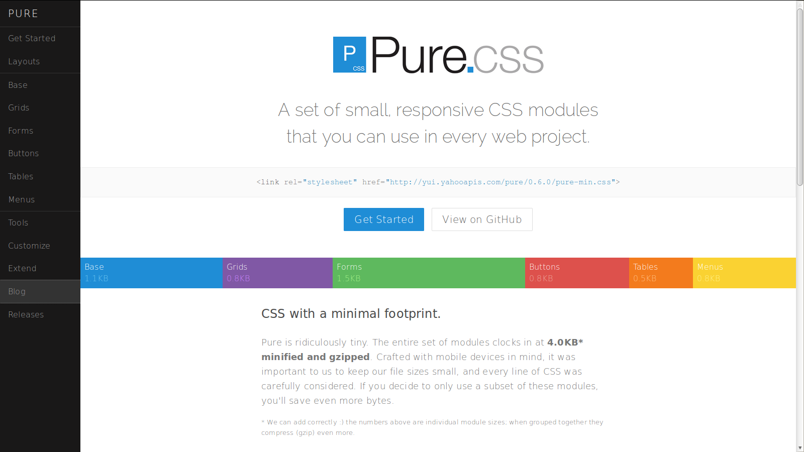
To be more specific, this responsive framework helps fulfill the UI needs of responsive site, as it offers many responsive styles, designs, and UI components. All the elements look great on devices, since they’re crafted keeping mobile devices in mind.
5. Semantic Grid System
Constructing page layouts using the grid systems have a downside: the layouts are not purely semantic since experts believe that grid systems fail to separate the markup and presentation in the right manner. However, the problem can be resolved using the Semantic Grid System.
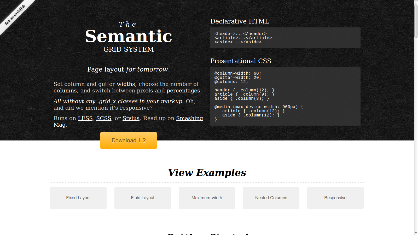
This is yet another grid system that overcomes the problems found in other grid systems. It is semantic in nature, helps in creating fluid or fixed width and is responsive.
The framework provides both the capability of a CSS framework, and most importantly, helps in separating the mark-up and presentation.
Wrapping Up!
Whether you’re an experienced developer or just a beginner, using any one of the aforementioned responsive frameworks will help you get your responsive website up and running quickly. Apart from reducing the development time, these frameworks also help cut down the cost to a great extent. The frameworks prove quite useful, as they fulfill your prototyping, testing and other needs – that otherwise would have required using a wide range of products.